Helmut SALDEN (1910–1996)
A prolific lettering artist
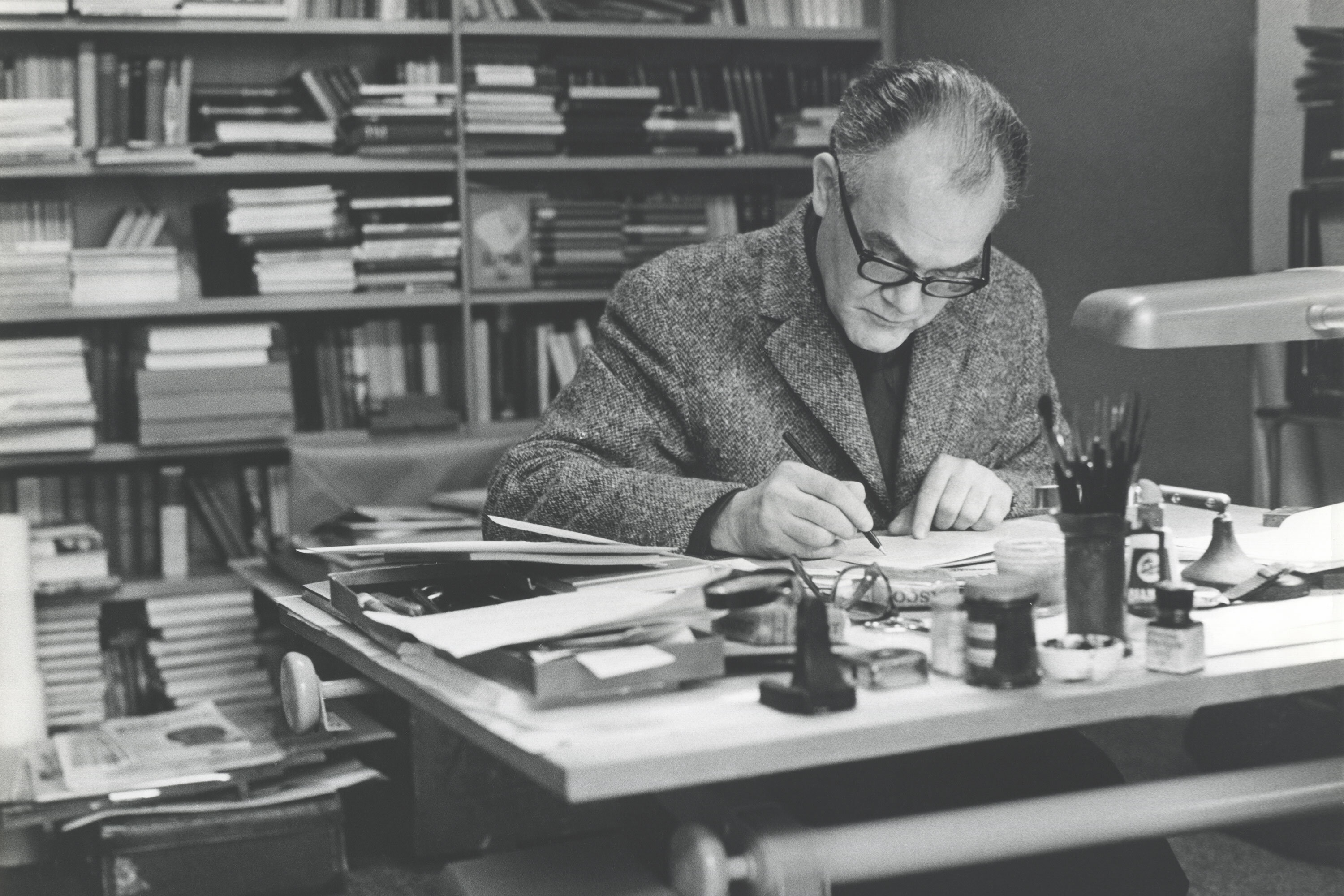
Helmut Salden was born in Essen, Germany on 20 February 1910. He was a student at the Folkwangschule für Gestaltung, also known as the ‘Bauhaus des Westens’ (‘Bauhaus of the West’ ). Starting in 1931 he became an instructor of photography at this institute. Because of his opposition to the Nazi Party, he was fired in 1933. In 1934 he fled the country to France, Spain and Switzerland. In 1938 he followed the Dutch writer Hendrik Marsman to the Netherlands. After working a short period for Piet Zwart, Salden started as a designer of book covers for, among others, A.A.M. Stols. In 1942 he was arrested, and was condemned to death in 1943. After his sentence was commuted to imprisonment, he spent the rest of the war in a number of prisons and concentration camps. In 1946 he returned to the Netherlands, where he became a prolific book designer, working for more than seventy publishing houses in the Netherlands and abroad.
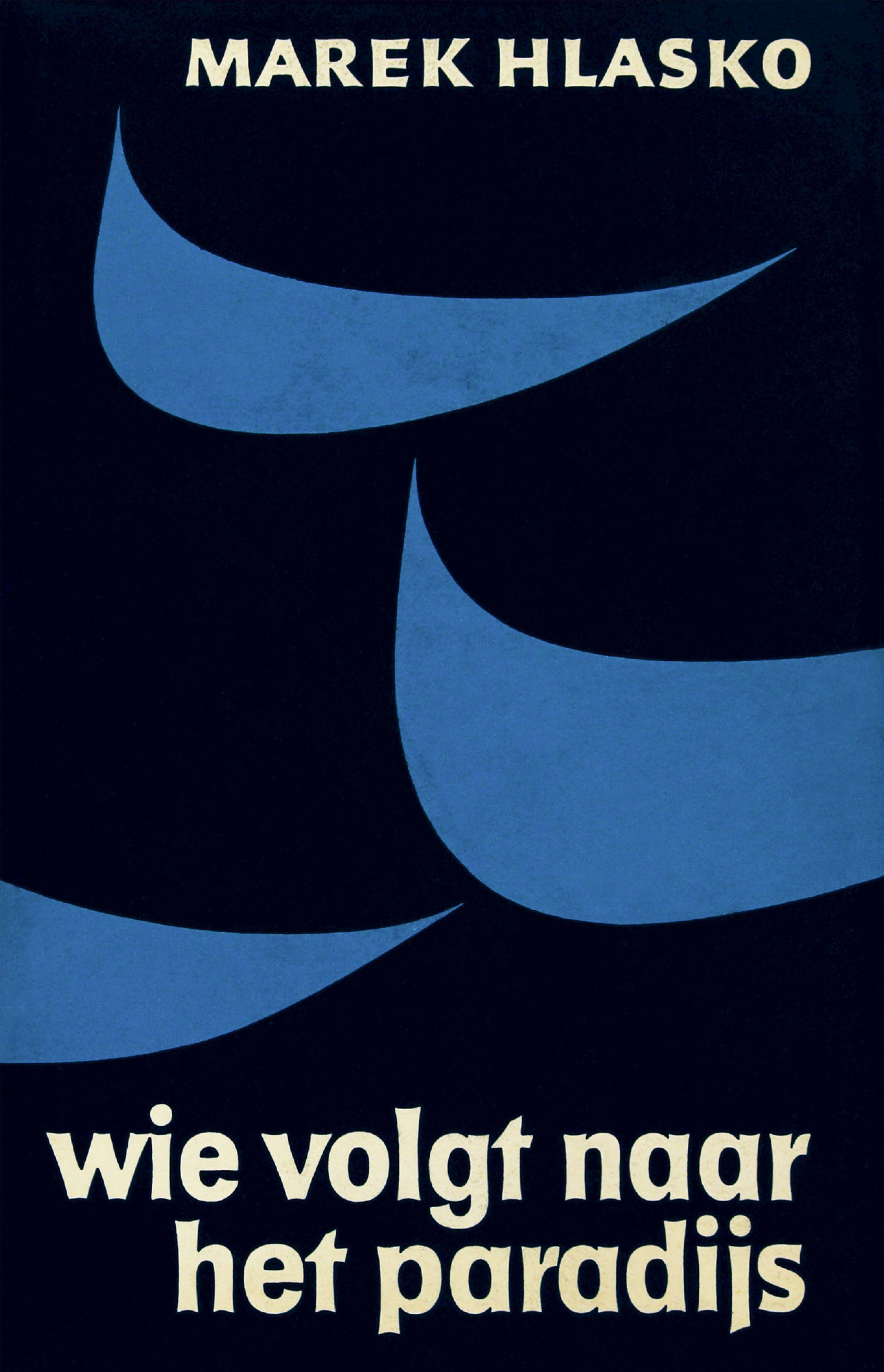
Salden is known for his excellently designed bindings and dust-jackets. In addition, he was a skillful typographer. His book designs received many awards; over one hundred of his books were deemed to be among the best-designed books in the Netherlands. Around 1975 Salden stopped taking on new assignments. He then decided to concentrate on designing monograms and experimented with hundreds of letter combinations. Helmut Salden died on 2 January 1996. In 2000 his archives were donated to the House of the book | Museum Meermanno.
The completion of the conservation of the archive of this prolific artist earlier this year provides an excellent opportunity to show many original drawings of lettering, dust-jackets and monograms, covering a period of more than 50 years. We hope that the greater accessibility of this archive for designers and historians will be a source of inspiration and will promote research.
At the progressive Folkwangschule in Essen, Salden was the pupil of the influential modernist Max Burchartz (photography and graphic design) and the calligrapher Wilhelm Poetter. In 1931 Salden became instructor of photography at the same school after he had worked as an assistant to Burchartz for some time.
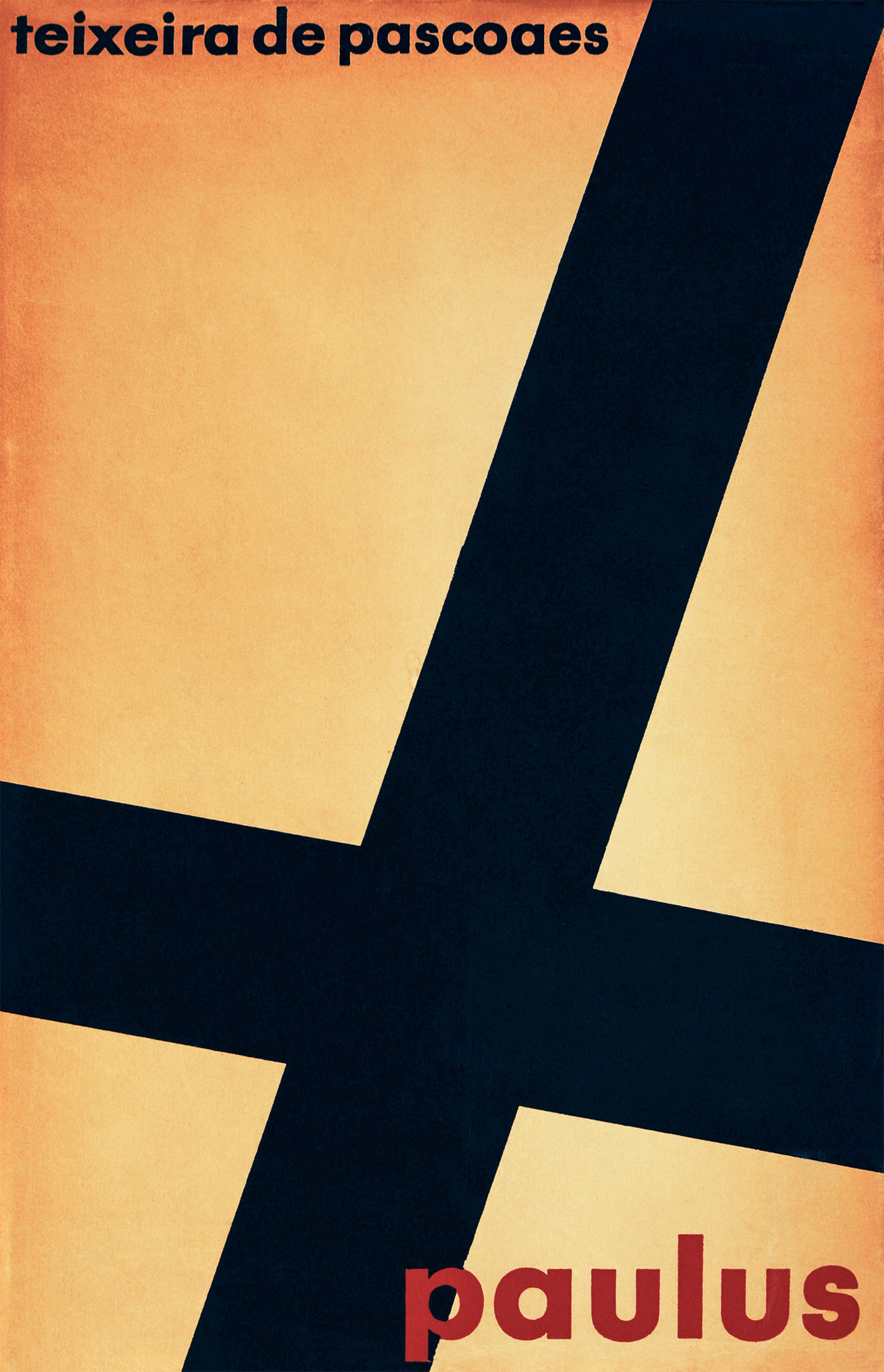
After his arrival in the Netherlands in 1938, Salden briefly worked for Piet Zwart. In The Hague, he met the writer Menno ter Braak, who soon introduced him to publishers, including Leopold and Stols. Some of his early work has modernist traits, often with sans serif letters and a preference for lower case. His calligraphic training is apparent in other early works, such as those made for Stols.
Books on which Helmut Salden collaborated received many awards. In all, these include at least 110 books for which he designed the binding and/or dust-jacket. For 39 of these books he was also responsible for the typography. Salden twice received the State Prize for Typography (1949 and 1952), and the H.N. Werkman Prize for graphic design in 1954. In 1994 he was awarded the Œuvre prize by the Foundation for Fine Arts, Design and Architecture.
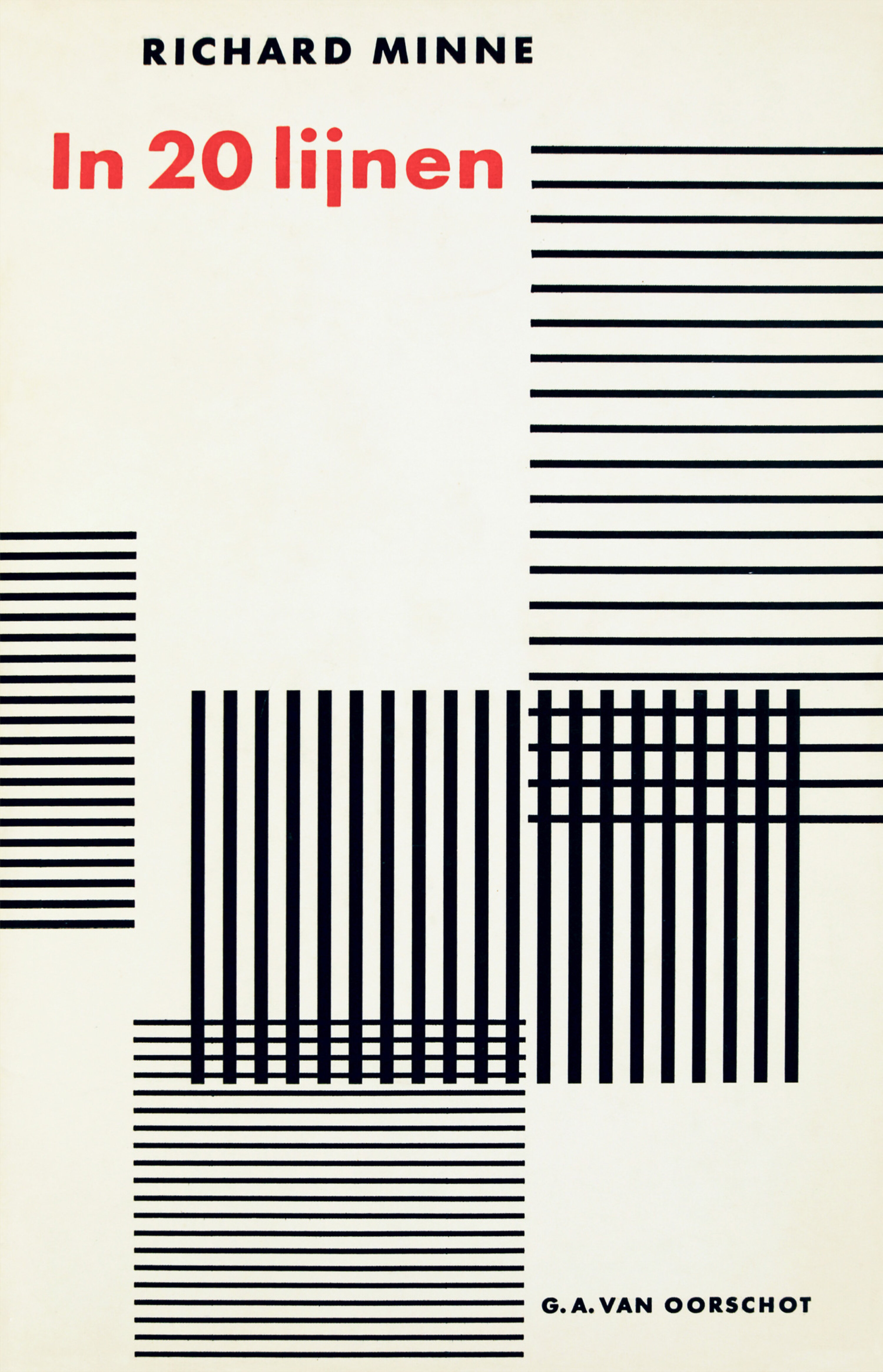
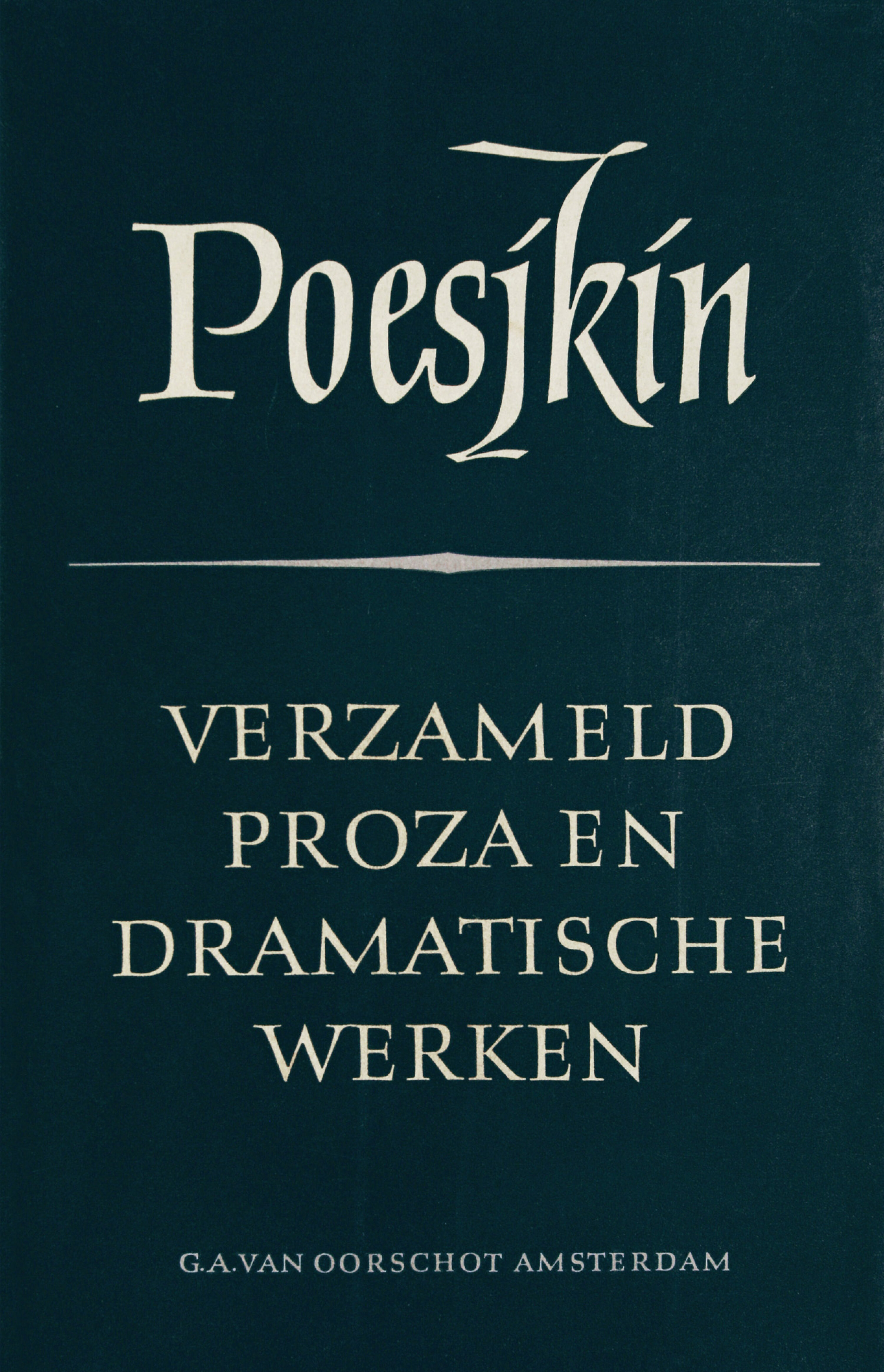
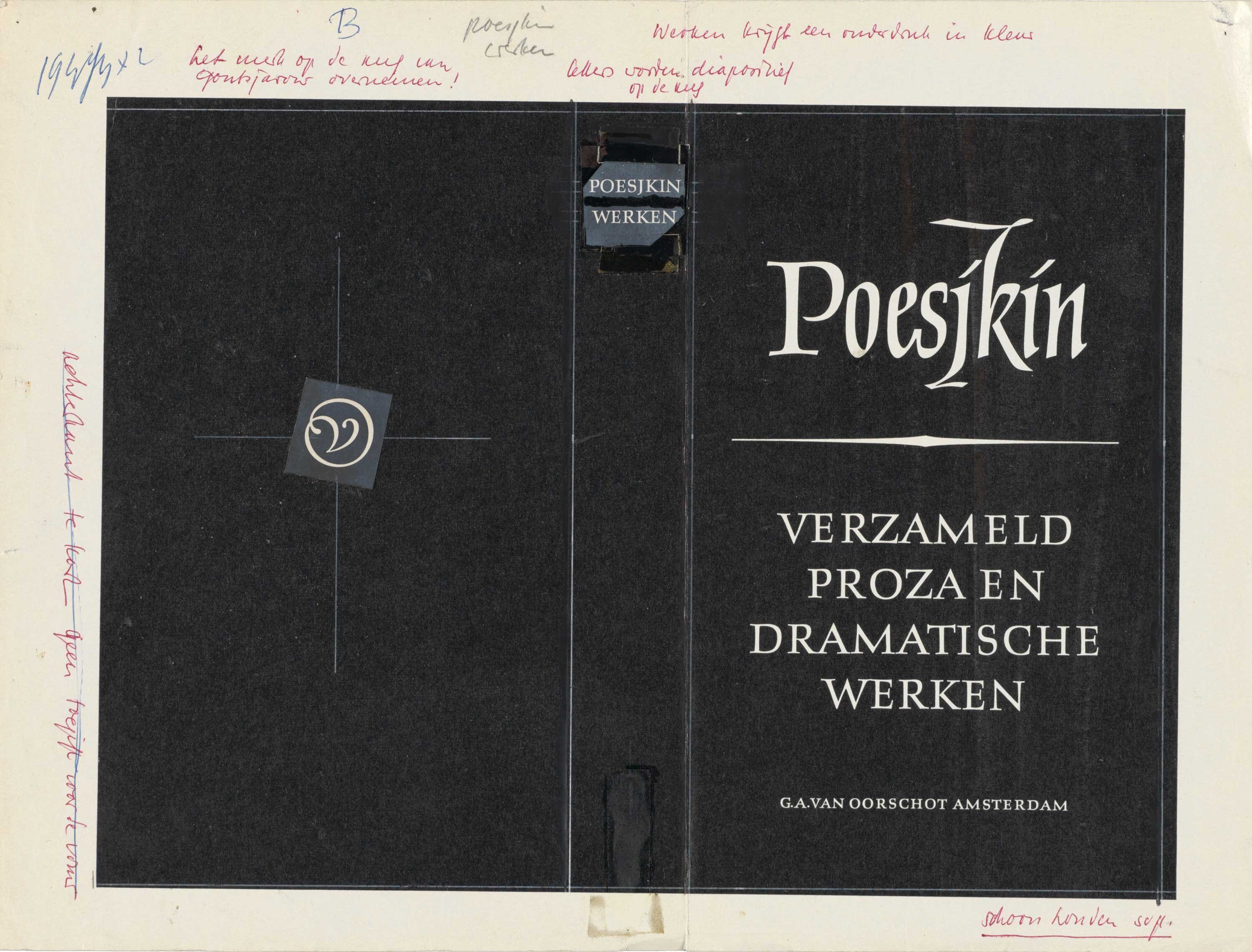
Salden is primarily known for his designs for dust-jackets and bindings, but he was also responsible for the typography of a significant number of books. Among these are several handsome India paper editions published by G.A. van Oorschot, including the highly regarded Russian Library. Salden’s stubbornness in matters concerning book composition, for example the use of quotation marks, sometimes led to heated discussions with editors. Even though he could be obstinate, letters from many editors and authors show that they were very satisfied with his designs.
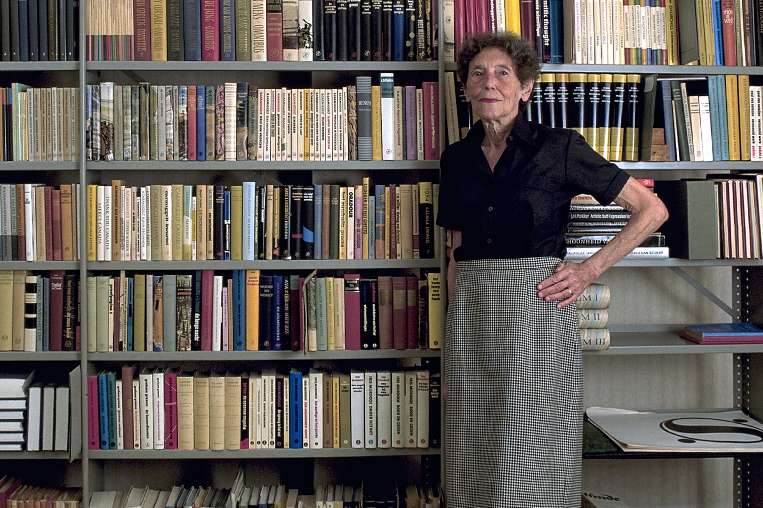
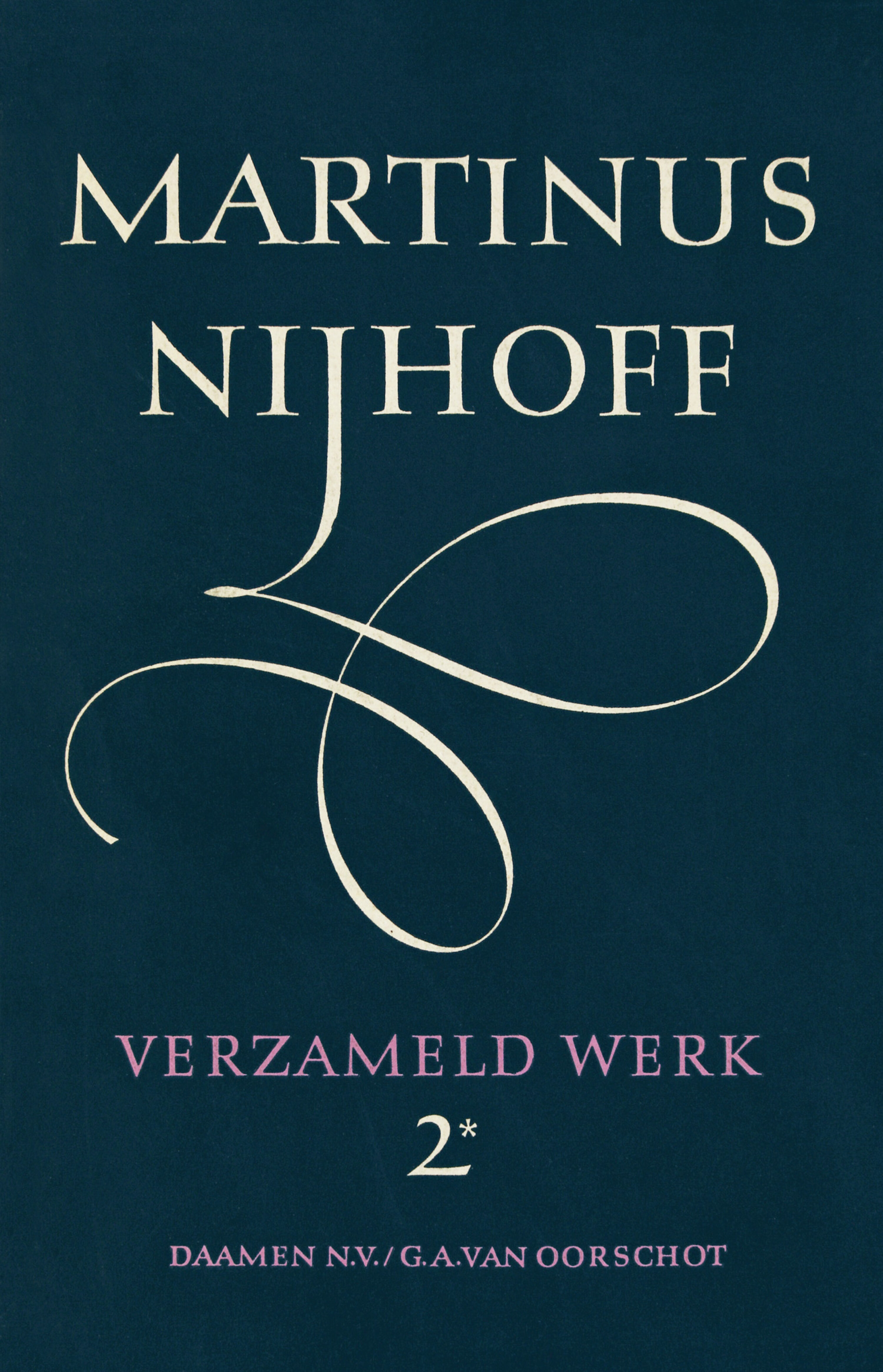
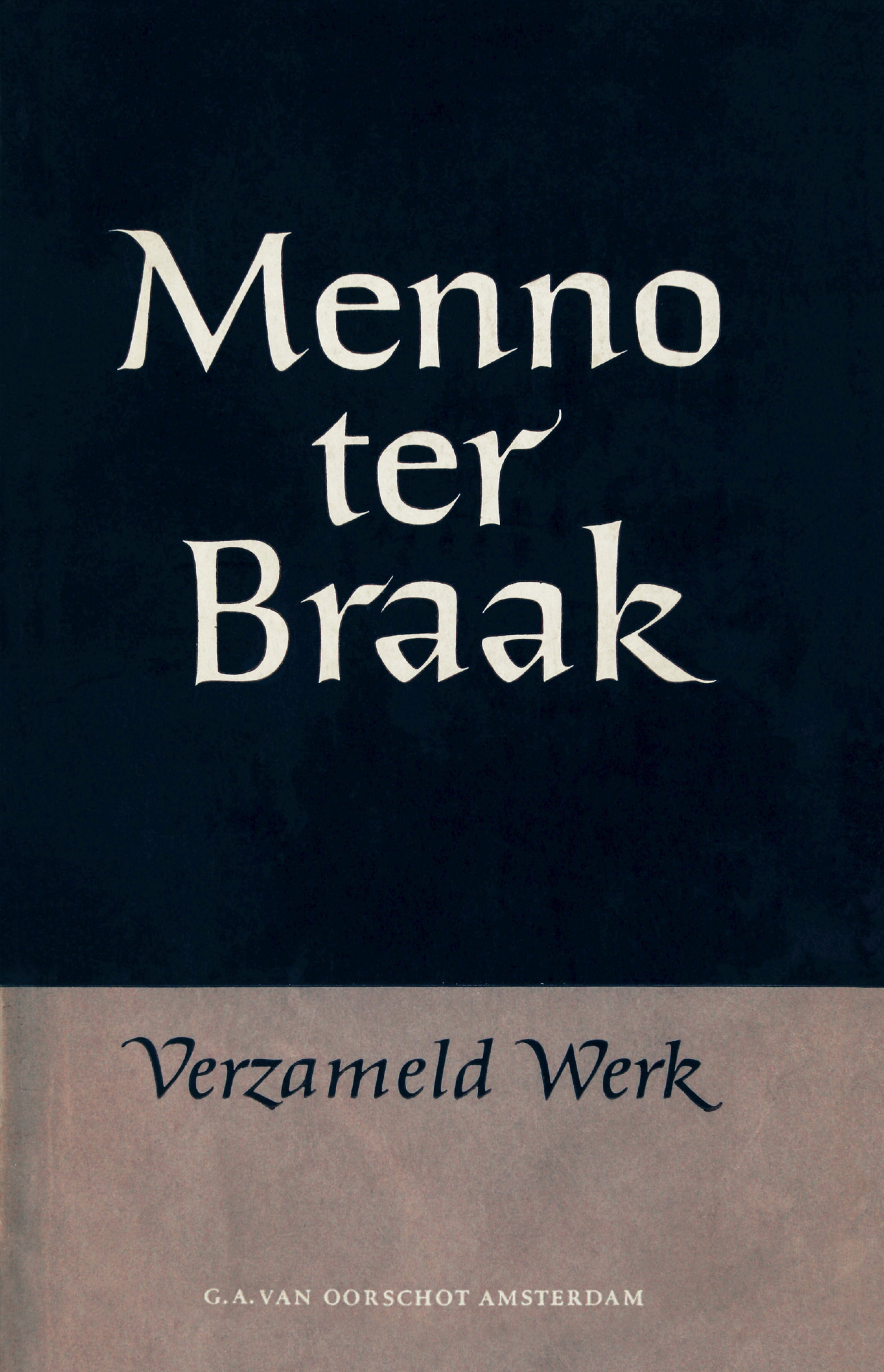
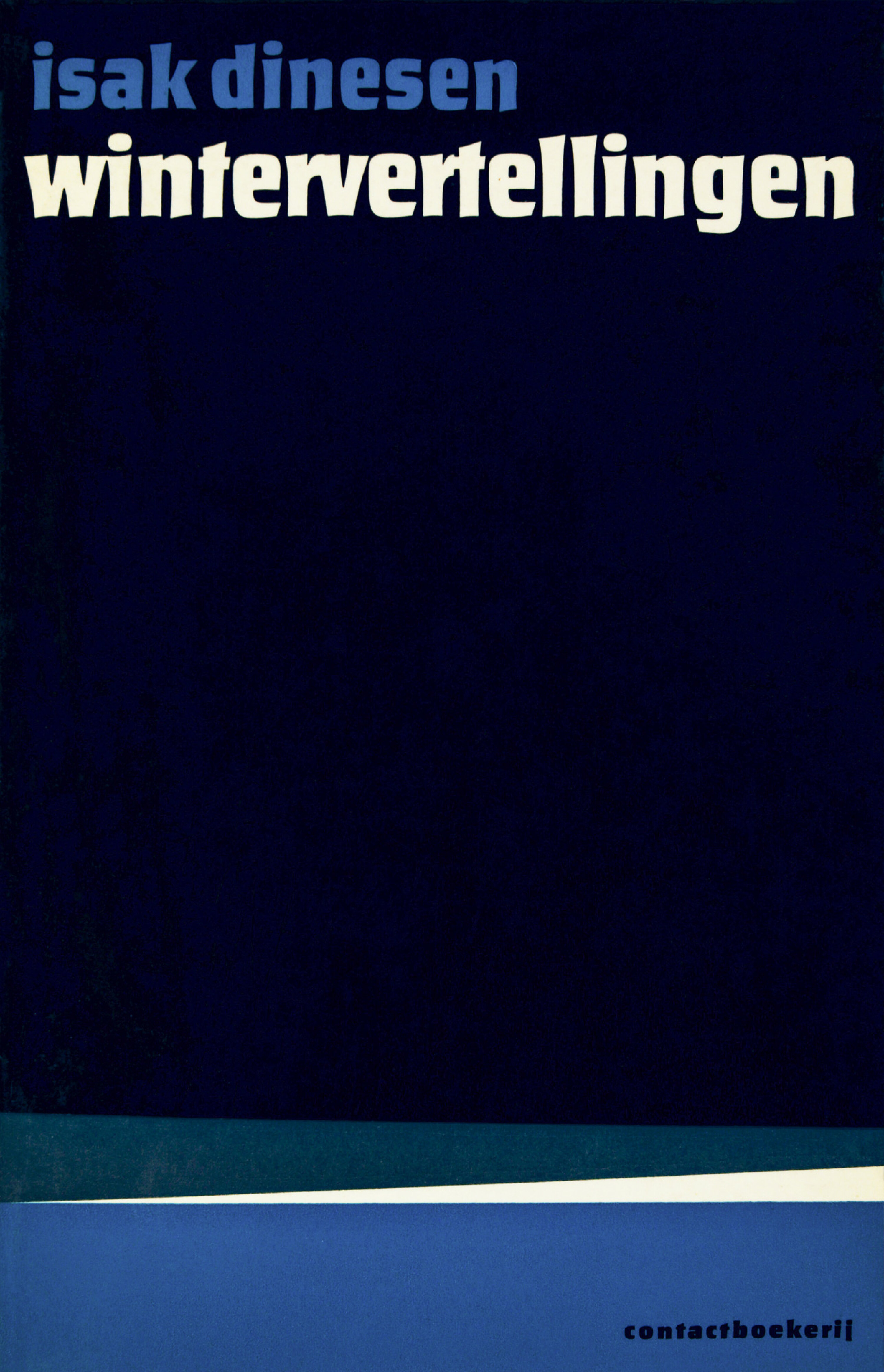
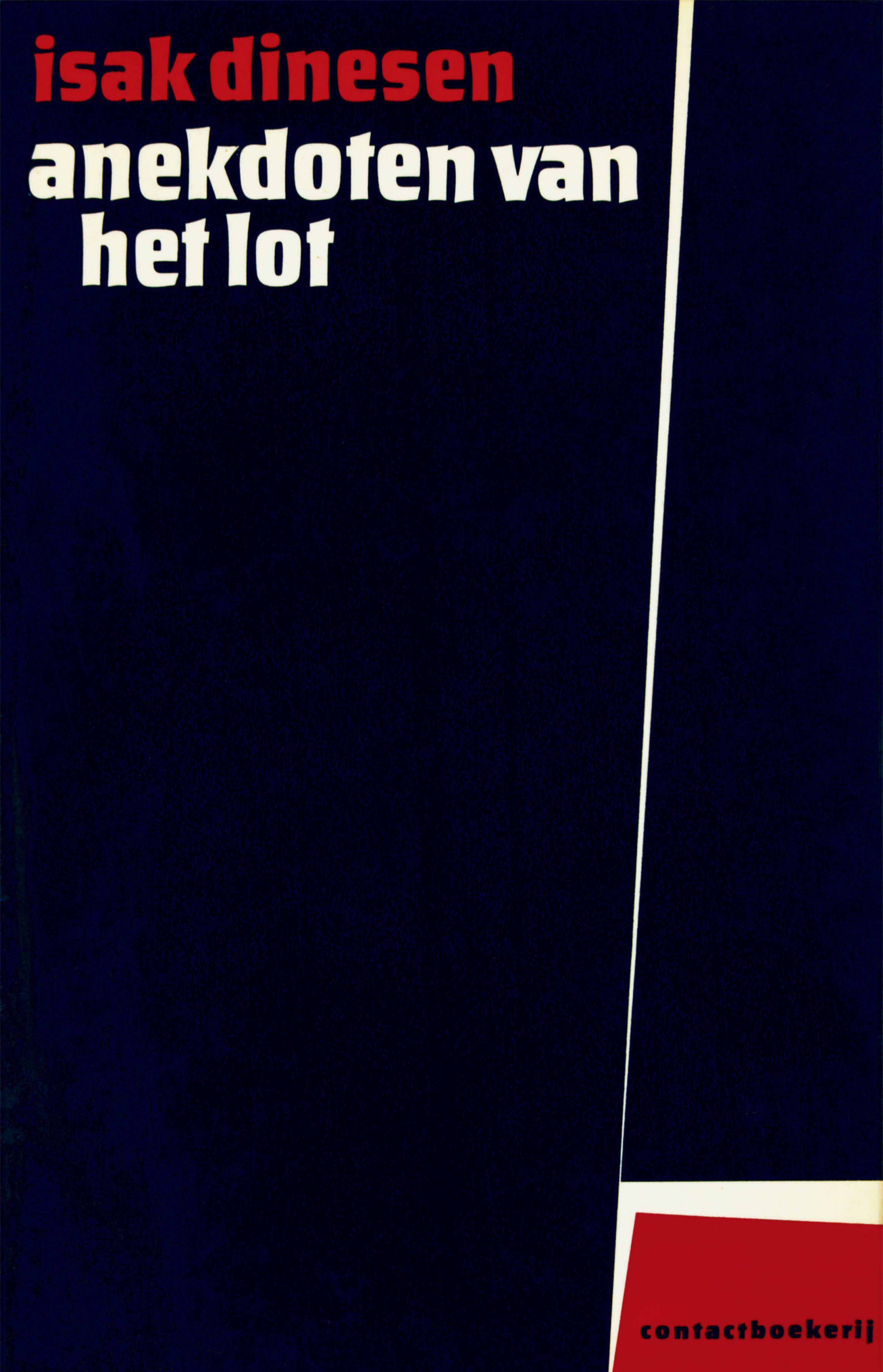
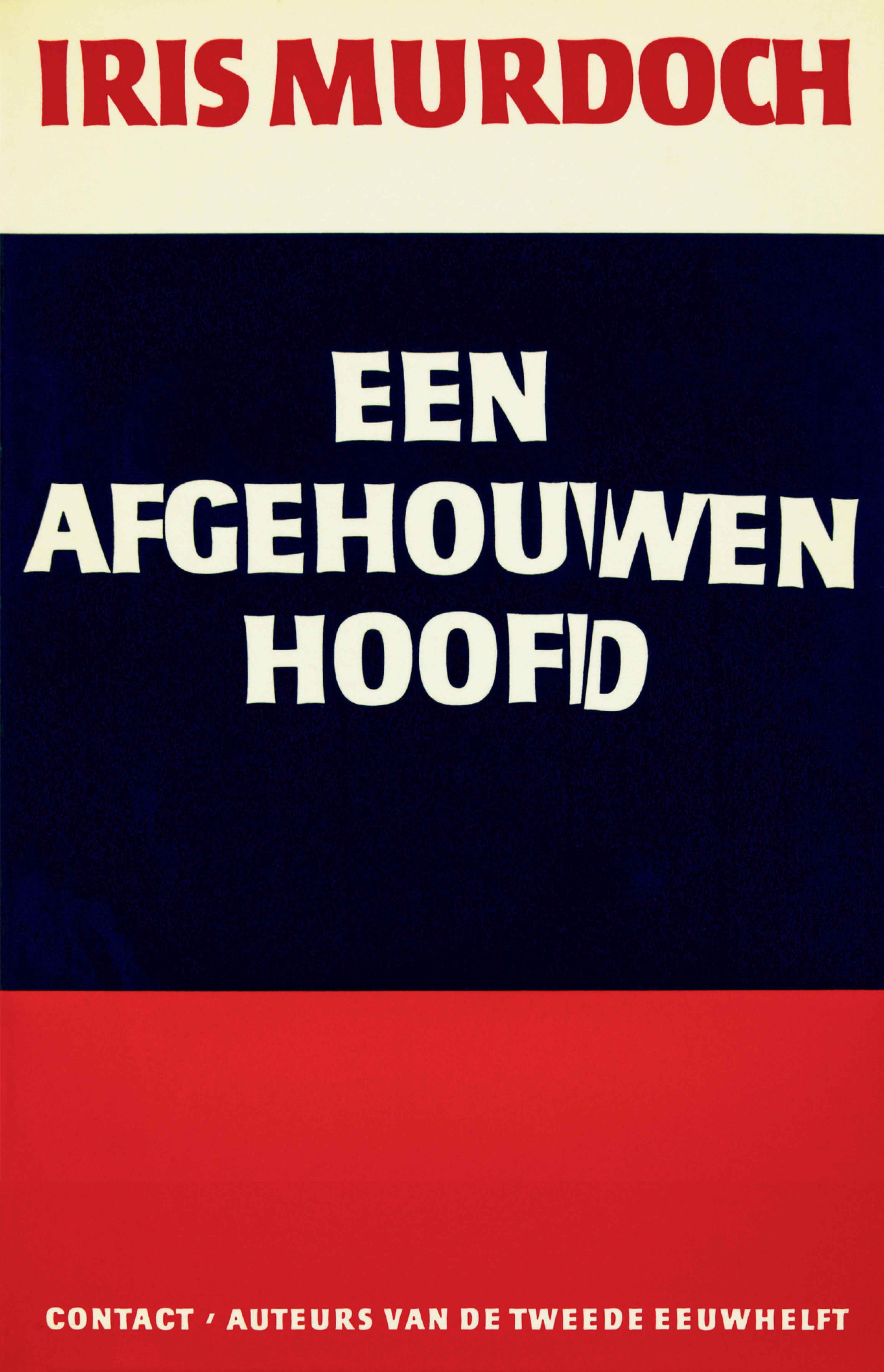
The perfectionist Salden was critical of his own work. For example, the Collected Works of Menno ter Braak, for which he won the State Prize for Typography in 1949, he later described as a “crumpled thing”. He himself thought that the well-received dust-jacket for Petrarca’s Madonna Laura was a failure, because according to him, he lacked a sufficient understanding of letterforms at that time. Still, there were works with which he was pleased, although he was sparing with his praise. The design for The critic as artist by Oscar Wilde which he made for the bibliophile publisher Stichting De Roos was “not so bad”. Salden was delighted if he could achieve a subtle symbolism, such as in Een afgehouwen hoofd (A severed head) by Iris Murdoch, where the words in the title look like they have been given the chop. Amongst his favourites were also certain combinations of books by the same author, such as Anekdoten van het lot and Wintervertellingen by Isak Dinesen.
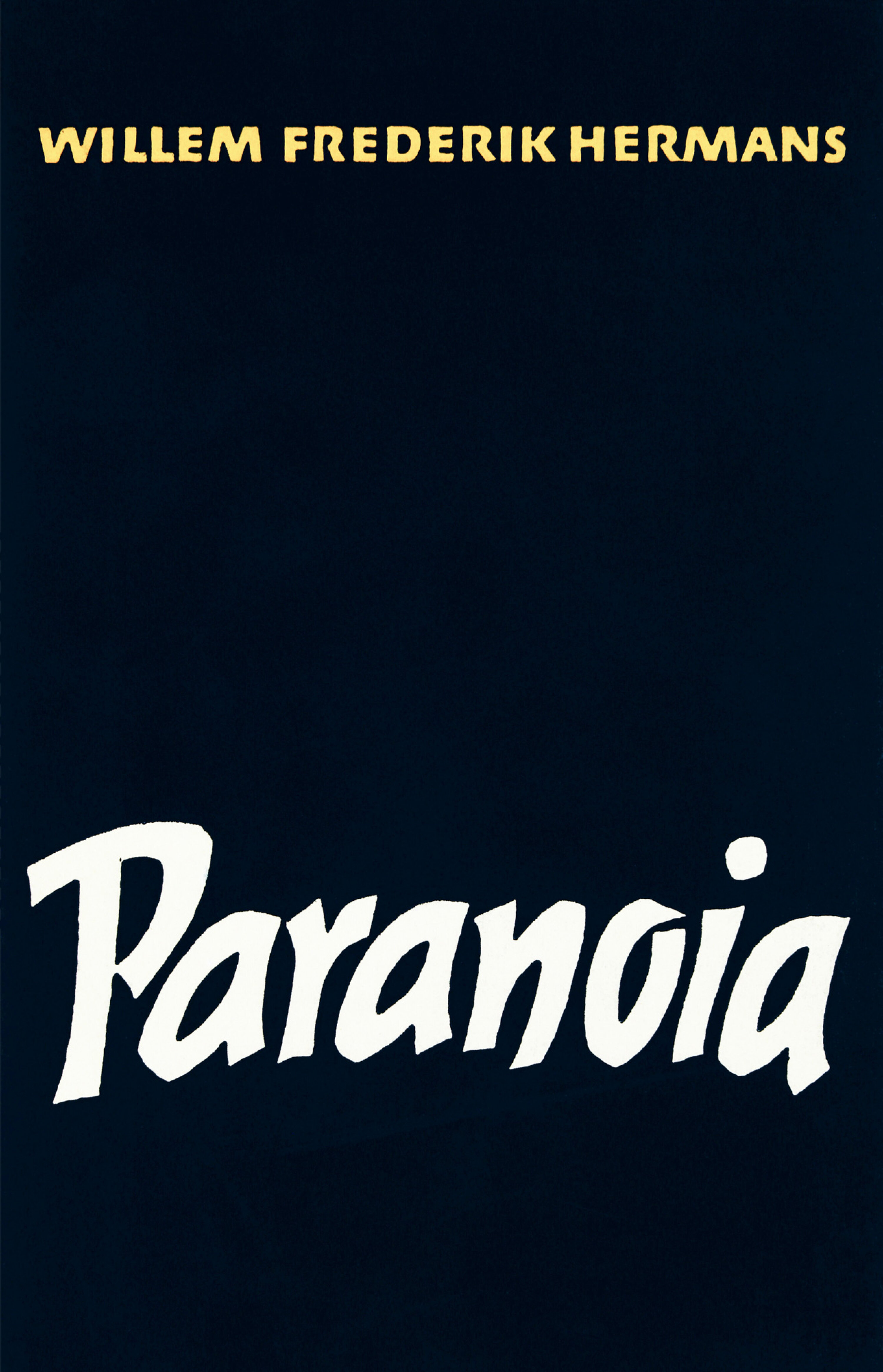
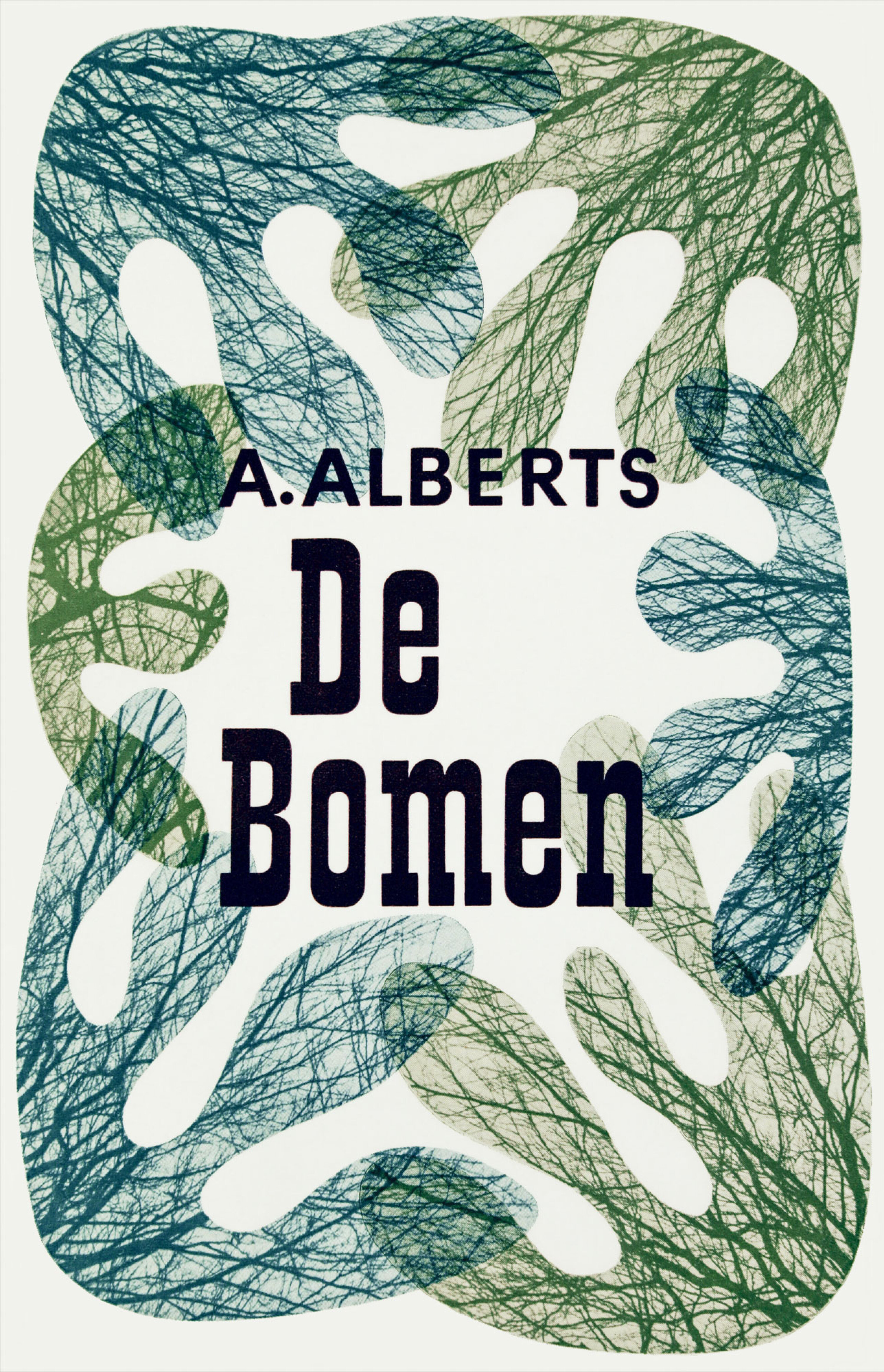
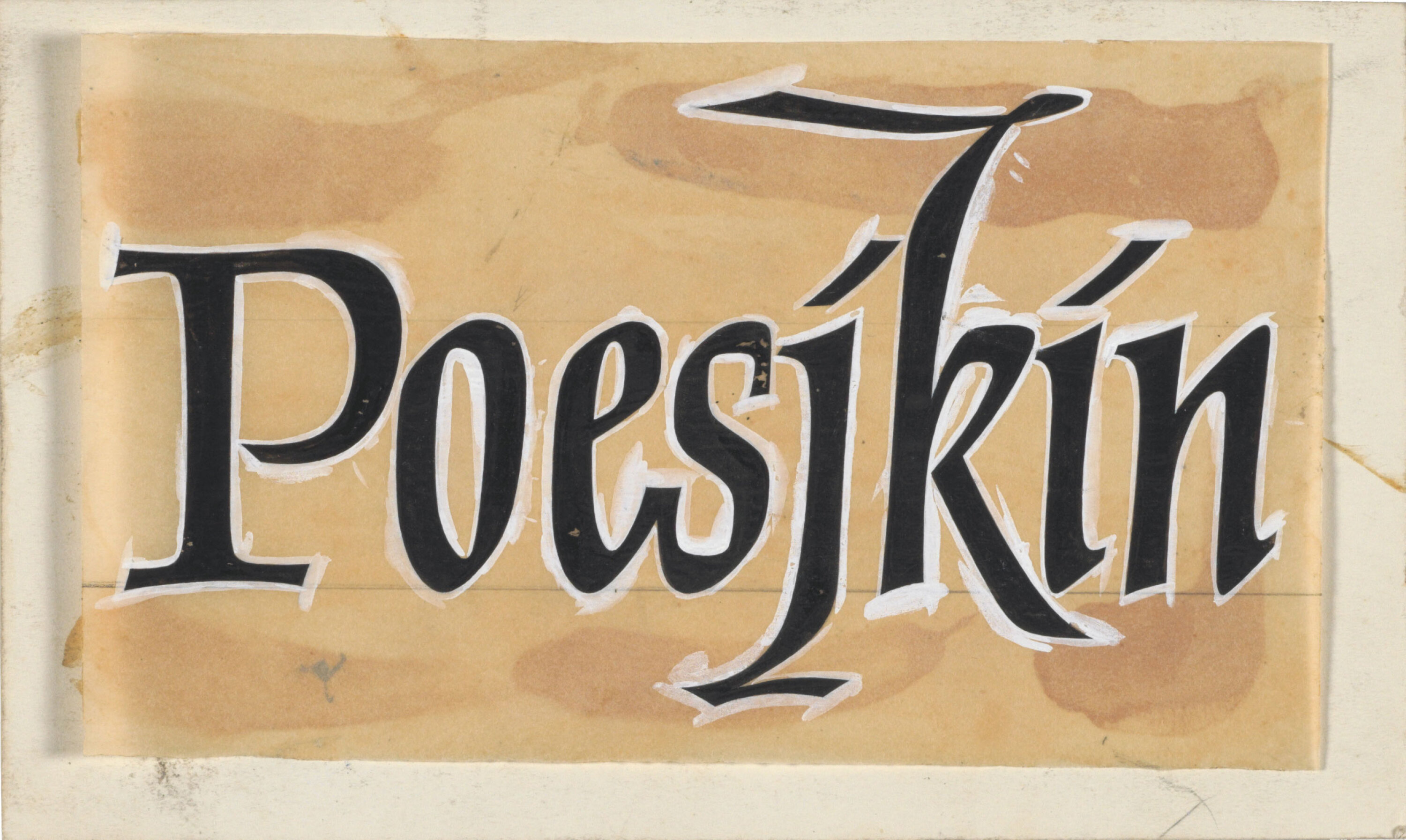
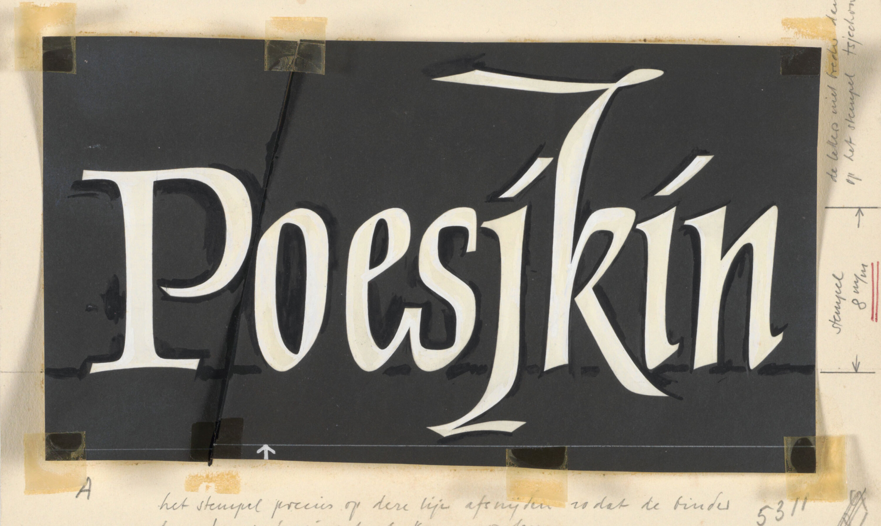
For his dust-jackets and bindings Salden hardly ever used existing typefaces, instead he drew an incredible variety of letterforms. He not only took great pleasure in drawing letters, but it also gave him the opportunity to take the deviation in spacing between the letters into account. Throughout specific series he kept to the same style, for instance in the Russian Library published by Van Oorschot, with the names of the authors in a beautiful italic. In addition, he regularly used a number of specific alphabets. From these, he assembled his lettering, for example for the publications of the Arbeiderspers or the Stoa series of Van Oorschot.
In the early 1950s, Salden had already started on the design of a typeface, but the demands of his regular work as a graphic designer were an obstacle. His inspiration for this typeface was the seats in the theatre of Dionysus in Athens. In 1959 he received a commission from the Ministry of Education, Art and Science to create an official typeface based on this design. Although the idea was to make time free for this commission, once again his other projects took too much of his time. In 1964 the ministry determined that the capitals and the roman type were finished and the italics were half-way done. Unfortunately the design was never completed, perhaps because in the meantime the era of metal printing type was coming to an end.
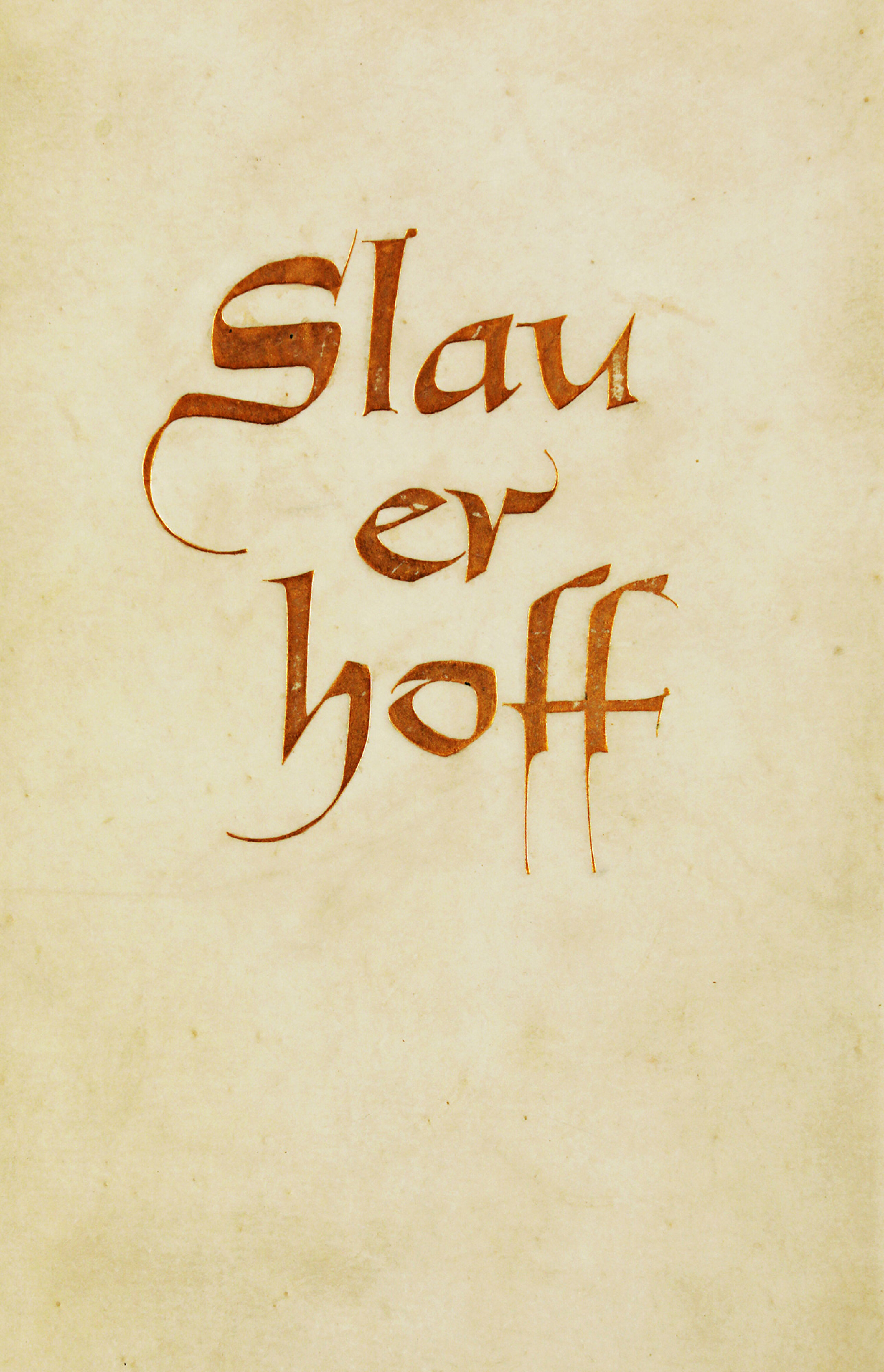
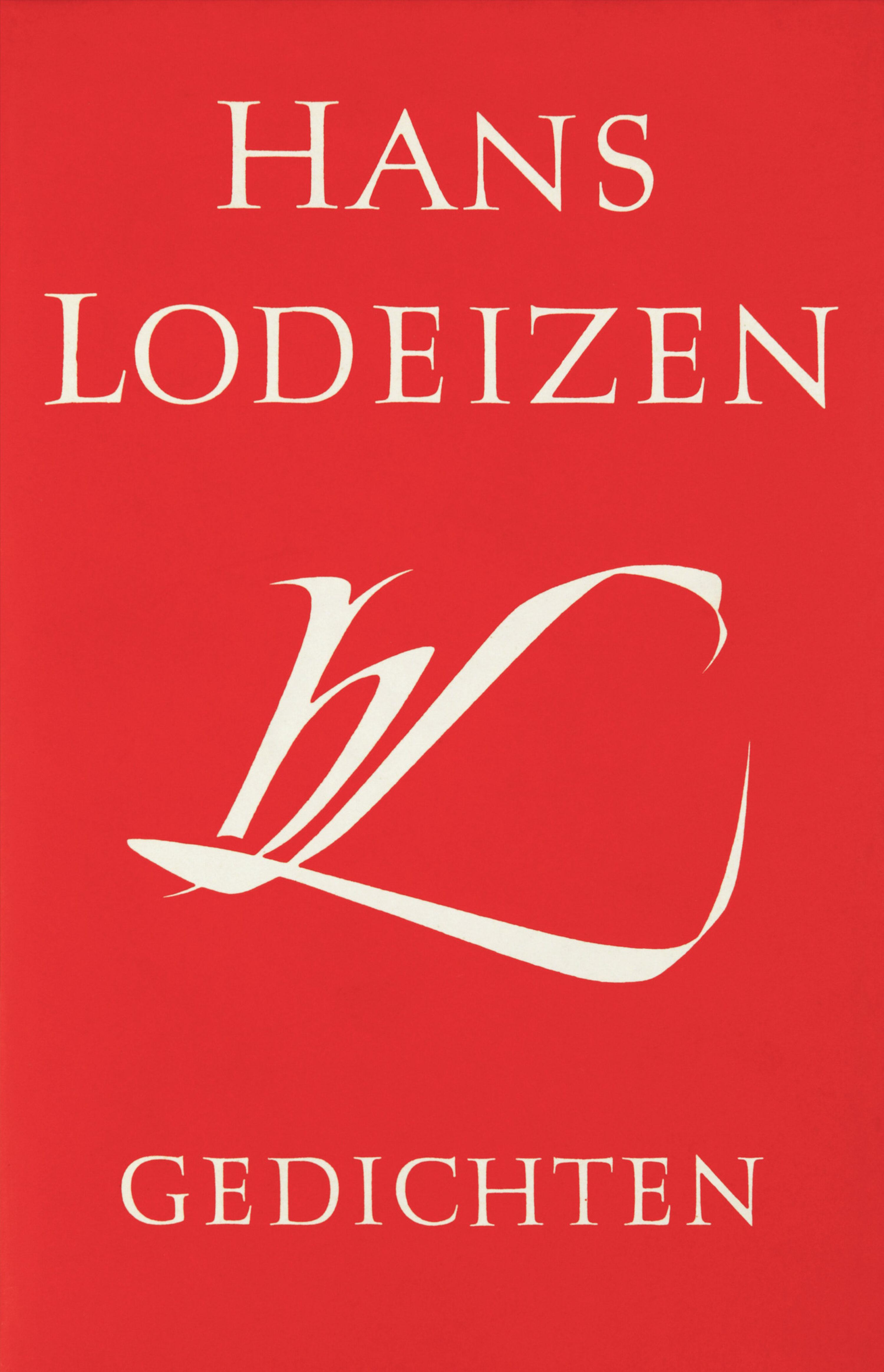
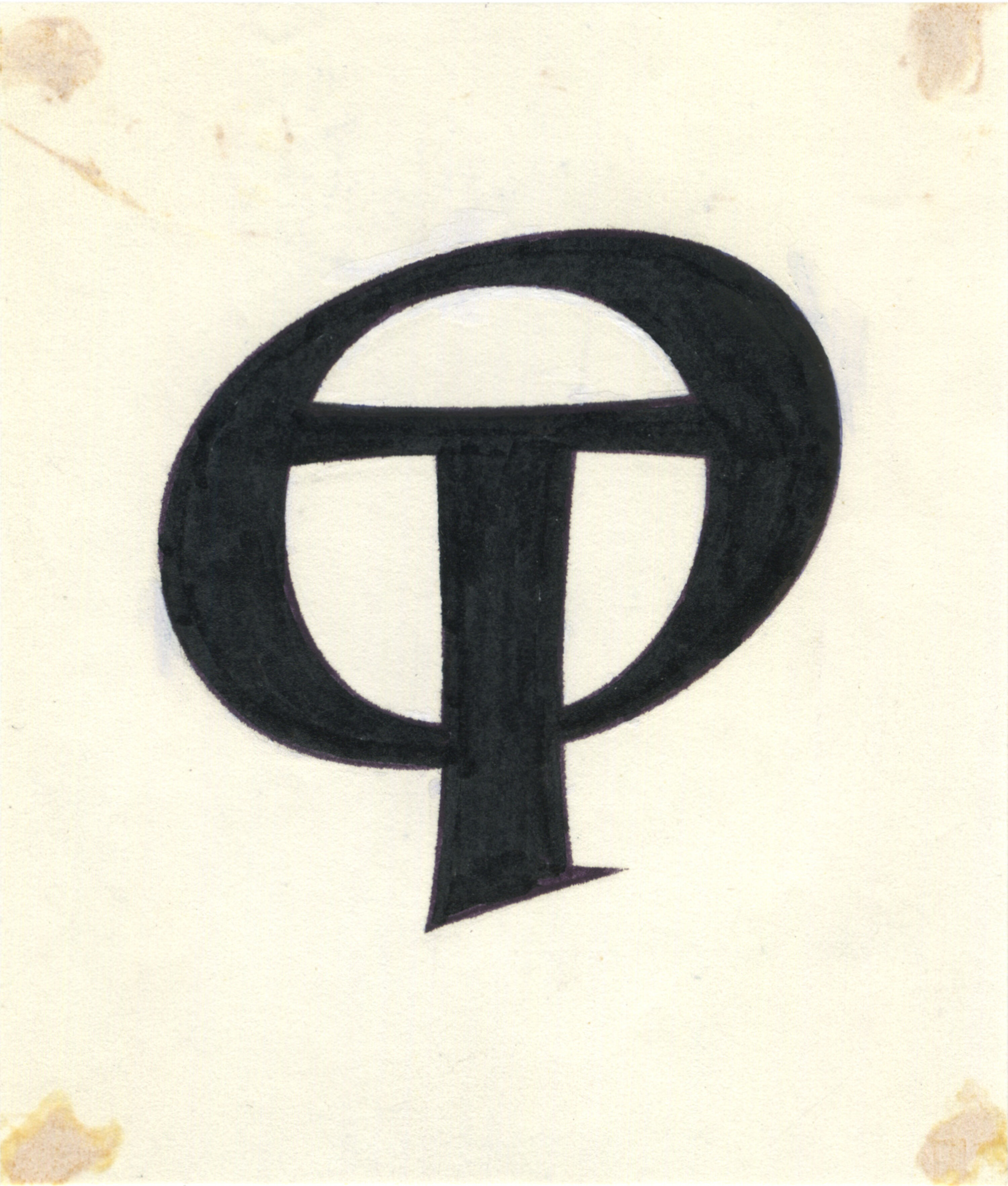
Around 1975 Salden stopped taking on new assignments. He then decided to concentrate on designing monograms and experimented with hundreds of letter combinations. Earlier he had made monograms for publishers and designed monograms for authors on dust-jackets. Later in his life he was inspired by people whom he admired or with whom he identified. The variation in the drawings is impressive; they range from abstract geometrical to traditional calligraphic forms. Salden said that he often tried to reflect the character of the person in the form of his letters. On many of his book covers, the form of the letters also relates to the content of the book or the personality of the author.
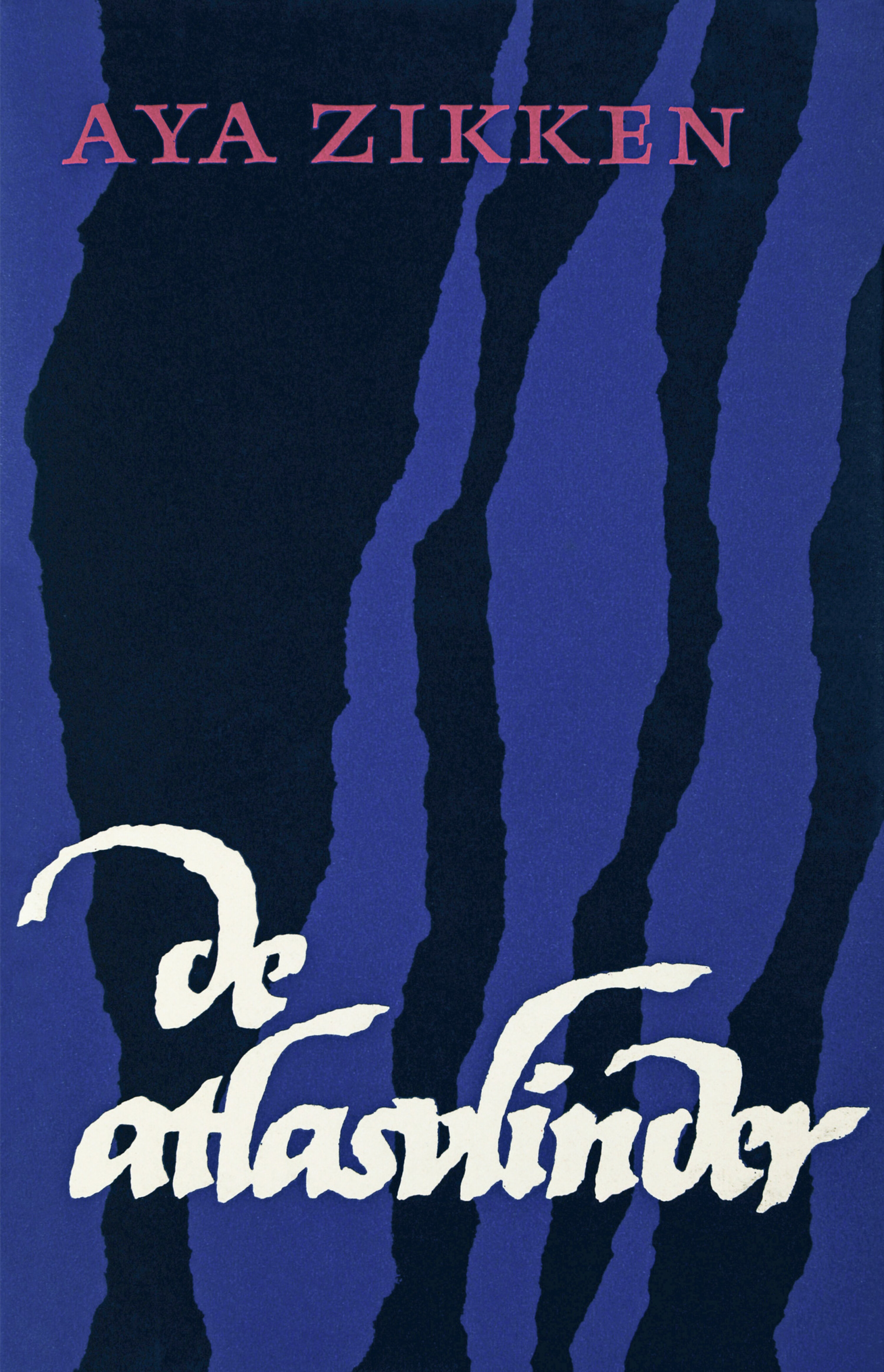
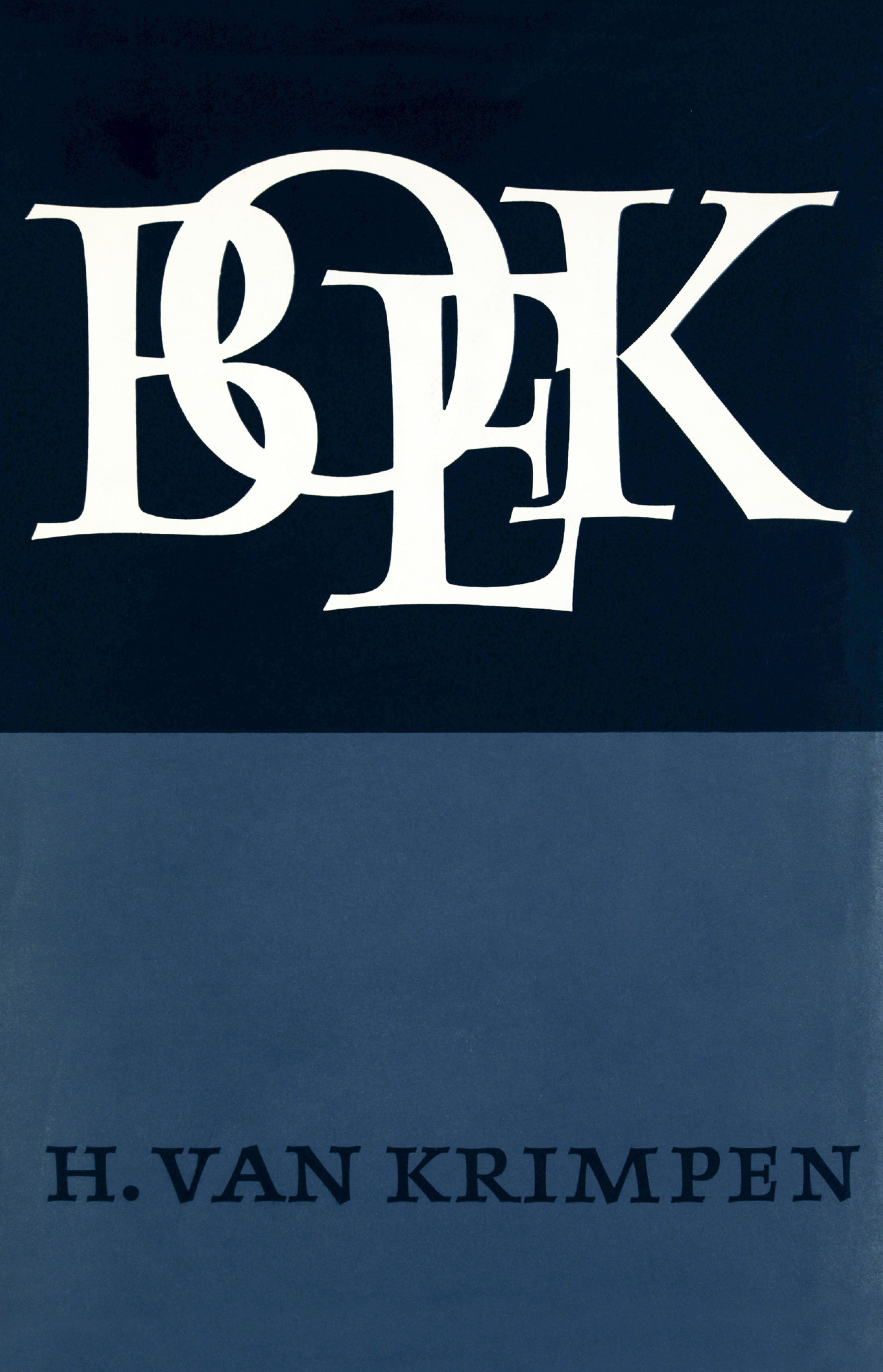
The Salden archives not only contain original work, but also personal copies of his books and an extensive correspondence with publishers, authors and colleagues. In many copies of his books Salden comments the content or the lay-out. For instance in his copy of Boek, Salden gives his opinion on the ‘optical centre’ of a poem. According to some Salden was a bit of a recluse, but he did correspond with colleagues, several of which he honoured with a monogram. The American calligrapher and author Paul Standard was a great admirer of Salden’s work; their correspondence stretches for more than 40 years. Another admirer was the Dutch publisher Reinold Kuipers, who send Salden a postcard to show how happy he was with the design for De atlasvlinder. Colleagues like Hermann Zapf and Gerrit Noordzij tried to lure him out of his isolation and present himself at ATypI.
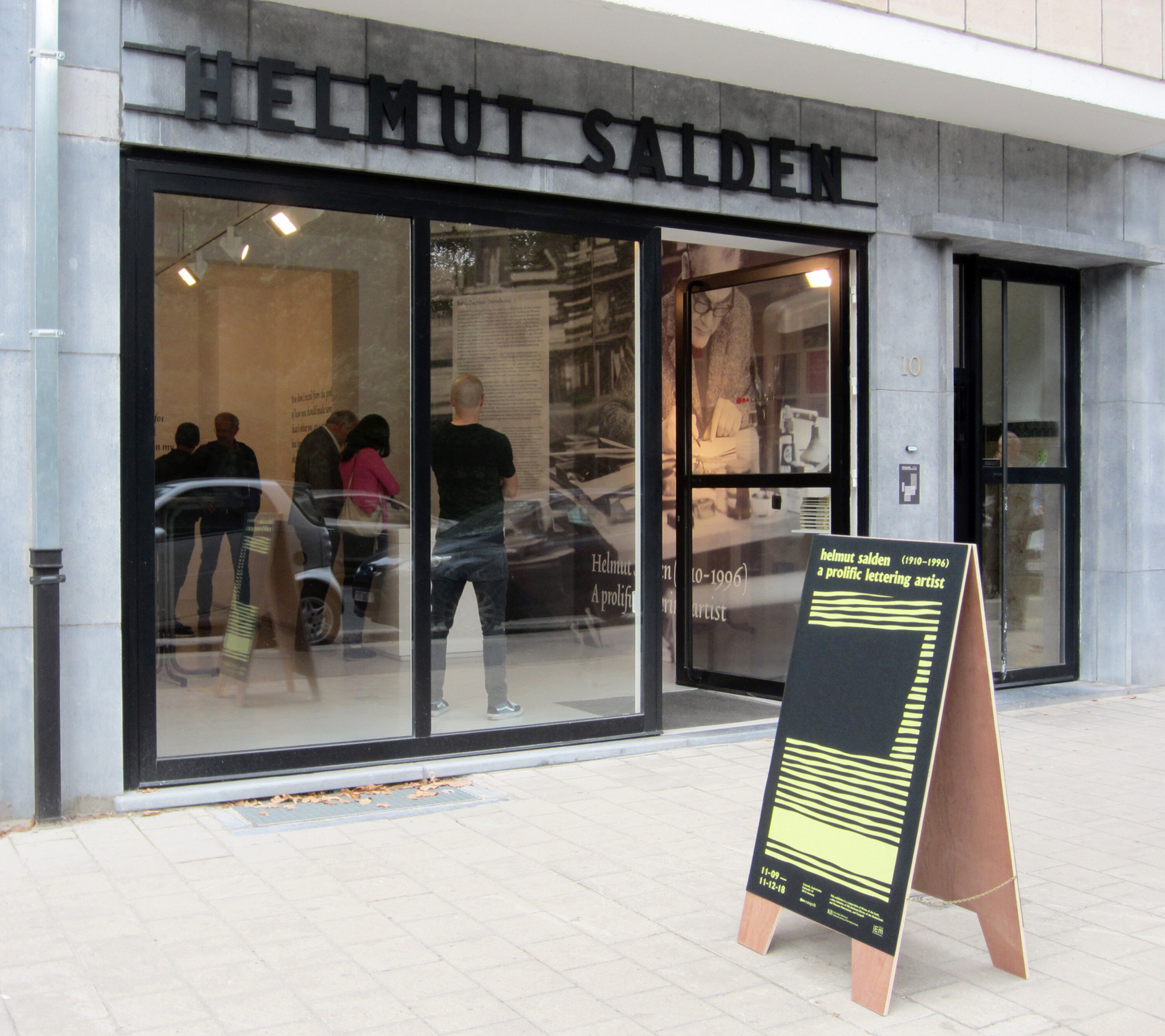
Helmut Salden (1910–1996). A prolific lettering artist
Catapult, 11.09.2018 – 11.12.2018
Text: Rickey Tax
Translation: Paula Pumplin
Editing: Aafke Boerma, Erik Geleijns
Photografphy: Henk Bieuwenhuijs, Ole Eshuis, Willem- Jan van Wijgerden, Frank Jansen, Ben Verbruggen
Picture editing: Anke Broeren
This exhibition and the conservation of the archive of Helmut Salden have been made possible thanks to a generous contribution from Fonds 5.
In collaboration with: House of the book, a joint initiative of KB, National Library of the Netherlands and Museum Meermanno.
Would you like to keep up with all our activities and exhibitions?
Subscribe to our newsletter!


