Strengthening and harmonising graphic identity Sonian forest
Services
- Brand design
- Logo design
- Type design
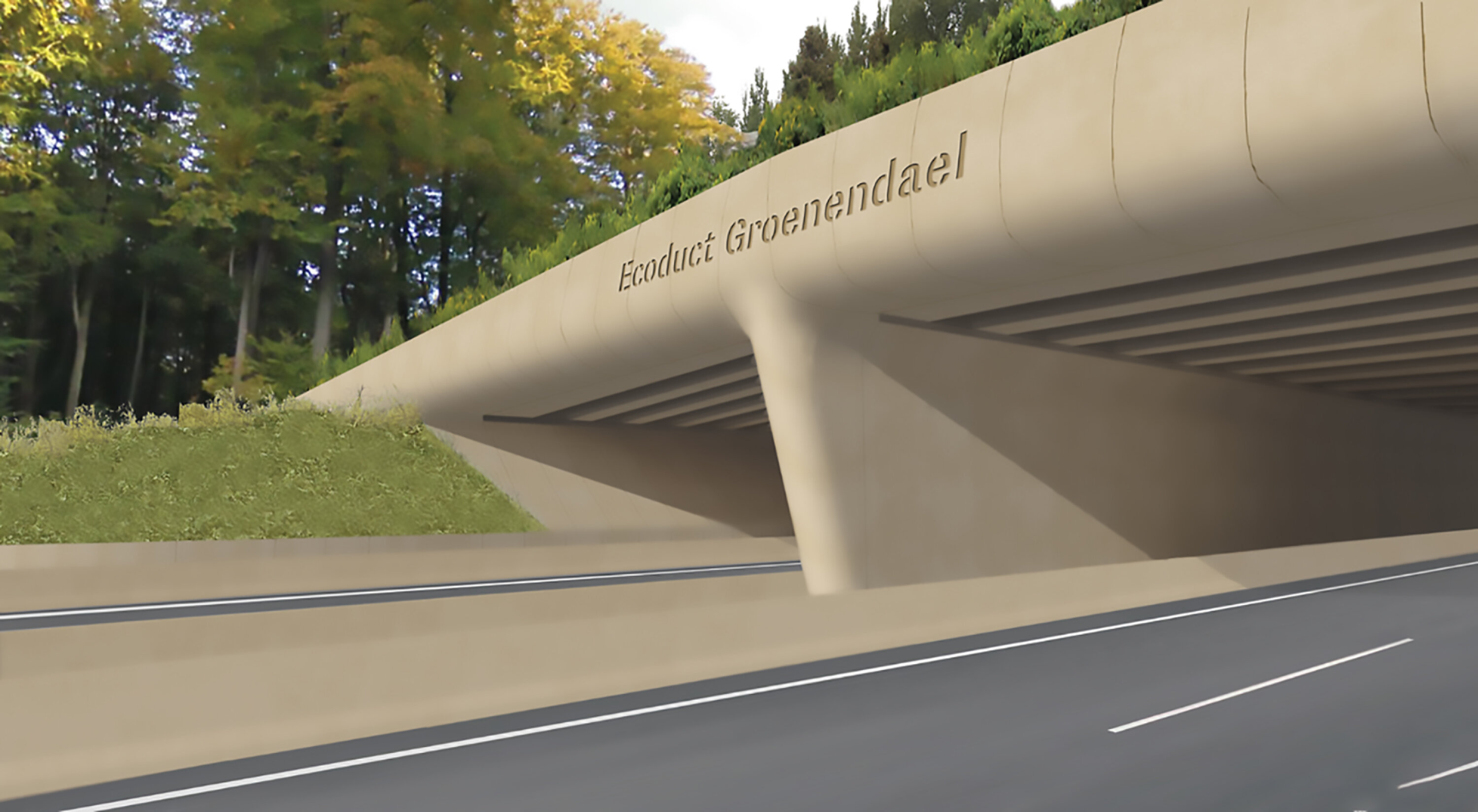
- Signage
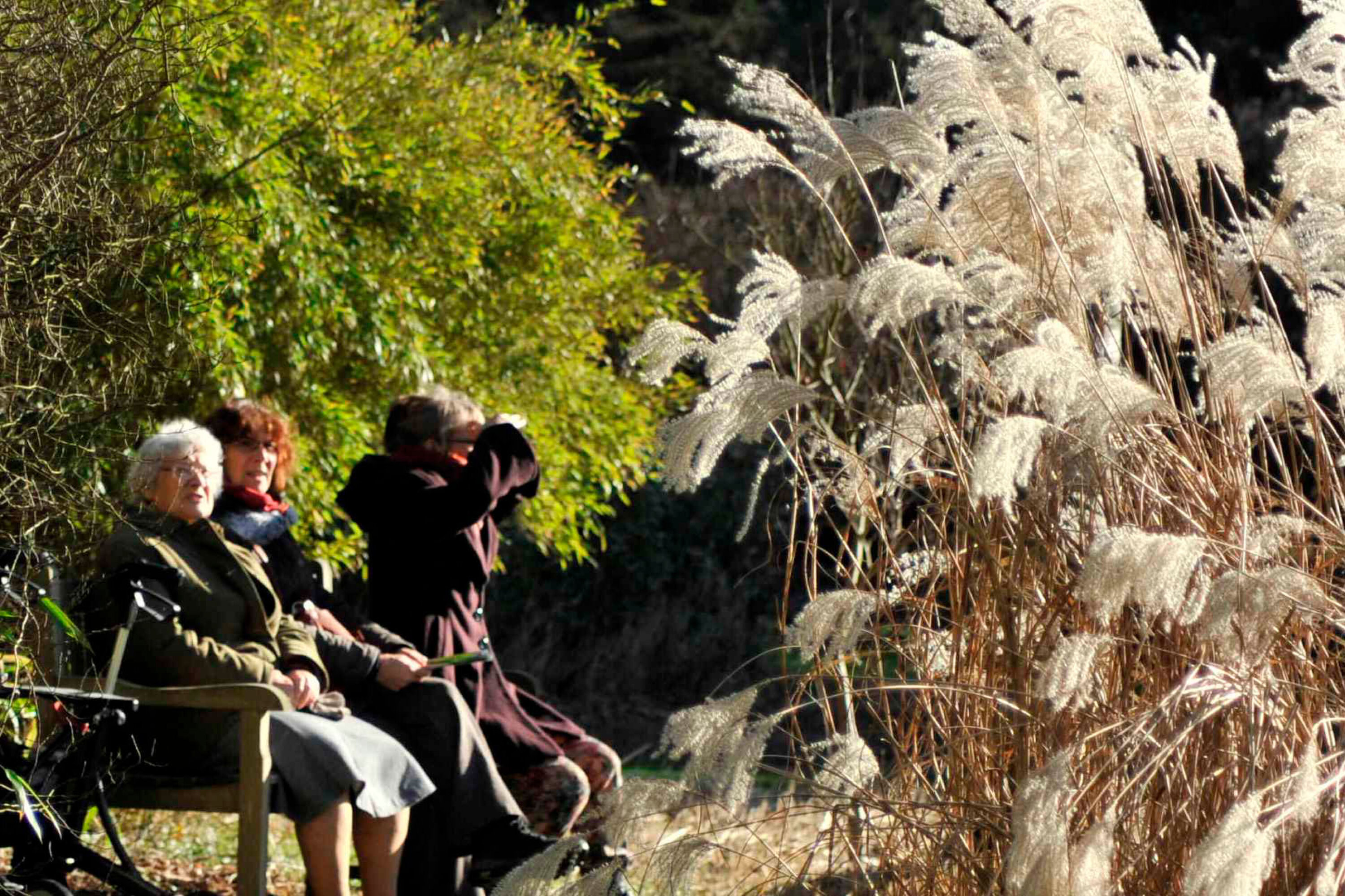
As a vast natural area, the centuries-old Sonian Forest is unique in Belgium's heritage. With its robust trees, the forest is known as an ecological zone with a diverse range of recreational possibilities. The Sonian Forest is spread over three regions, which gave rise to very fragmented communication.
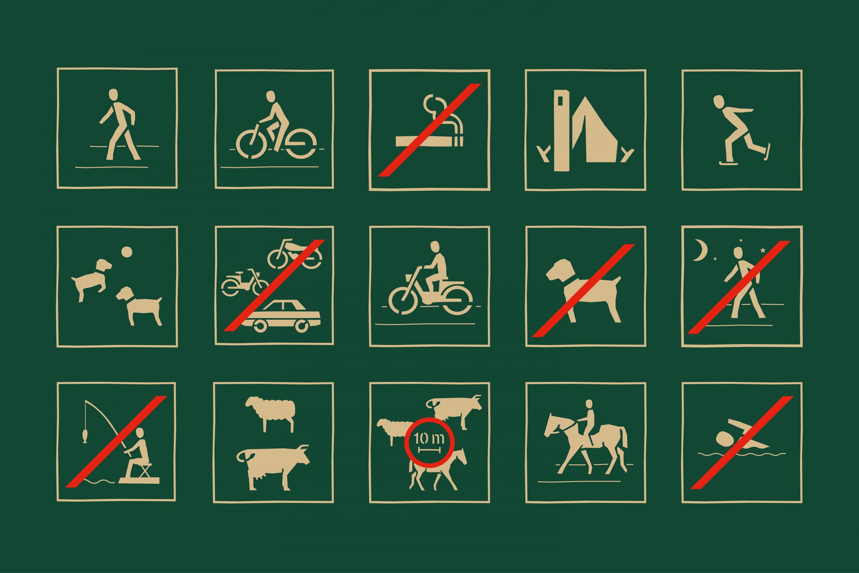
The assignment included research into the possibilities of harmonising the identity of the forest and the development of a logo with a house style with which the Sonian Forest can profile itself. In addition, we investigated which graphic and typographic requirements are necessary to achieve a quality image of the Sonian Forest and develop the complete signage. The established graphic and typographic identity will be translated into various communicative carriers.
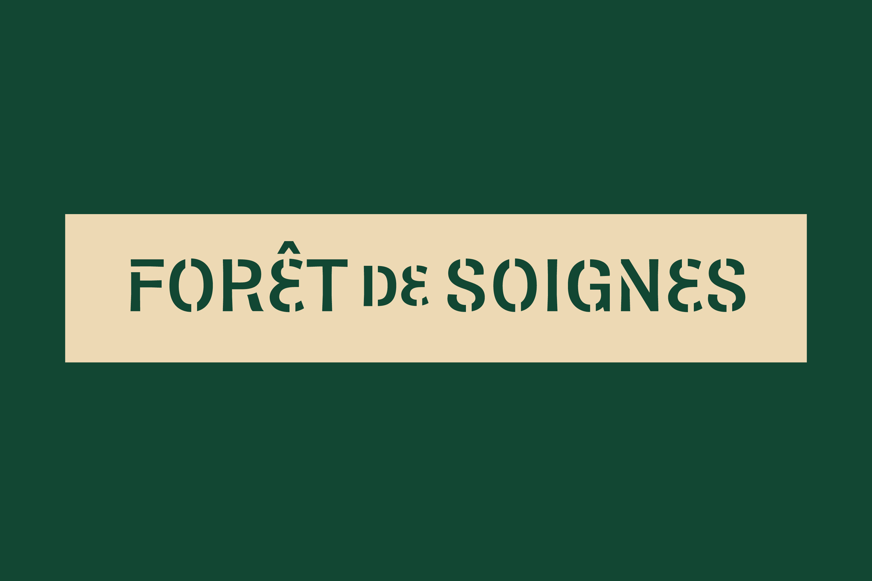
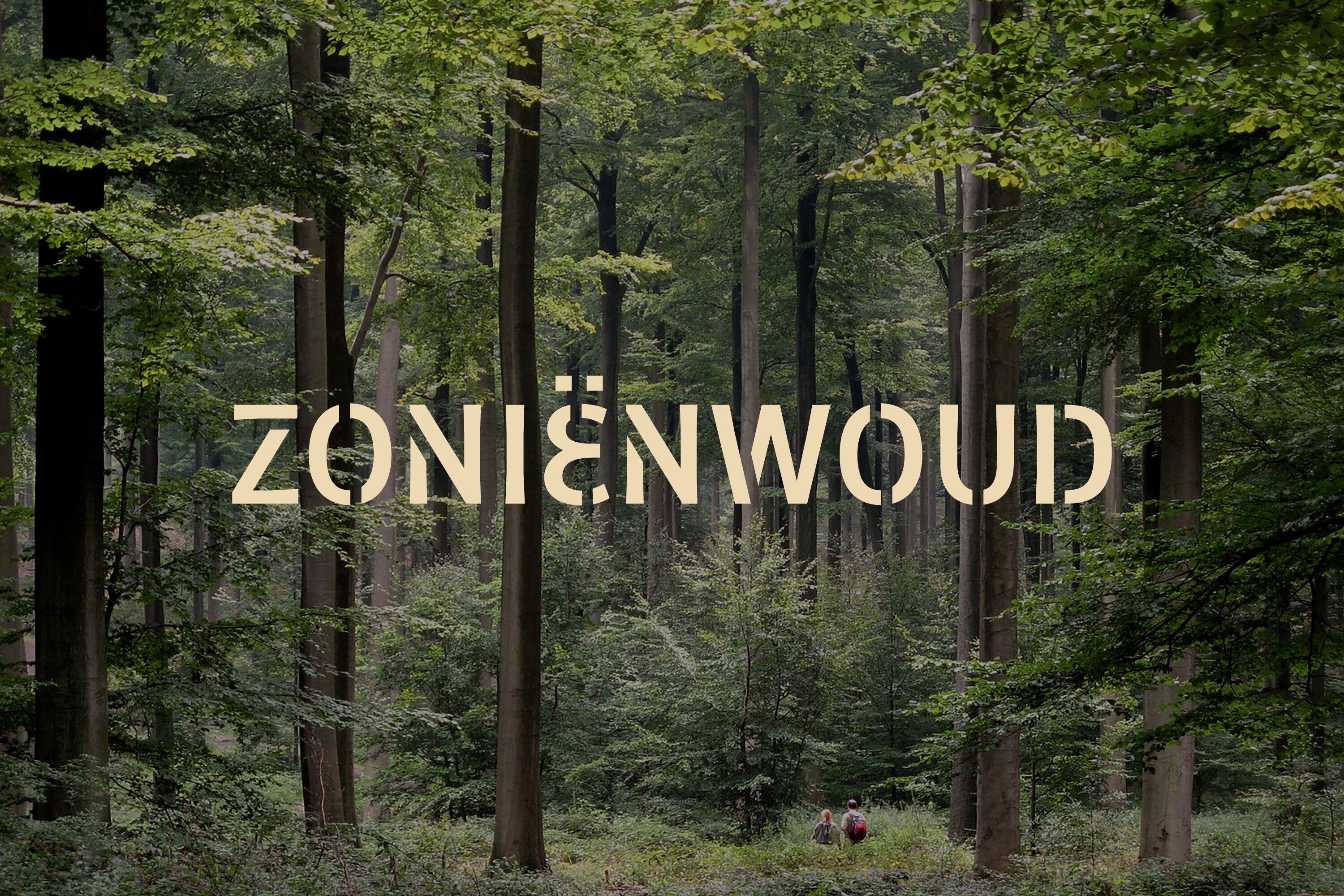
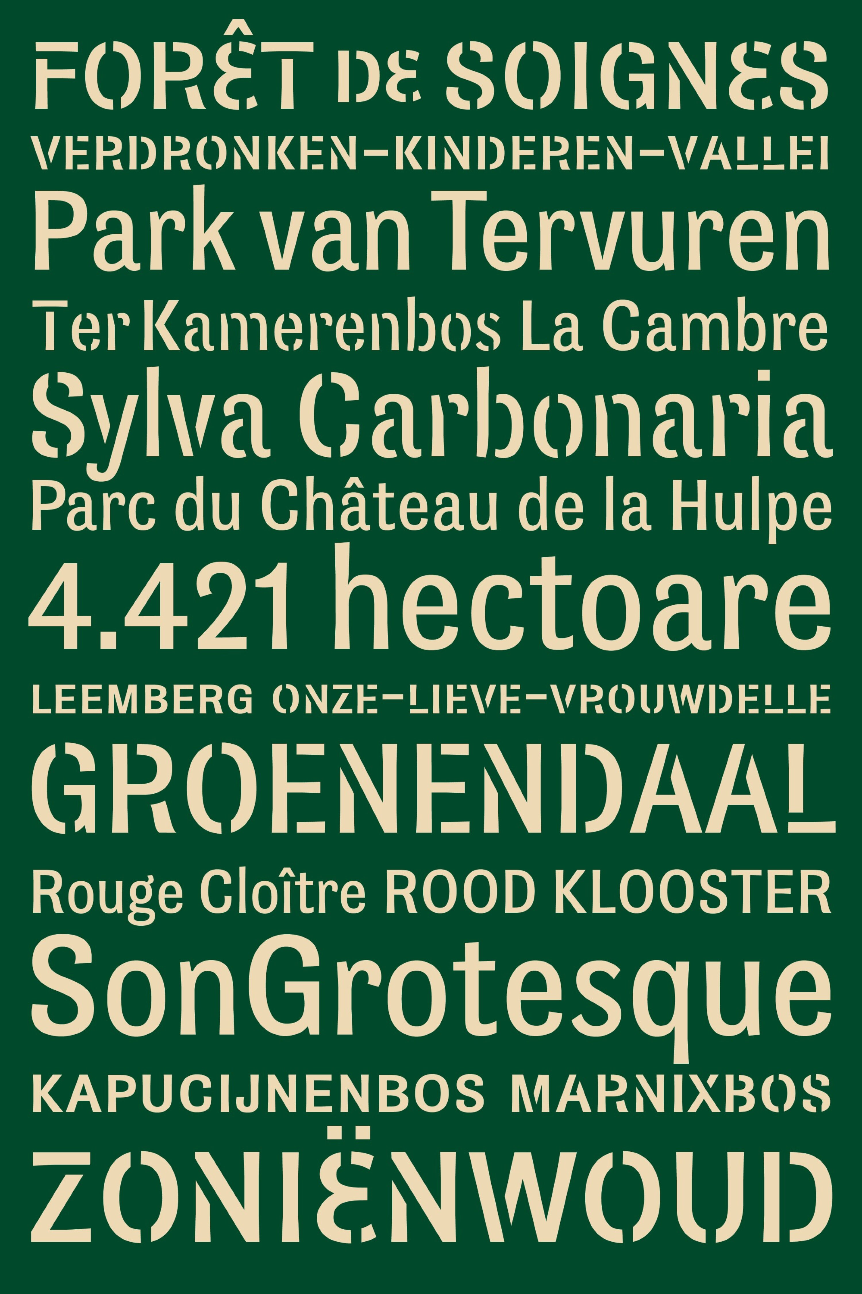
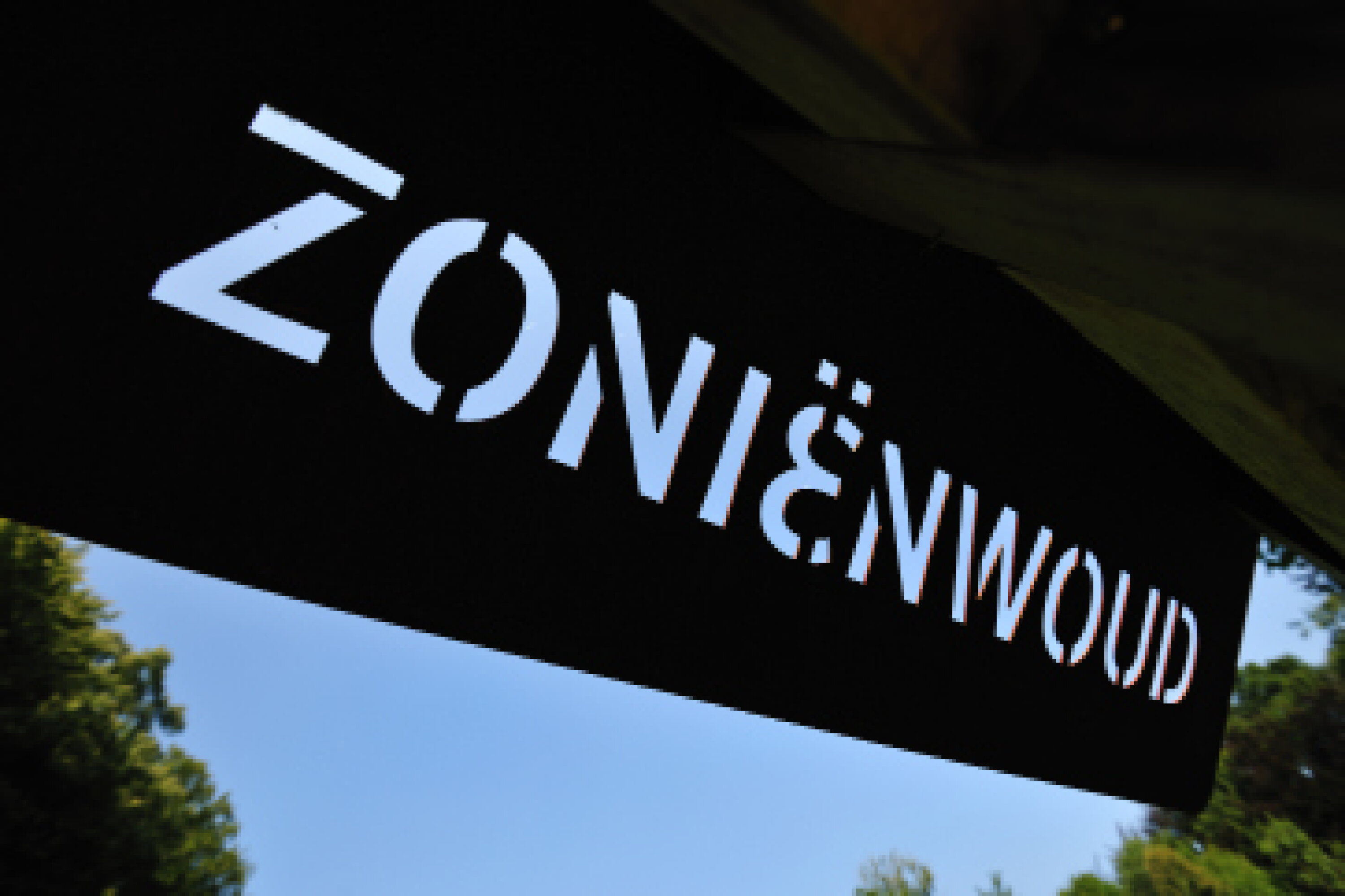
We built the Sonian Forest’s corporate identity around an sober wordmarque. We designed new letters for the logo. In the design, we tried to portray the atmosphere and character of the Sonian Forest: a natural mix between old and new, between history and future.
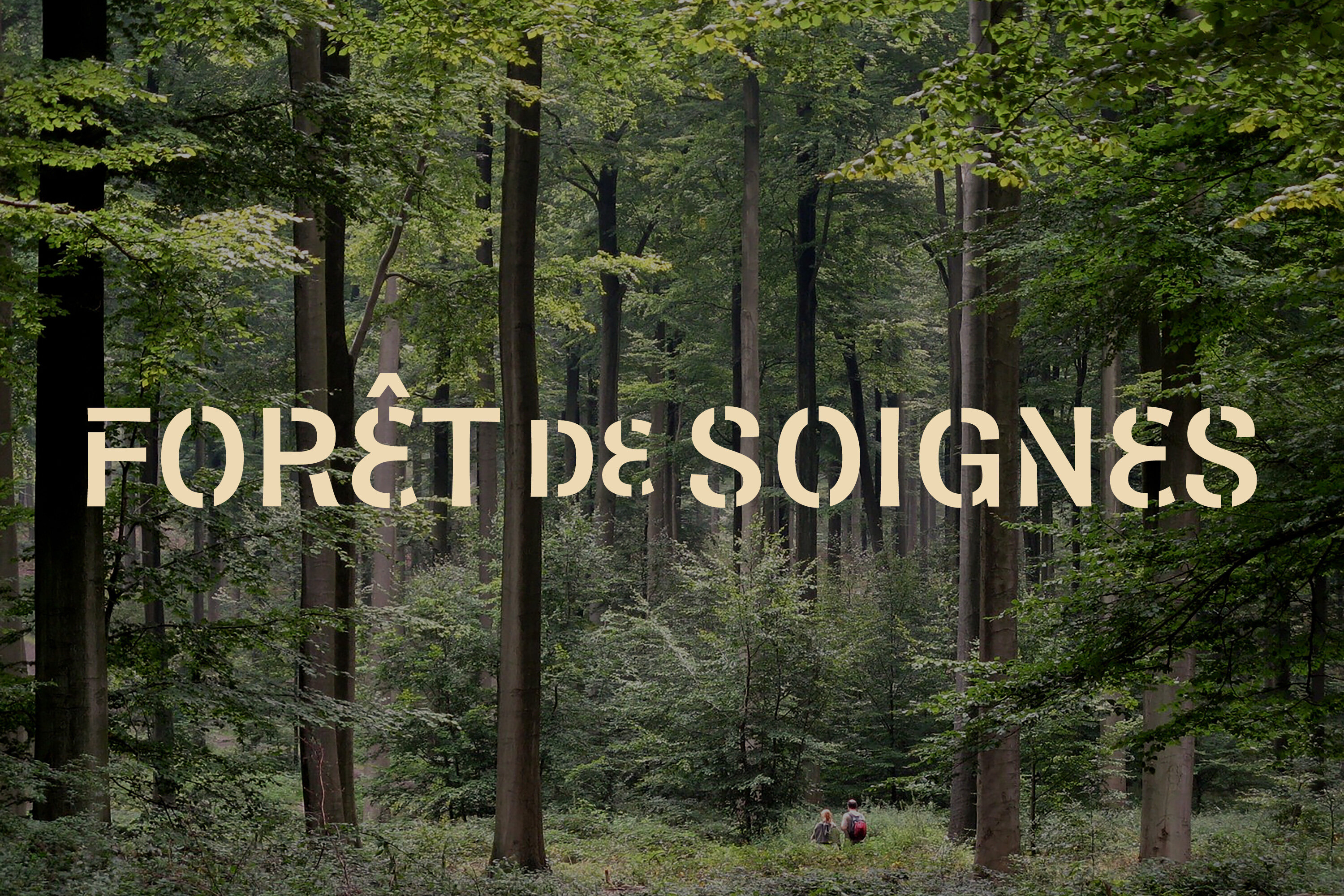
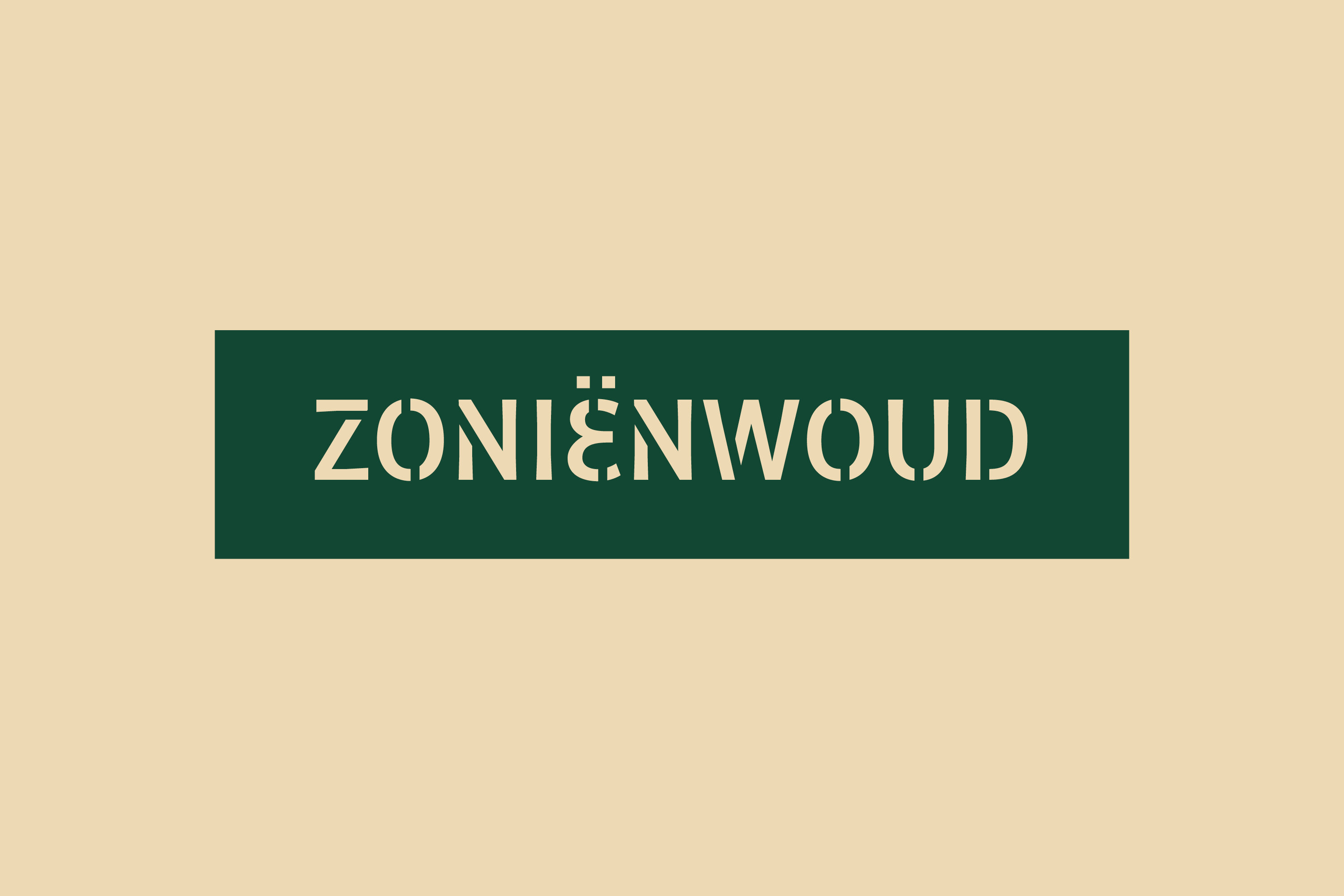
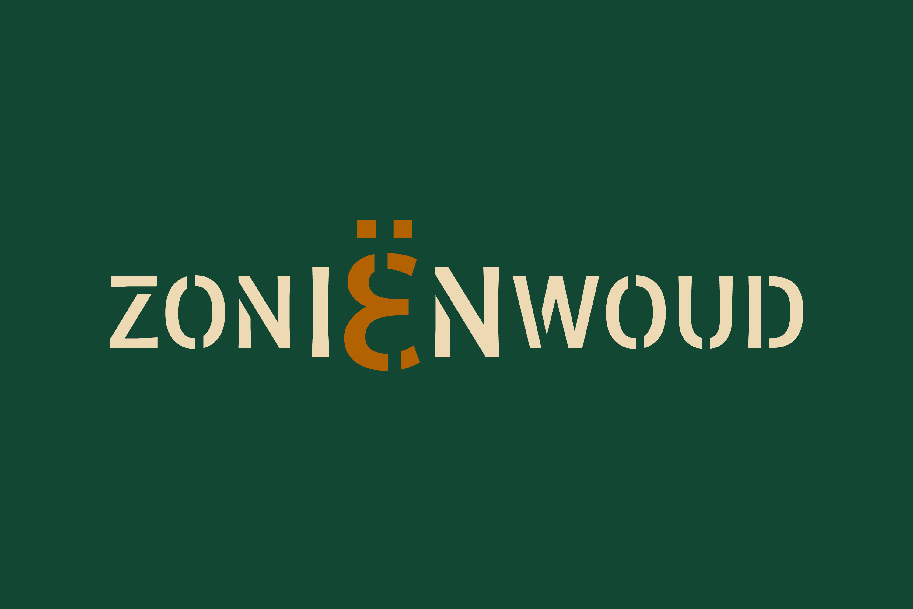
The Sonian Forest stretches over the Flemish, Brussels and Walloon region. We brought the visualization of the three regions together by using the Greek ‘E’. A striking and yet discreet reference to the three governments that manage the forest. The addition of this symbol created full but sober wordmarque Zoniënwoud/Forêt de Soignes.
“Corporate design inclusive of a wordmarque, bespoke typeface suite, visual identity, and design of pictograms and signage system.”
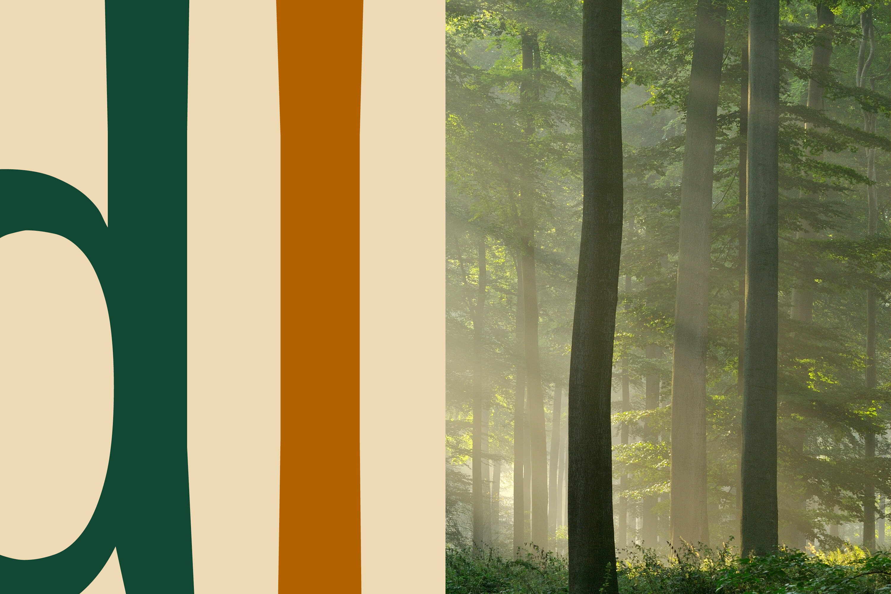
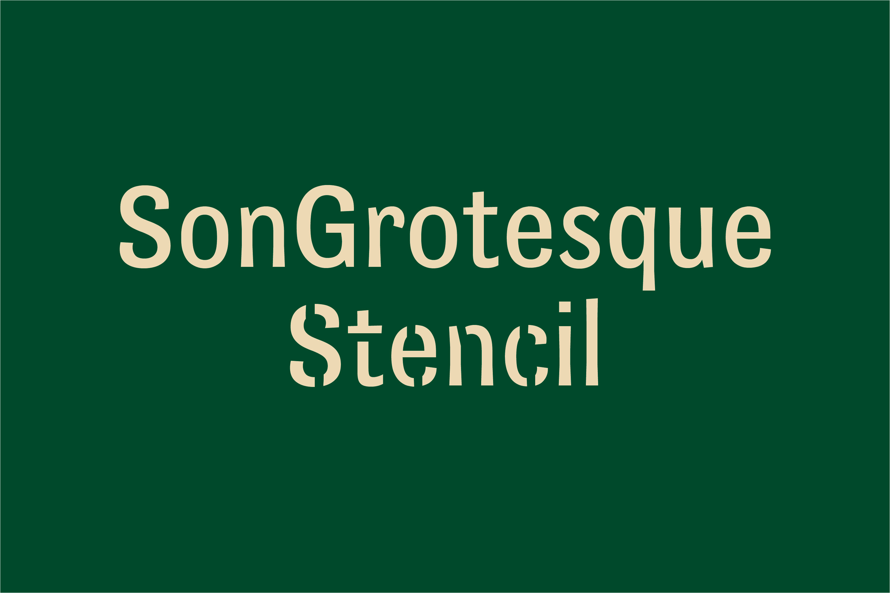
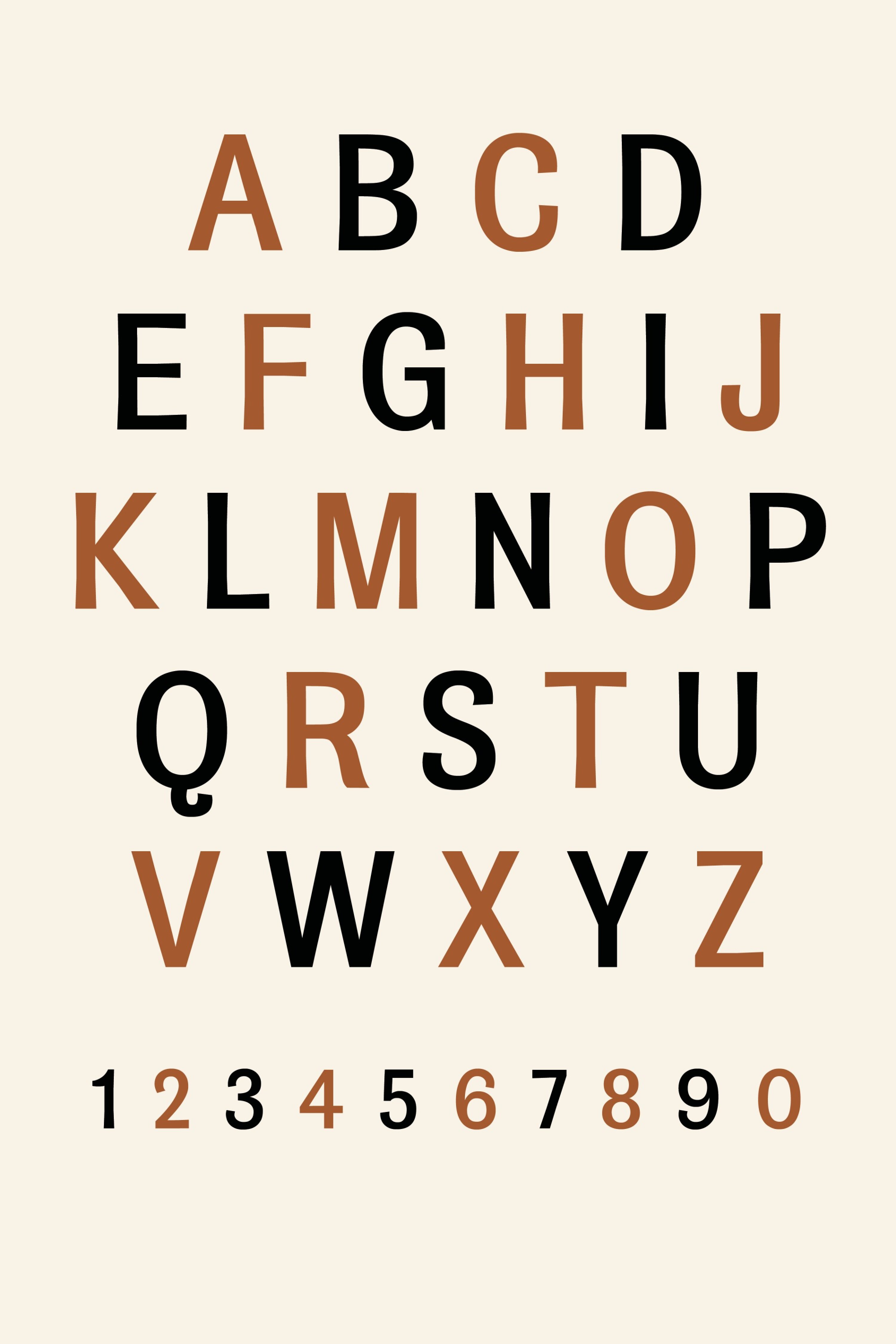
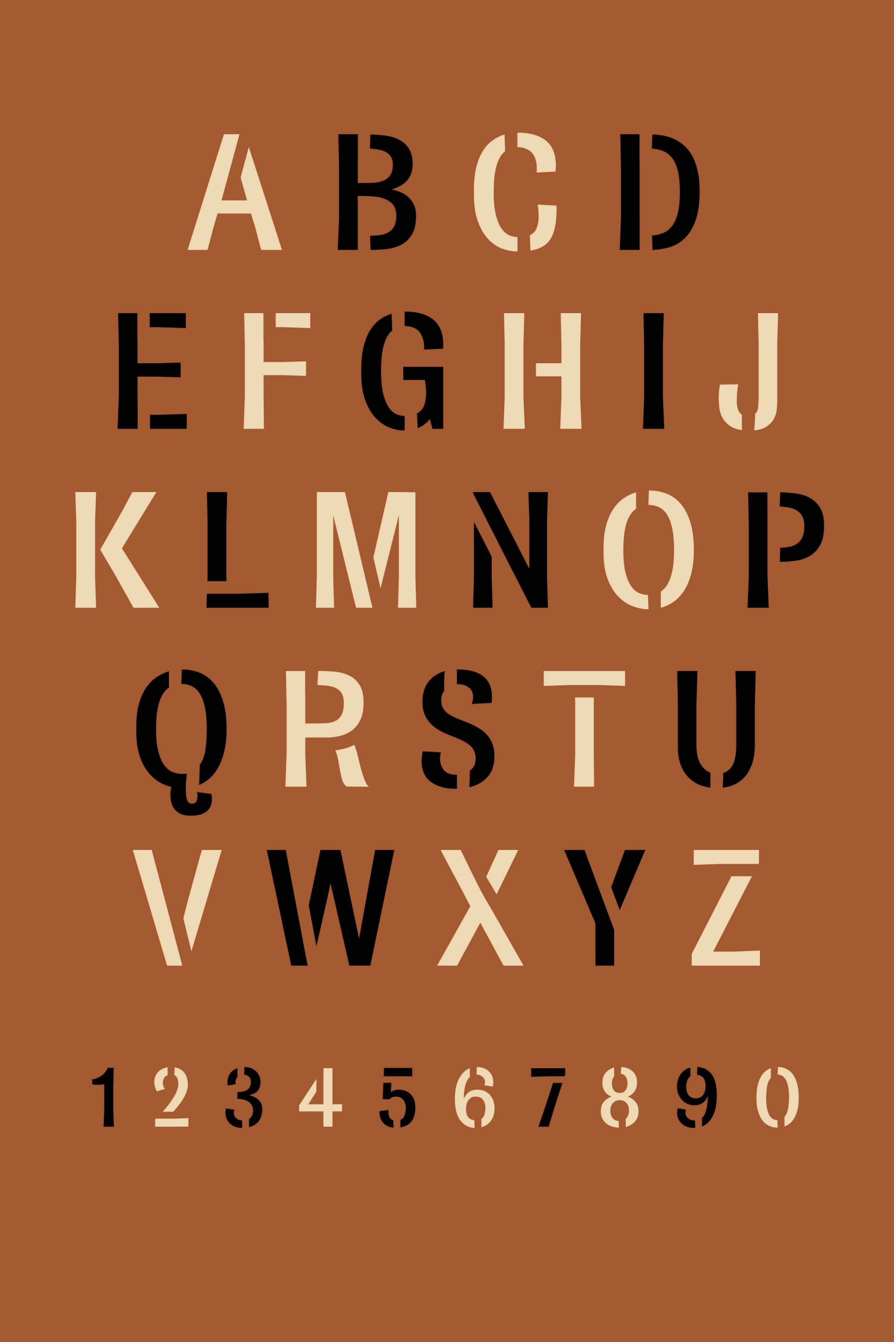
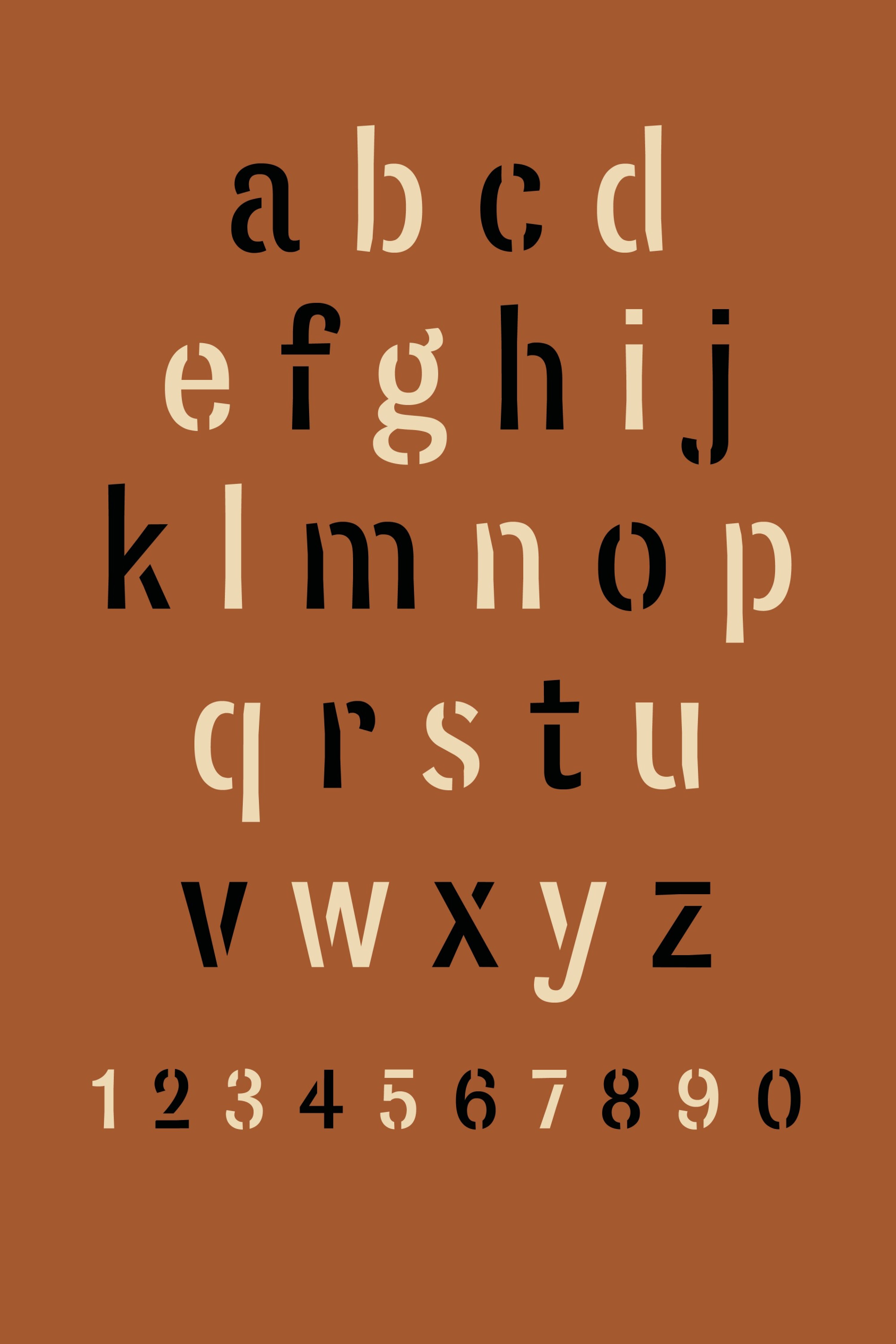
In this house style, the Sonian Forest has not only been given a unique and recognisable logo, but also a specially developed typeface. The ‘characters’ are an important element in the recognisability of the house style. The ‘SonGrotesque’ typeface conveys the atmosphere of the wordmark in all possible communication applications. The name of the typeface has its origins in the oldest name of the Sonian Forest: ‘Sonia’. The appearance of the letters refers to the slender, grand shapes often found in the Sonian Forest.
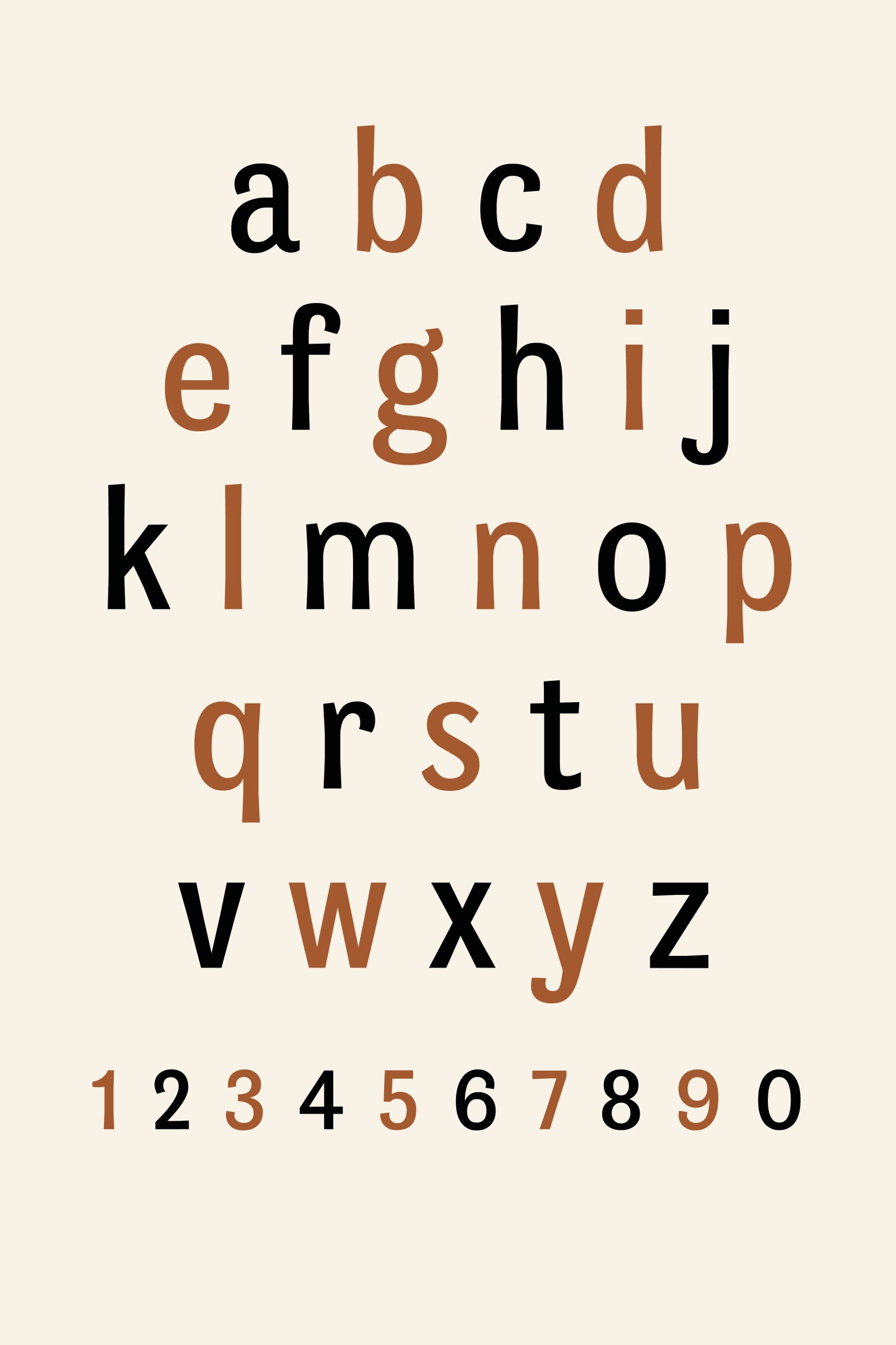
“The atmosphere and character of the forest is contained in the design of the letters.”
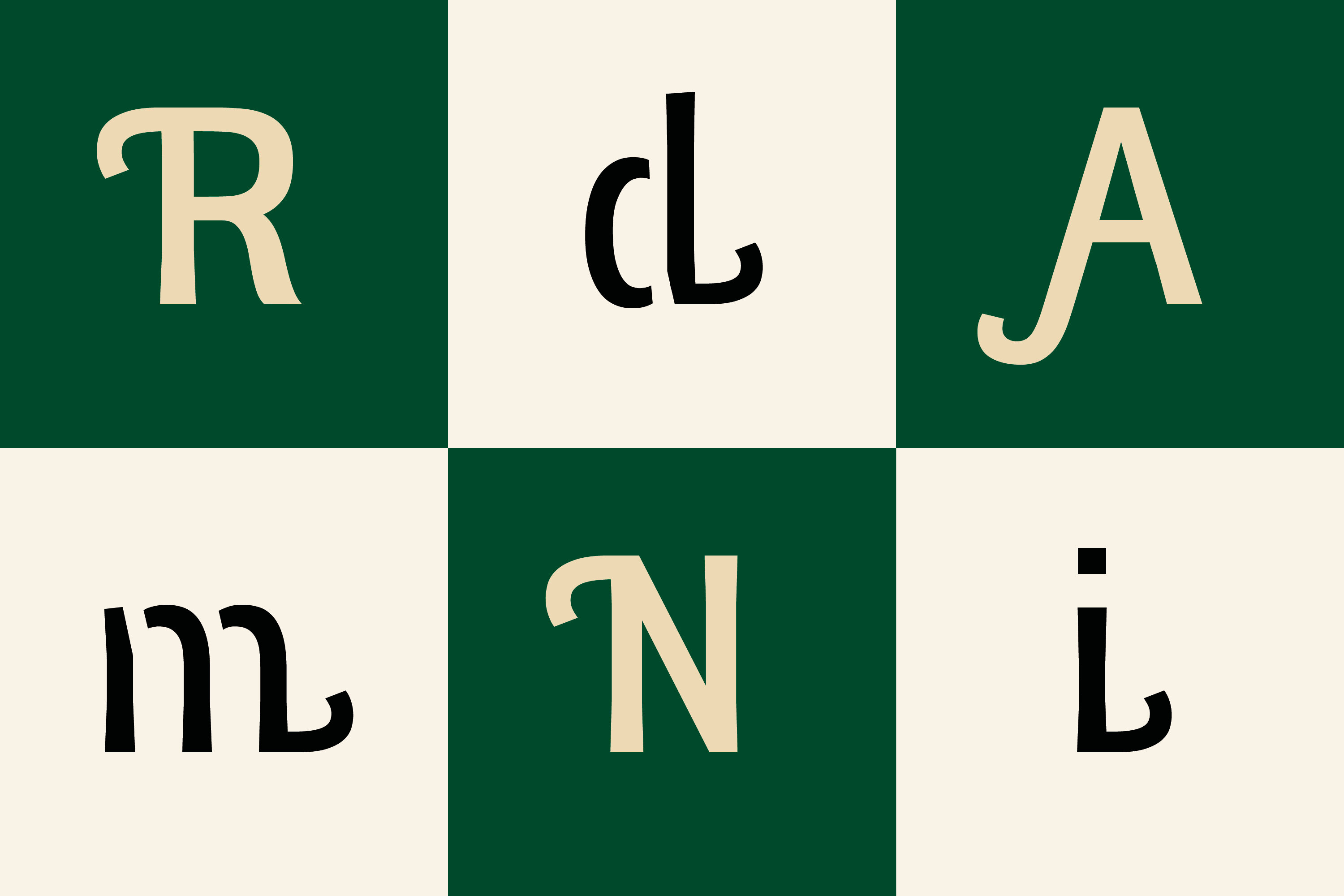
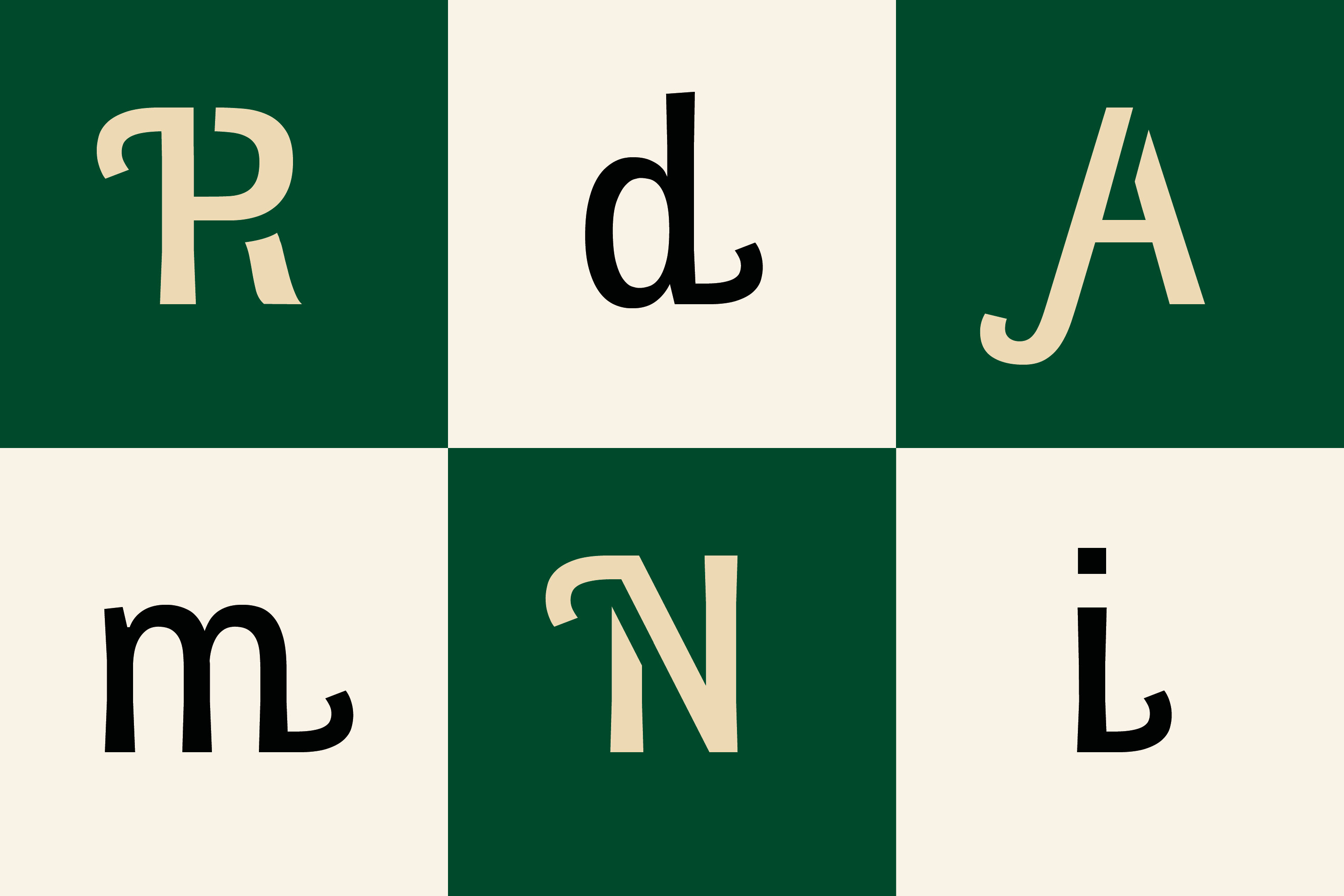
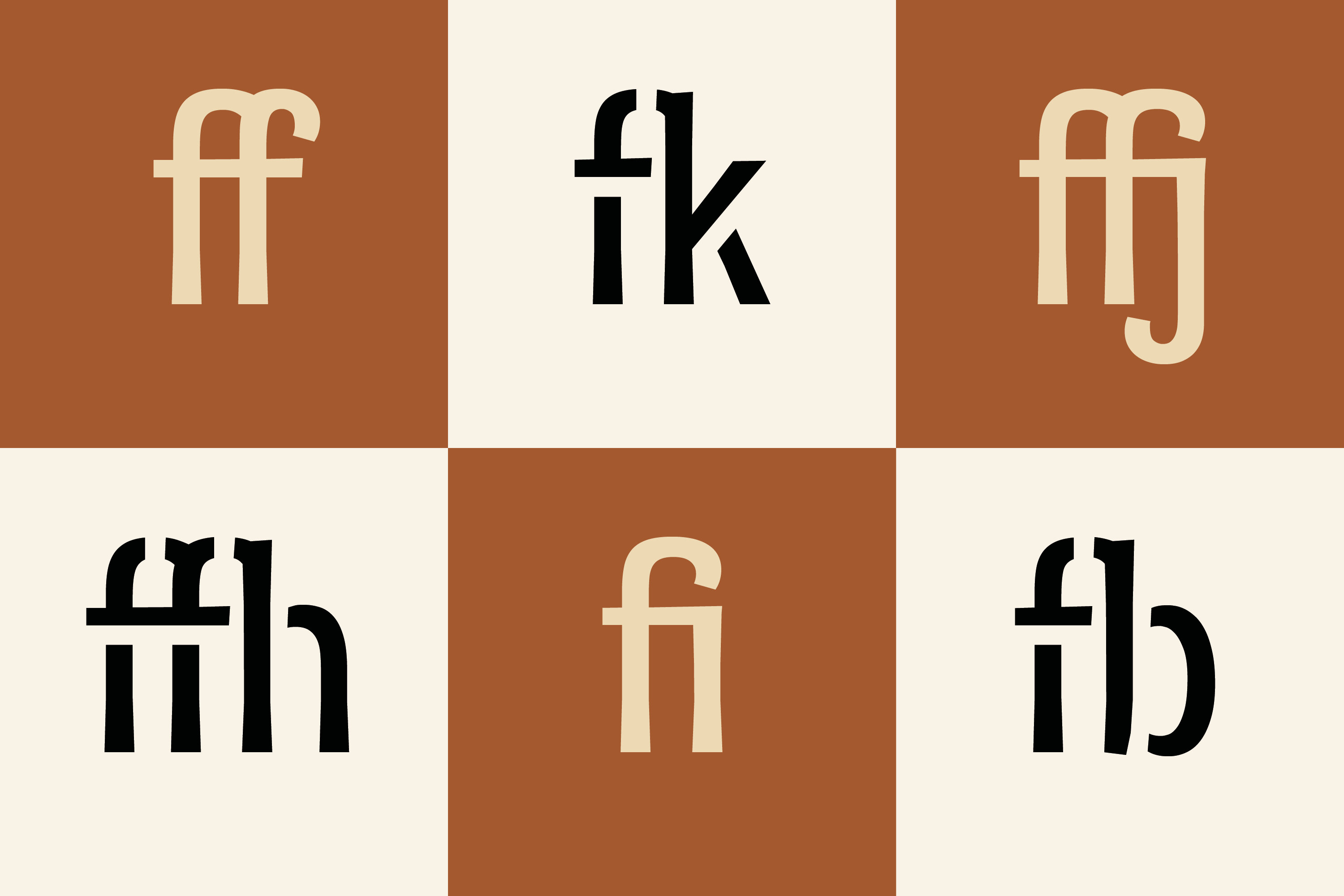
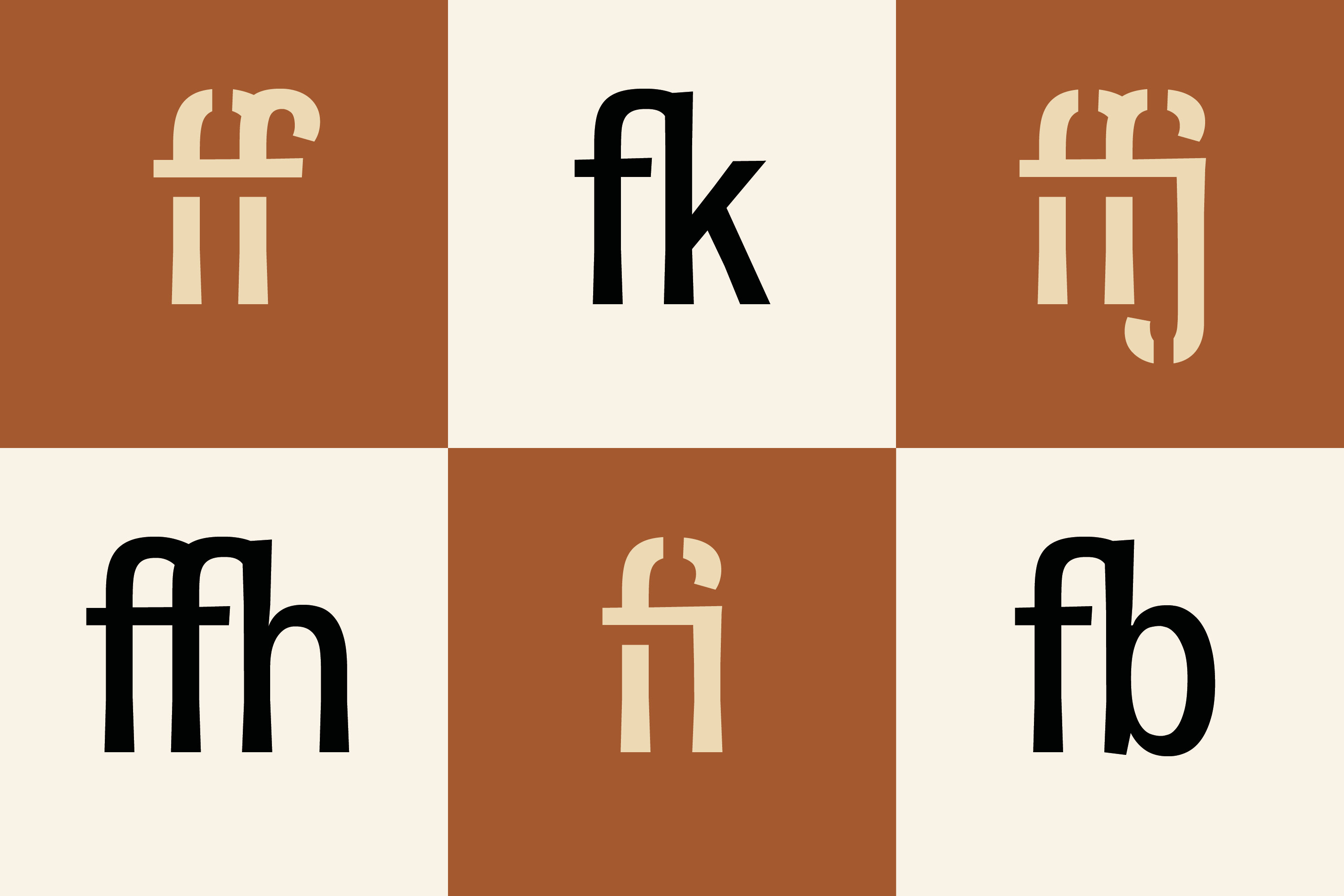
“Stencil letters can be cut out so that they blend in with the materials present in the Sonian Forest.”

Strategy
- Survey
- Research
- Branding
- Questioning
Design
- Brand design
- Logo design
- Campaign
- Type design
- Print design
- Cartography
- Signage
- Illustration