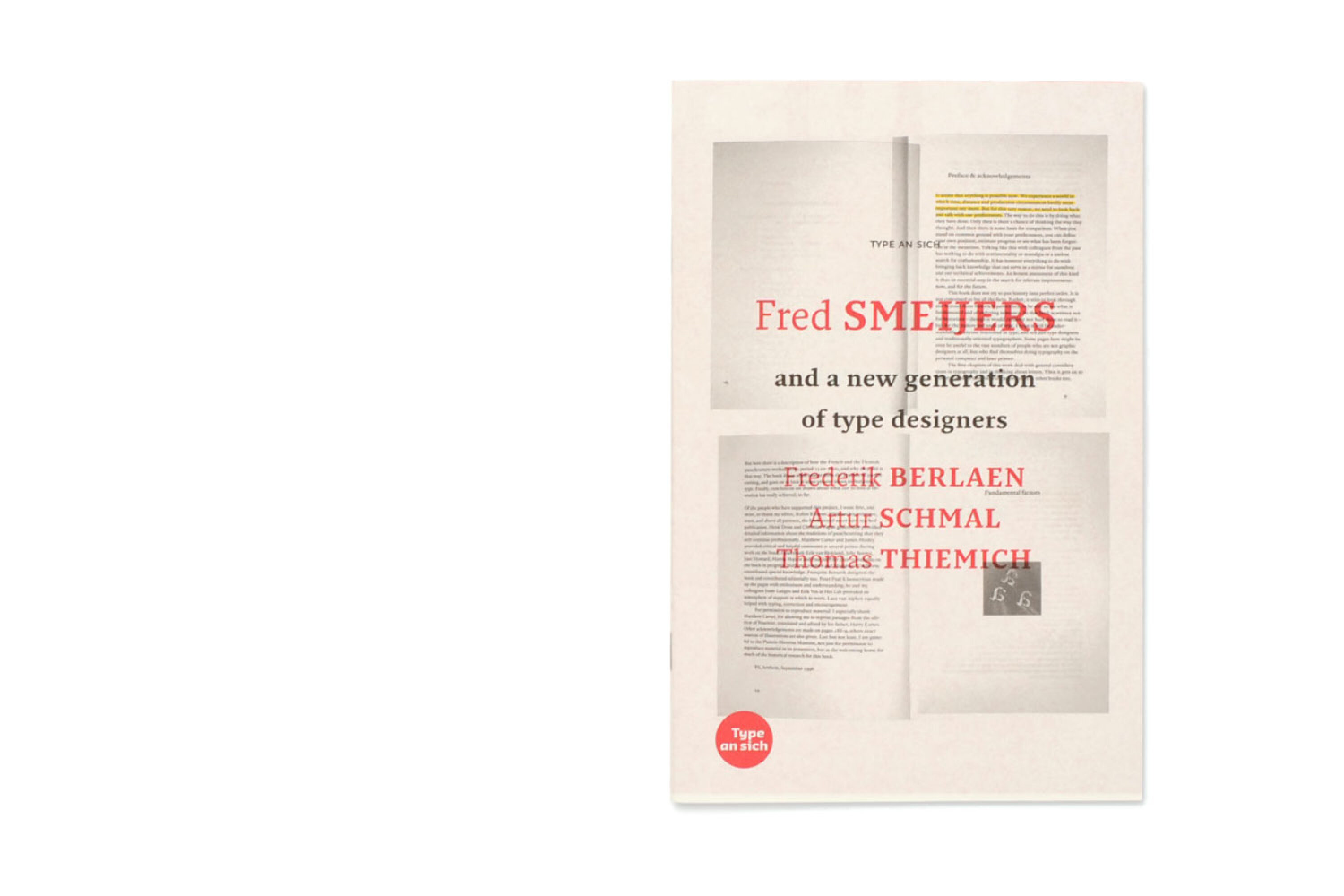
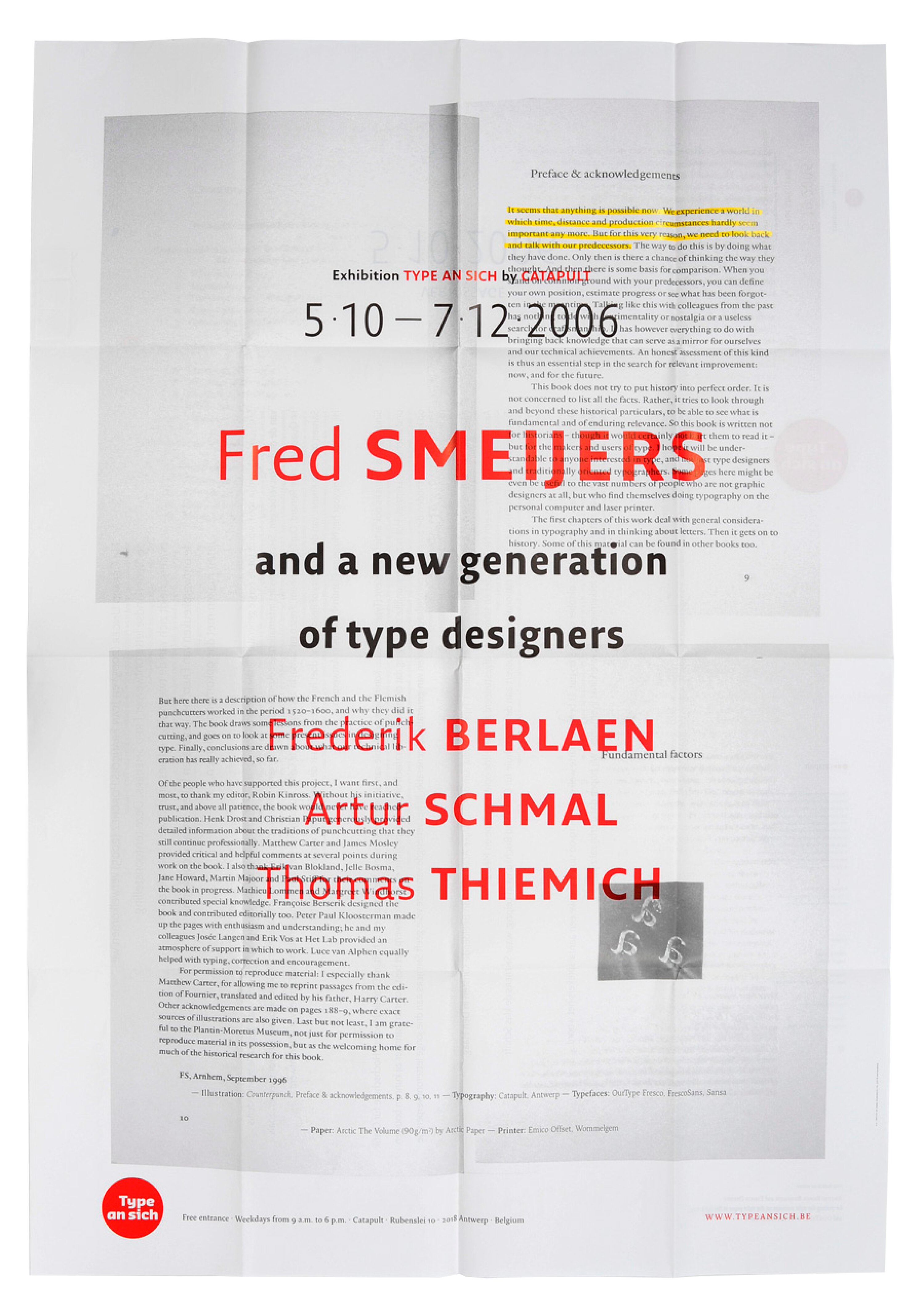
Type An Sich 3 | Fred SMEIJERS and A New Generation Of Type Designers
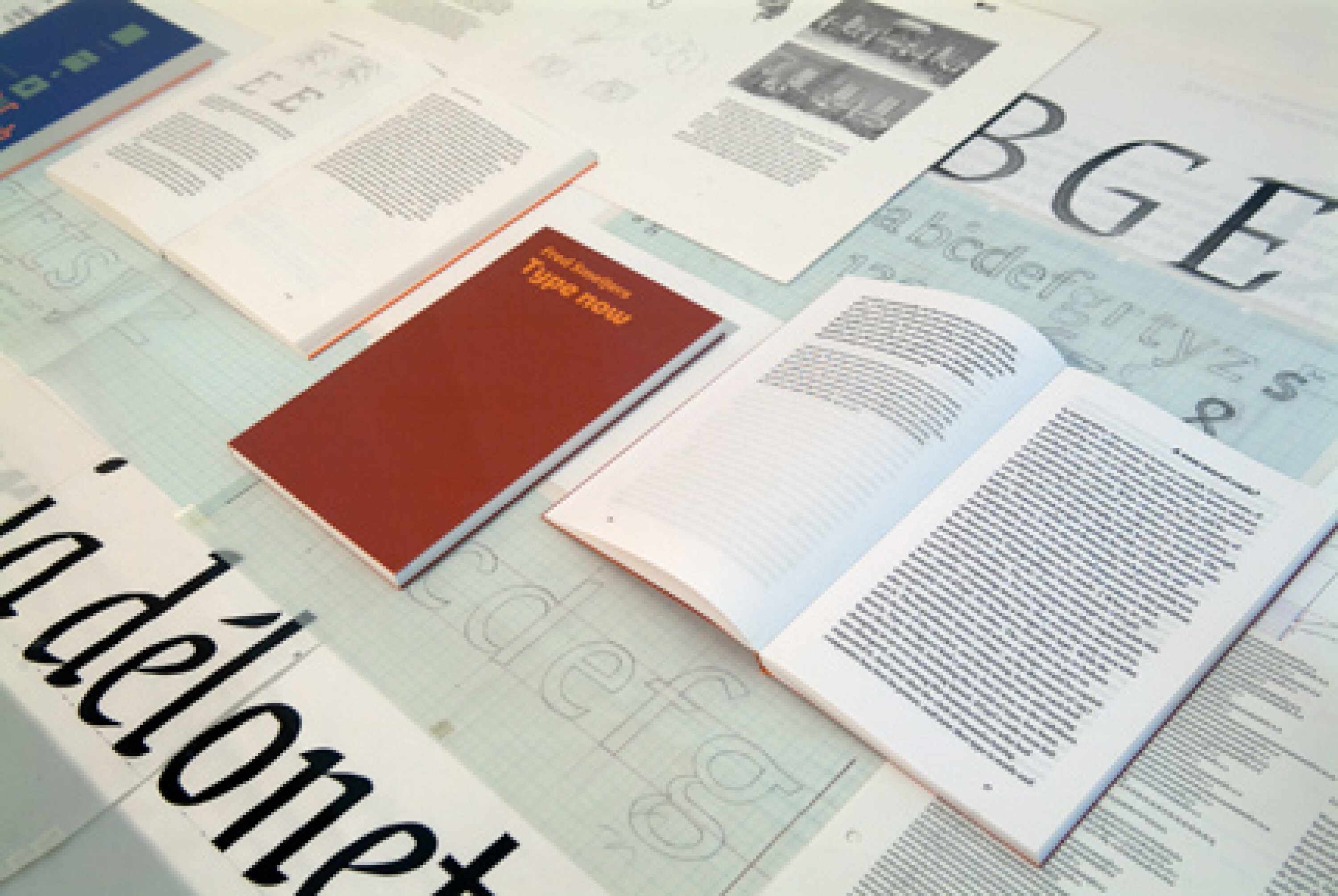
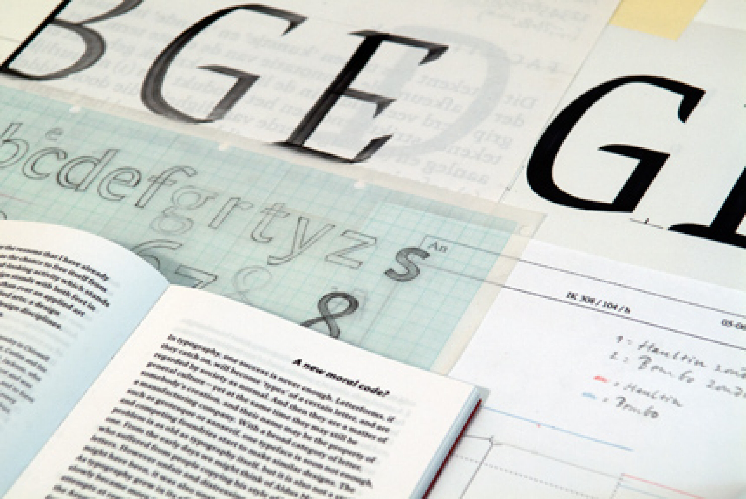
SMEIJERS, born in 1961, can be seen as belonging to the first generation of digital type designers. Yet the starting points of his work often lie buried deep in the history of the printed letter. SMEIJERS enjoys an international reputation as the author of the books Counterpunch and Type Now, but he is known above all for his type designs, such as ff Quadraat, teff Renard, OurType Arnhem, Fresco and Sansa. In 2000 he won the Gerrit Noordzij Prize for the stimulating effect of his work on the profession of type design. Together with Eric KINDEL of the University of Reading (uk) he is conducting research into the history of the stencilled letter. He is also active as a researcher and advisor at the Museum Plantin-Moretus in Antwerp.
From 1988 SMEIJERS has also taught, recently on the Type & Media course at the Royal Academy of Art, The Hague, and now as Professor for Digital Type Design at the Hochschule für Grafik und Buchkunst, Leipzig. He takes the view that disciplines such as graphic design, typography and type design, flourish best when they can build on the knowledge and the methods that have been carefully passed down from generation to generation. In line with this vision, Smeijers has given the chance to three young type designers to put their work next to his.
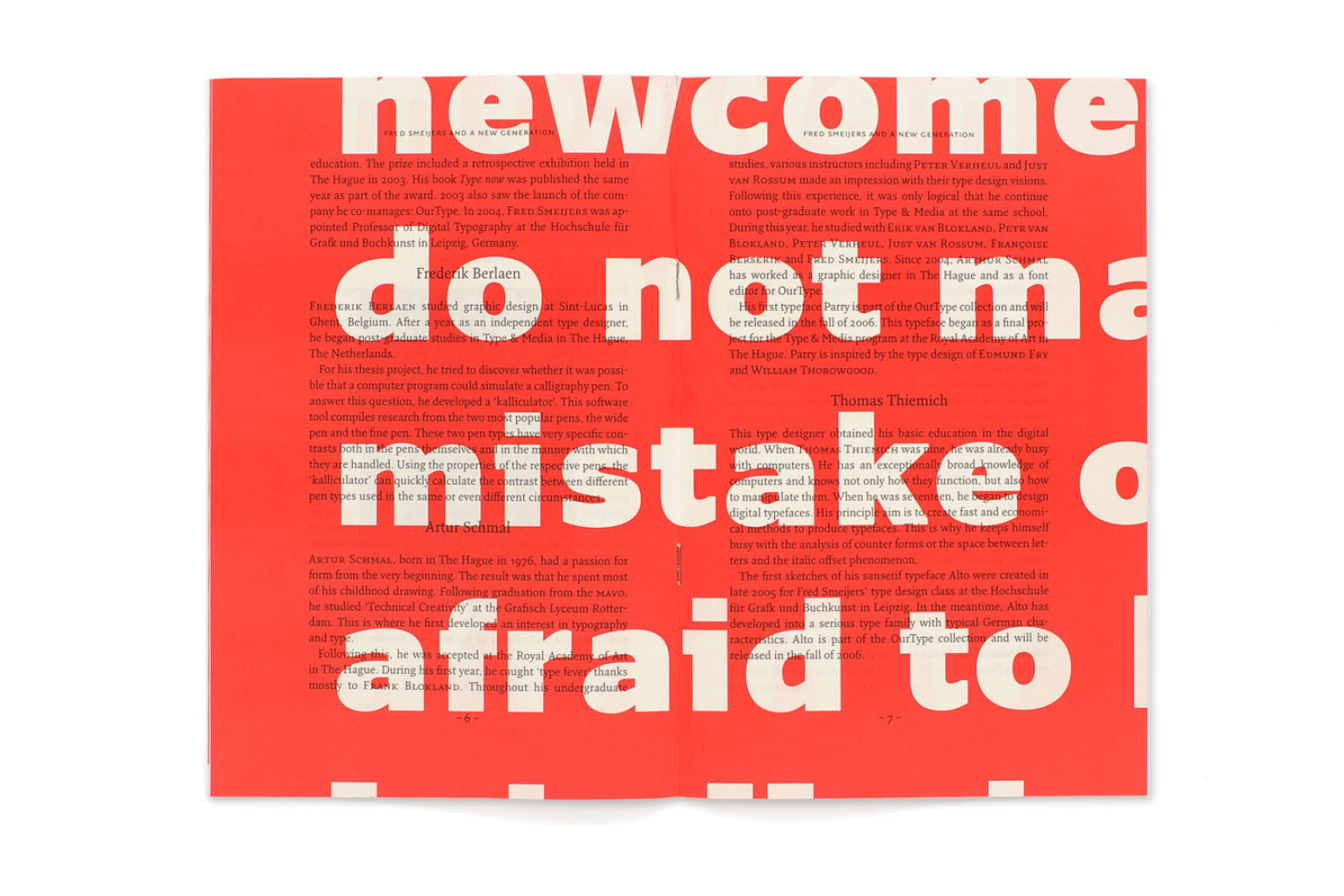
Frederik BERLAEN (°1981) is Belgian and a student on the Type & Media course at the Royal Academy of Art in The Hague.
Artur SCHMAL (°1976) is Dutch and in 2003 graduated from the same Type & Media course.
Thomas THIEMICH (°1981) is German, and a student at the Hochschule für Grafik und Buchkunst, Leipzig, where SMEIJERS runs the class in Letters in Digital Media.
Could you outline your current teaching in type design?
I teach at the Royal Academy of Art in The Hague where I’m a kind of guest lecturer, and then I have a professorship in Leipzig, at the Hochschule für Grafik und Buchkunst (Academy of Visual Arts).
Are these postgraduate students?
In The Hague students follow a postgraduate course. They are mostly mature students who have already completed other studies, and they have chosen to do this one-year course, so in principle they are very motivated.
The school in Leipzig is a Hochschule which means that according to the German system it has the same level as a university. My German students also have some higher professional education behind them; the average age is twenty-two or so. So you can expect something from them.
Are the ones in Leipzig studying specifically type design?
Yes, but there is no type design without typography. Just drawing type and not being able to judge why a certain page is not composed well doesn’t make sense. It’s important for me to have that link. In Leipzig it’s especially important to create an awareness of what the profile could be of a present-day type designer. In a way they need that, because Germany is very German, and we speak here of former East Germany where they had all kinds of rules and systems: the system dictated a way of life, a way of design... it’s still present, although about fifty percent of our students would come from west Germany. German books dealing with type and design often say ‘do this and don’t do that’. Falsch/richtig. It’s striking how many of those books there are.
It is very important to step out of this and read more international flavoured books. In the end the students are a bit lazy when it comes to other languages, besides, not all the good writing on type is translated in German. This is a bit of a problem, somehow students know all about i-pods but never heard of Paul Rand.
I would imagine at The Hague, with people like Noordzij having taught there, it’s a very different mentality.
Yes. It’s a very different mentality. In Germany I try to stress that you as a type designer have to be open to other disciplines. They could be where your future customers come from. You have to be interested in what’s going on out there, and you have to be capable of talking with other people and working as part of a team.
Another big difference is of course the roots of both schools. Leipzig has a past which is rooted in general convention and all the glory of the printing trade which was present in Leipzig once. The the Hague school is rooted in the rebel attitude towards type design as a design discipline of which Gerrit Noordzij was and is the main representative.
Would it be true, then, that you’re more involved in trying to get the students to see the wider picture than the nitty-gritty business of designing letters?
There’s also a lot of nitty-gritty. That’s always there. So it’s both. But it’s very important that we don’t just deliver somebody who can draw very neat classical typefaces which are never used because people don’t like him or he’s not able to make the right connections. It’s very important to find out what kind of person the student him- or herself is and cultivate their individual talents. So as a teacher I could be described as talent cultivator.
You wrote, I think in Type Now, of how you hated school because it was exactly the opposite of that: too generalised.
Yes. but there’s also a general knowledge which does for everybody, and knowledge of all this nitty-gritty work: general technical stuff. There has to be an awareness that a type designer stands with both feet firmly in the middle of society, so forget about the idea of this man alone in an attic fumbling around with serifs: I don’t like that at all. Also I don’t like the attitude of a thing having to be precisely this, only this or else it cannot be good. That’s not the kind of wind that blows in my classes. I tell the students to go out and try to do projects with other disciplines–maybe students from the class in system design or photography– and try to look at the use of type and why type might be used like this or that. We also use history as a lead in to looking at how things actually evolved. And that means showing a lot of pictures, talking a lot, and there always has to be a lot of handwork, a lot of practice. And there things can be difficult. The students in Germany tend to see things in a rather conceptual and intellectual way: the idea or the awareness is more important than the actual practical side of things. With type design that’s not true. Type design still involves a lot of ‘do-work’, whether you work with computers or not. That goes hand in hand with the intellectual part. It’s like a musician: he cannot discard his practising. No matter how elaborate or how good new methods are in detecting mistakes, there still has to be a large amount of simply doing the thing.
Could go into that nitty-gritty a bit more for a minute? Presumably one of the most important underlying strands is for the students to have an intimate familiarity with the skeleton structures of an alphabet?
Yes.
What is the best way of achieving that?
Again, it’s a mix. You can look at good samples. You can put a grid over the samples, as the Renaissance people did working with a square and a circle, to see how wide a classical capital E normally is. And another method is still of course simply writing. Writing is very important, not because we like to be calligraphers (I hate that word), but with writing the student has to judge what he’s doing constantly. If you make a stroke you instinctively judge the wellbeing of the stroke: did it go okay, does it fit between the other strokes? So it’s a very intensive looking and judging your feeling for letter shapes.
How far do you think students need to go with writing?
The writing is just a kind of tool. I simply use writing as a very direct way of training your eye. That’s the important part. Then, by writing a few words, word image comes in play, and then you have to deal with word spacing. When they manage that, for me that’s enough.
A calligrapher to become good has to practise so much that it becomes almost automatic, but you’re saying it doesn’t need to go that far.
No. But it’s a very good way of testing yourself constantly. In that respect writing is a good tool to learn to look at letters.
It can stretch much further than that of course, writing can be a source of reflection and inspiration for type design, but not for every type designer per se.
And do you bring in your researches into punchcutting?
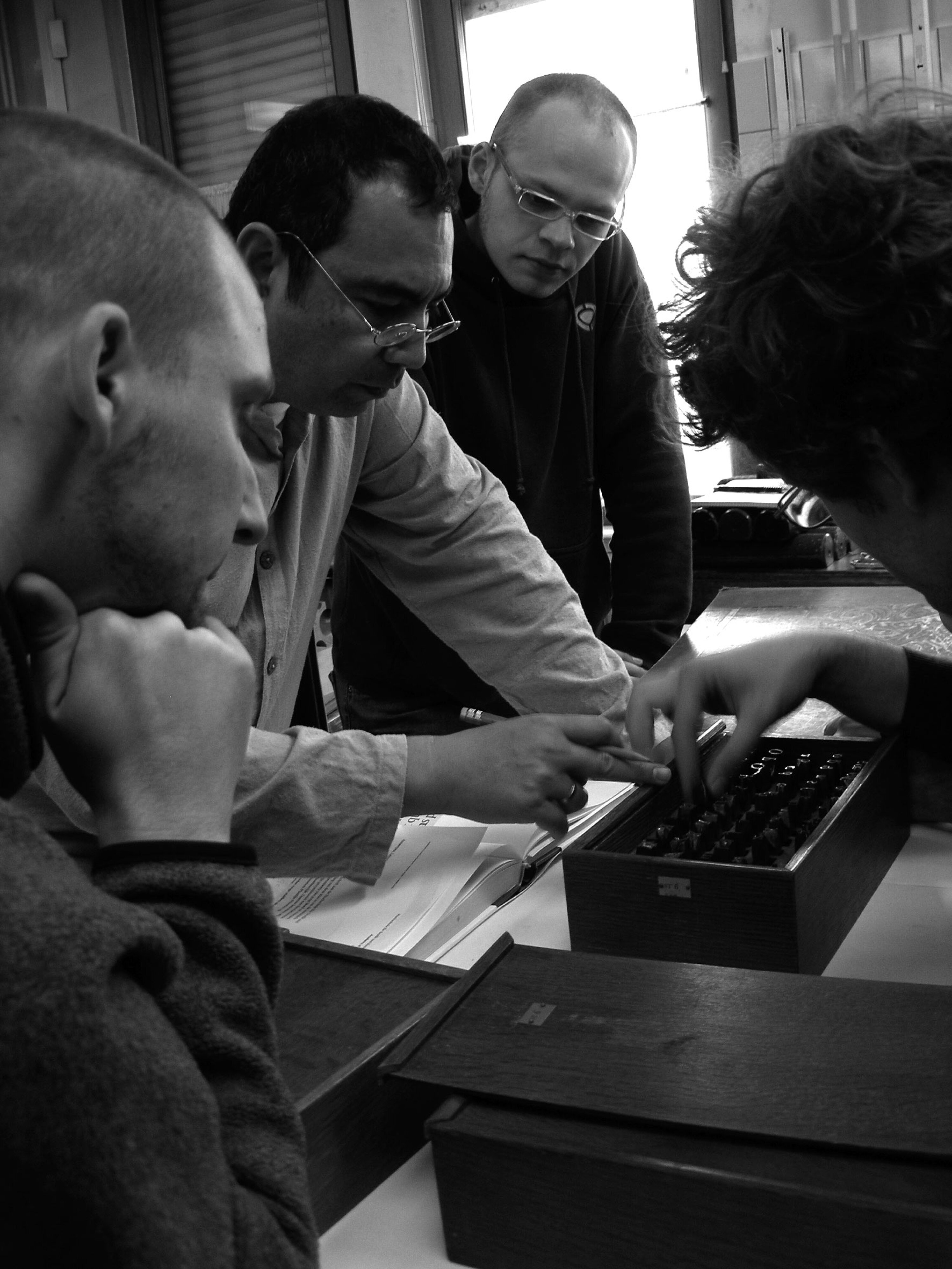
Yes, I do talk about that. How much time was needed, how fine those people could work in steel. We have excursions: last autumn we came here to Belgium, to the Plantijn Museum. I connect that with a little bit of academic research, so that they are aware that these people could have a big output as well–just to make connections with today. For instance the example of Granjon cutting an italic in Paris and every week sending ten or eleven punches by a kind of Inter-City express service to Plantijn so that here they could already strike matrices and justify the typeface and start casting, without the whole alphabet being ready. So there was a kind of courier service between Antwerp and Paris, and they were able to work on a typeface in a kind of modular way. There’s someone making shapes; in the meantime we get on with the rest so that we can make the book very quickly. That’s very close to what sometimes happens today.
You studied at the art school in Arnhem, and you’ve written about some of your teachers there, in particular Alexander Verberne. What was the most valuable thing that you gained from his teaching?
He could make you enthusiastic. That’s a very important thing. He was able to kindle my interest in letter shapes. That all started there, withwriting. And he showed me things which I as a seventeen- or eighteen year-old had never seen before. Pages by those Italian writing masters. I was not particularly interested in writing or letter shapes at all, but I would never have thought that people could write so neatly! So it was a kind of ‘aha’ thing. The same with a fellow-student of mine, Martin Majoor.
And when this happens students start to exchange knowledge and experience because they are both interested in something. That’s very important: I think in the end students learn an awful lot from each other.
And therefore you need a good class atmosphere in which students feel able to talk to and deal with each other.
There’s another thing which I raised in Type Now and which is also an item in my teaching: how to deal with all this easy stuff which is now technically possible: doing no more than changing somebody else’s fonts then calling yourself a type designer. That’s not what I would want my students to do. Or if they do, then they shouldn’t think that’s a very big job.
By the time they’ve finished their course, what stage would you hope they’ve reached?
When they’ve finished my course they should have one or two type designs which are available to the public, and should know enough about the technical side of things to be able to find a place anywhere in the industry or anywhere in the whole design scene, and they should have enough design skills to be able to start an agency or work freelance either as a typographer or a type designer.
Would you like to keep up with all our activities and exhibitions?
Subscribe to our newsletter!