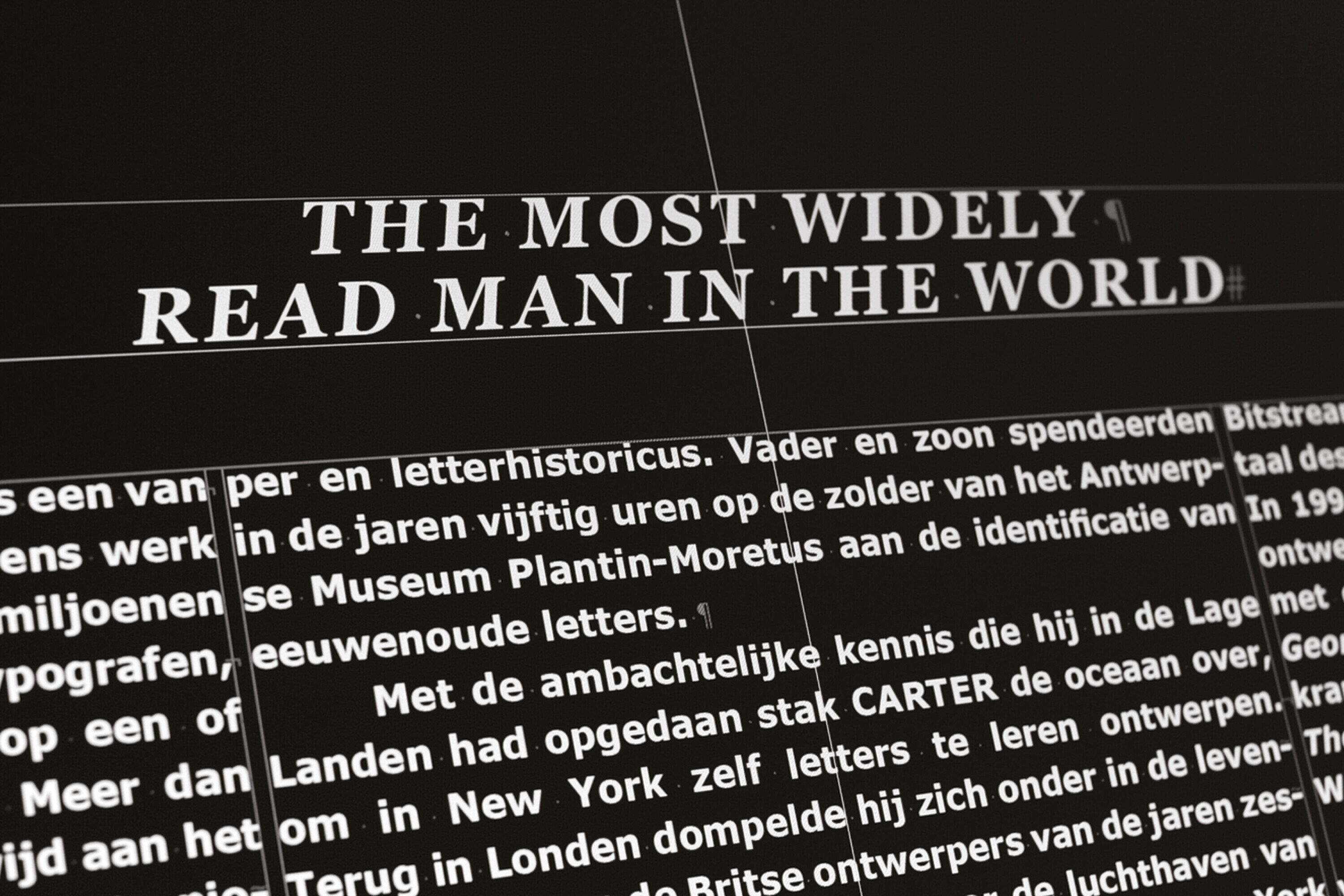
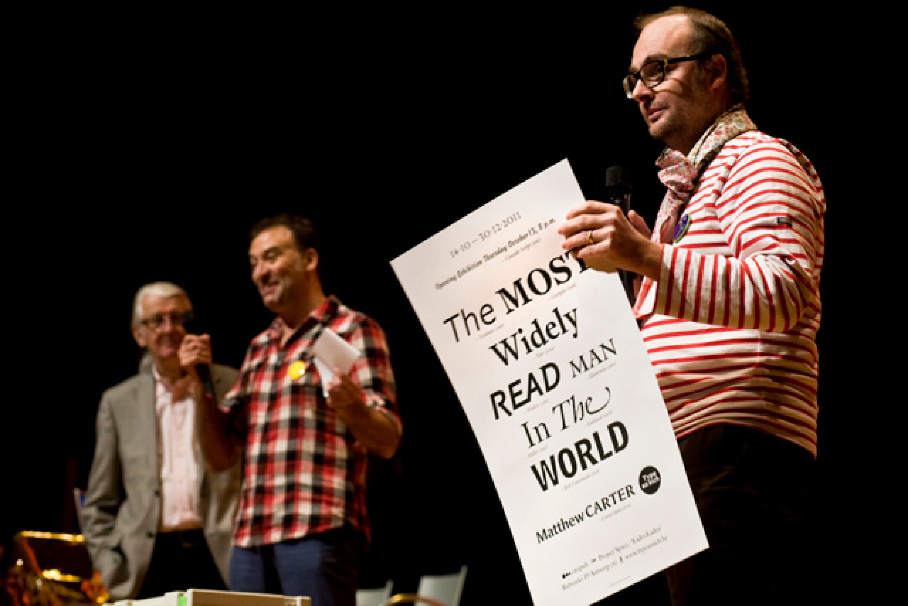
Type An Sich 6 | Matthew Carter, The Most Widely Read Man In The World
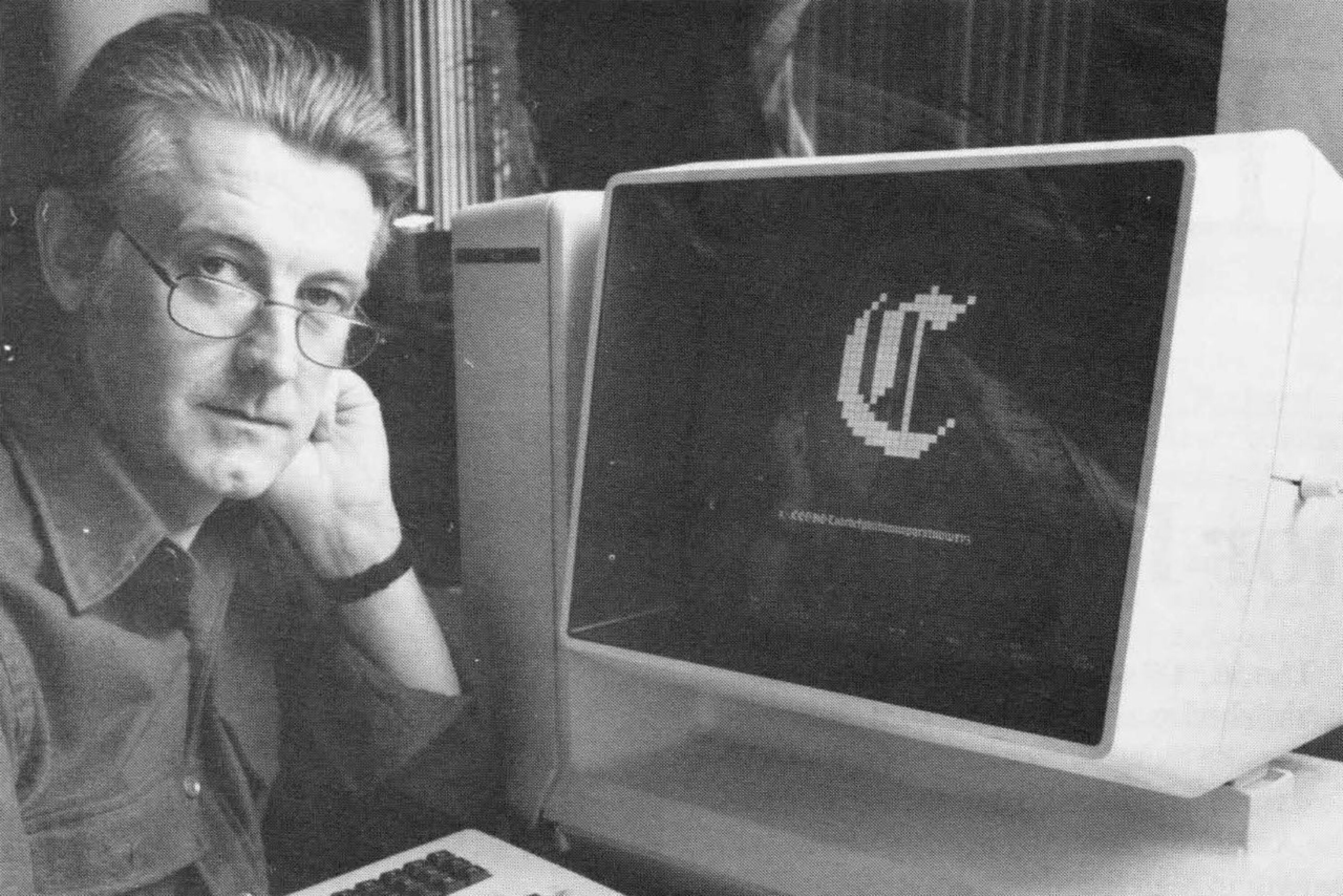
Matthew CARTER (London, 1937) is one of the few designers whose work is used daily by millions of people. Readers of newspapers, typographers, computer users, they are all somehow in touch with his work. He has devoted more than forty years of his career to designing typefaces for print. He was also a pioneer in making letters for computer screens, with Verdana and Georgia for Microsoft as the most important examples.
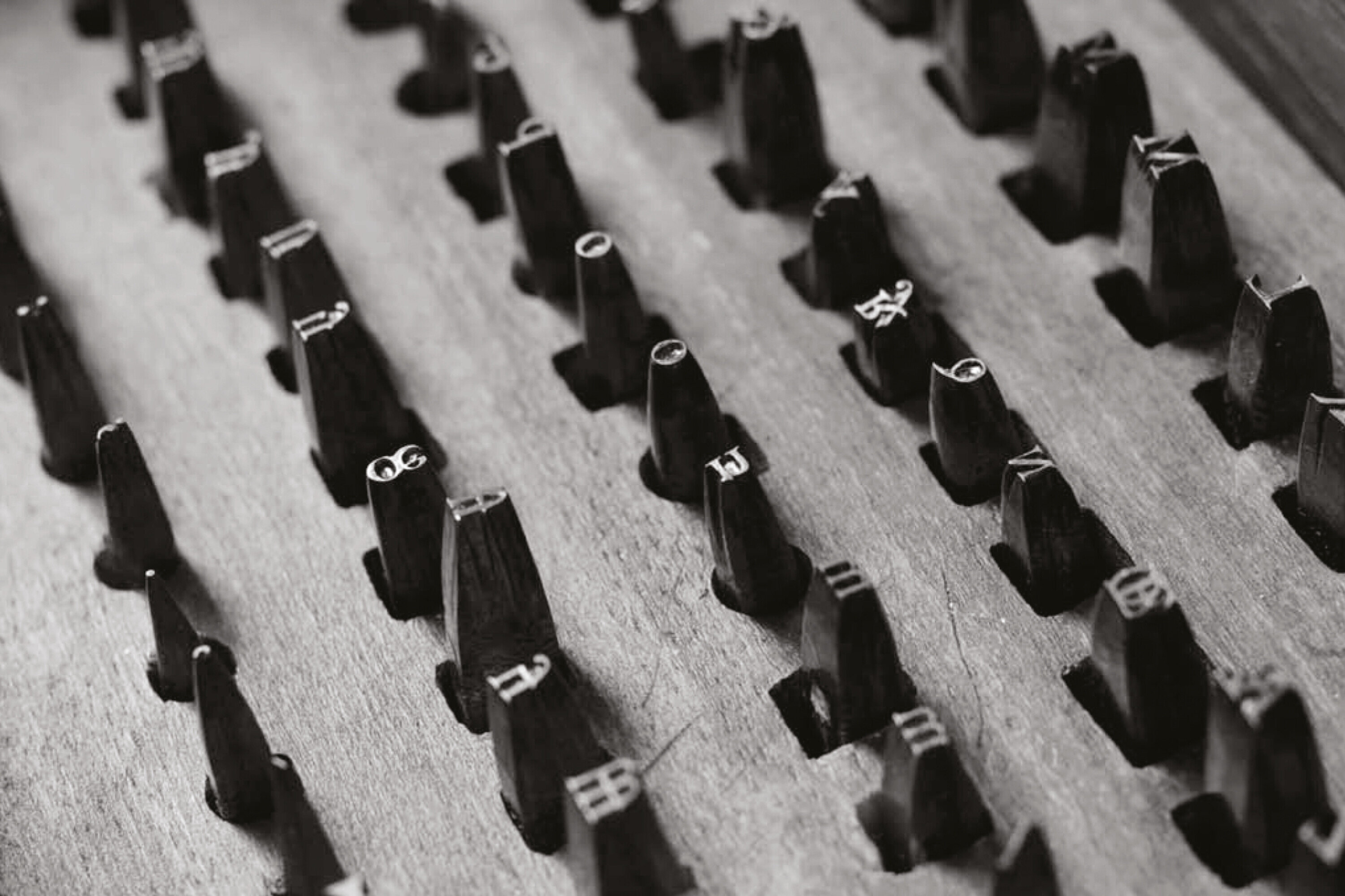
During his one-year internship with the printer Joh. Enschedé en Zonen in Haarlem, the Netherlands, the young Carter studied under the punchcutter Paul RAEDISCH, who cut the types of Jan VAN KRIMPEN, the company’s typographer. Enschedé was at that time the only commercial printer whose types were still cut by hand.
Matthew CARTER got his love of type from his father Harry, a typographer, book designer and historian of type. In the fifties, father and son spent many hours in the attic of the Museum Plantin-Moretus in Antwerp cataloging the ancient typefaces in the Museum’s collection. To add to the traditional knowledge he had gained in Belgium and the Netherlands, Carter crossed the ocean in 1960 on a visit to New York to learn more about contemporary typography.
Back in London, he immersed himself in the lively scene of the British design of the sixties, producing among other jobs an alphabet for signs at Heathrow airport. Leaving London again for New York, Carter worked for Mergenthaler Linotype, at that time the standard-bearer for phototypesetting. For Linotype he designed Bell Centennial, the font for the U.S. telephone directories.
In 1981 Carter joined typographer Mike PARKER and two other ex-Linotype colleagues to start Bitstream, the digital typefoundry. In 1982 the type designer David BERLOW joined them. After a decade at Bitstream that included the rise of digital design and the advent of the personal computer CARTER chose to return to full-time designing by starting an independent company with Cherie CONE, Carter & Cone Type Inc., where he still works. His clients have included Apple, Microsoft (Verdana, Georgia), the magazines Time, Newsweek, Wired, newspapers like The Washington Post, The Boston Globe, the New York Times, the Guardian, Le Monde, and the Walker Art Center. He has several exhibitions, lectures and awards to his name, including a Lifetime Achievement Award from the National Design Museum in New York. Last year he was awarded a MacArthur Fellowship by the prestigious American foundation that recognizes promising and creative people for their exceptional achievements. He has taught for many years at Yale University’s School of Art.
The first published type
Cascade Script was designed by Matthew Carter for Mergenthaler Linotype. It is a calligraphic font with bold angular shapes. The bold letters seem to be drawn with a pen or a wide blade.
It was designed as an alternative to Ludlow Hauser Script for photocomposition on the Linofilm. Similar letters were used by printers in the forties for the advertising industry. The pleasant Cascade Script with its lively and balanced form is particularly suitable for short texts and headlines.
Revival of a character with its roots in Antwerp
The roots of Galliard, the standard letter for university editions, books, scientific journals and art catalogs, can be found in the Museum Plantin-Moretus in Antwerp. Between 1955 and 1956, Carter spent several weekends in the attic of the museum to assist his father, Harry Carter, archivist of the University Press, Oxford, in investigating the old punches and matrices that dated from Plantin’s lifetime. At that time Matthew Carter was an intern at the Dutch printer Joh. Enschedé in Haarlem.
In 1965, Carter was hired by Mike Parker, Director of Typographic Development at Mergenthaler Linotype and also a big fan of the Plantin-Moretus Collection. If one of those old typefaces deserved to be revived, the men quickly agreed, it would be the work of the French letter cutter Robert Granjon (1513–1589).
The result, the typeface Galliard, starts with the Ascendonica typeface of Granjon, but incorporates the vitality and exuberance of Granjon’s complete works. Galliard is an anthology of the work of Granjon, as Carter himself described it. With his new design Carter caused a real revival of the style of the French master.
Carter provided ITC Galliard with a full range of characters: roman for body text, italic for ancillary use in captions and quotations, old-style figures designed for use in text, small caps for use in abbreviations and acronyms, ligatures, fractions, superior numbers for referencing footnotes, etc.
Galliard’s solid stroke weights reproduce well under a variety of printing conditions. Its compactness makes it economical; a large number of characters fit on a page.
In Galliard Carter’s experience of typographic history is united with his technological knowledge and his sense of aesthetics. Text set in Galliard has a comfortable familiarity. Certainly, this is due to its frequent use in the past twenty years. However, Galliard as a contemporary typeface that springs from a historical sources shares a kinship with Garamond, Plantin and Times Roman, other well-used and familiar 20th-century typefaces inspired in part by historical models found at the Plantin- Moretus Museum.
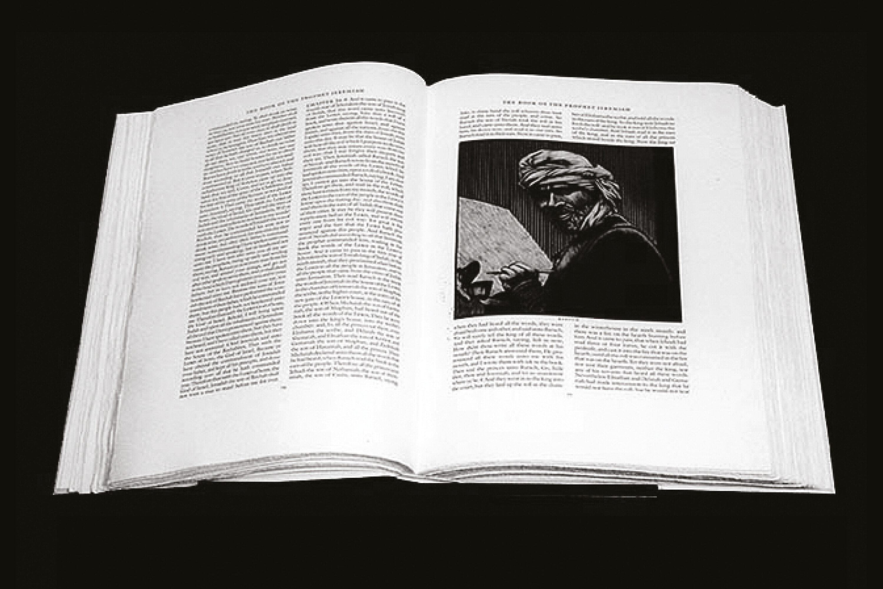
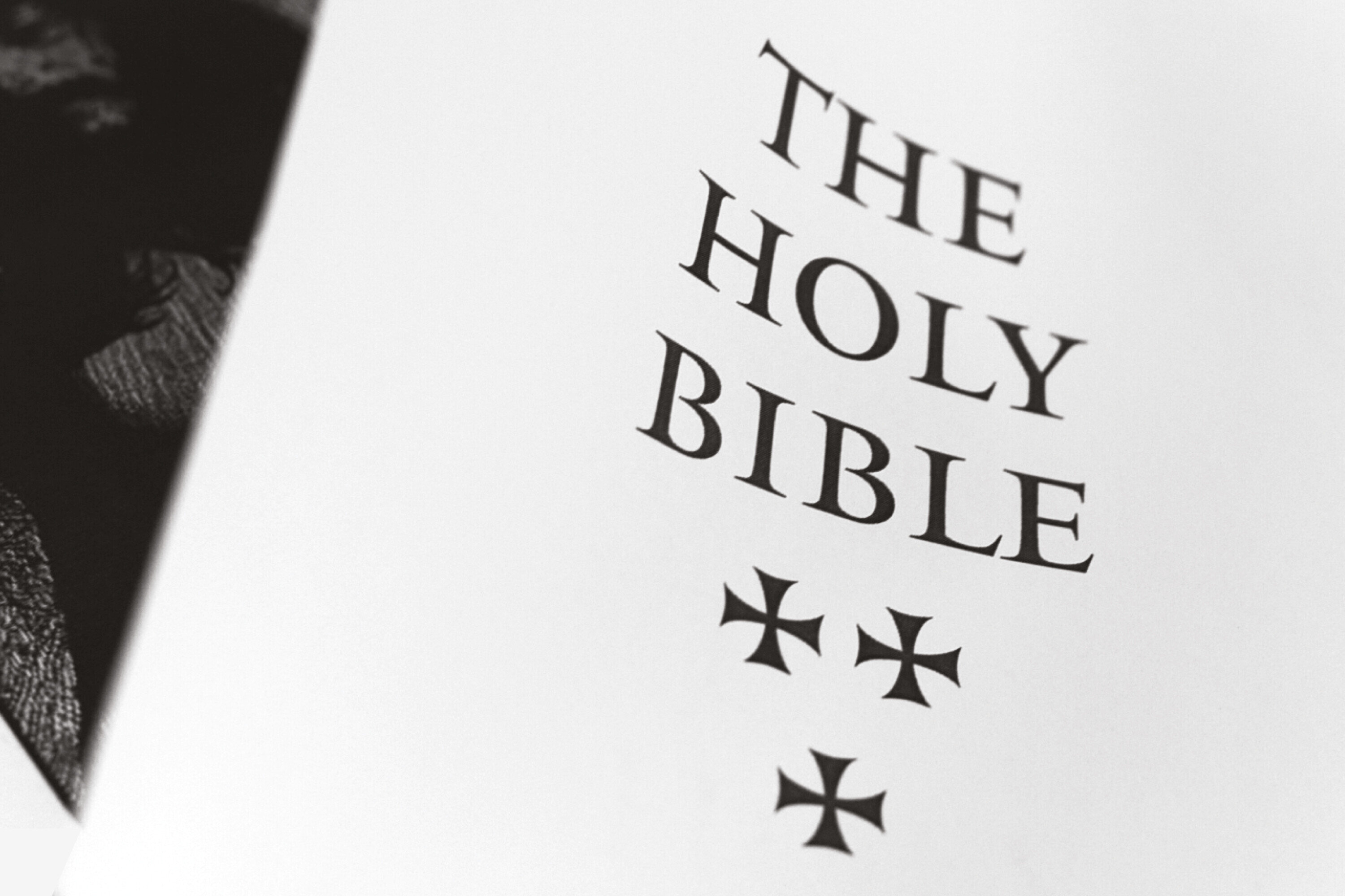
Galliard is used by both Adobe and in the luxury Pennyroyal Caxton Bible.
Renaissance of a type
Mantinia was developed at Carter & Cone Type, Carter’s typeface company. Mantinia is a titling face intended for use with Galliard, the highly acclaimed text font of 1978.
For Mantinia Carter found inspiration in the life and work of Andrea Mantegna, an Italian Renaissance artist of the 15th century. He was a painter and collector with a passion for the stone inscriptions of the Roman Empire. For the ligatures in Mantinia Carter was inspired by the carved inscriptions that Mantegna painted and engraved. The oversized capitals and the small capitals derive from Roman inscriptions carved in stone.
The most consulted letter in the world
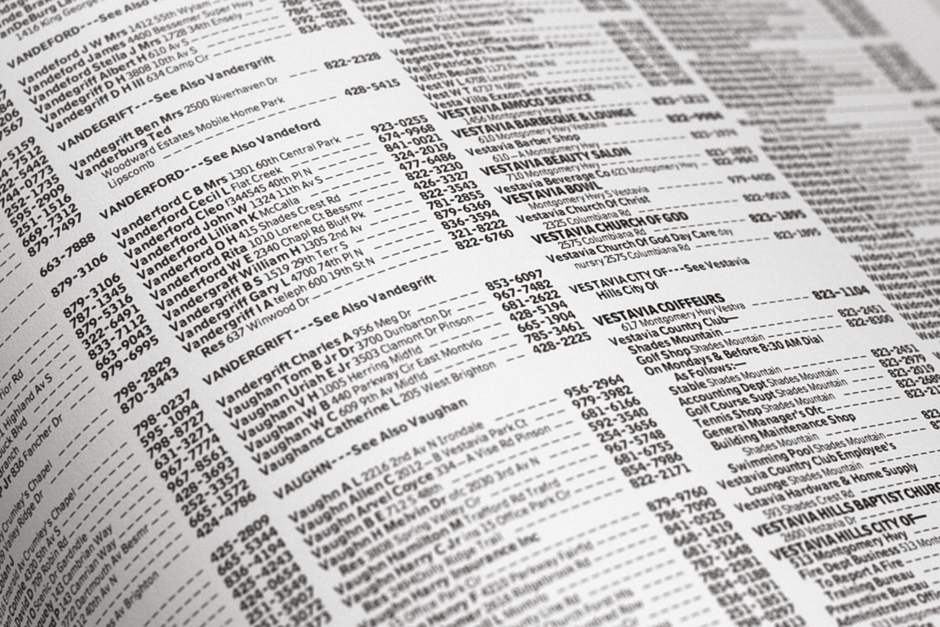
Bell Centennial, the telephone directory typeface was commissioned by at&t in 1974 for aesthetic and technical reasons and to solve an industrial problem. at&t wanted a contemporary sans serif which would replace Bell Gothic, developed for the Bell Company, and which would be compatible with Helvetica, a typeface that was used by Saul Bass in the mid-1970s as part of at&t’s new corporate identity. The design brief called for a typeface that could be read at a very small size. It would have to be legible when printed on the rough surface of directory paper and use no more space than that used when the same text was set in Bell Gothic.
Additionally, the typeface had to be designed to print on a high-speed press, using Cathode Ray Tube typesetting (crt), an early digital system, in which a cathode ray swept photographic film from left to right setting an entire line of text in fragments rather than the Linotype hot metal system which set the text letter by letter.
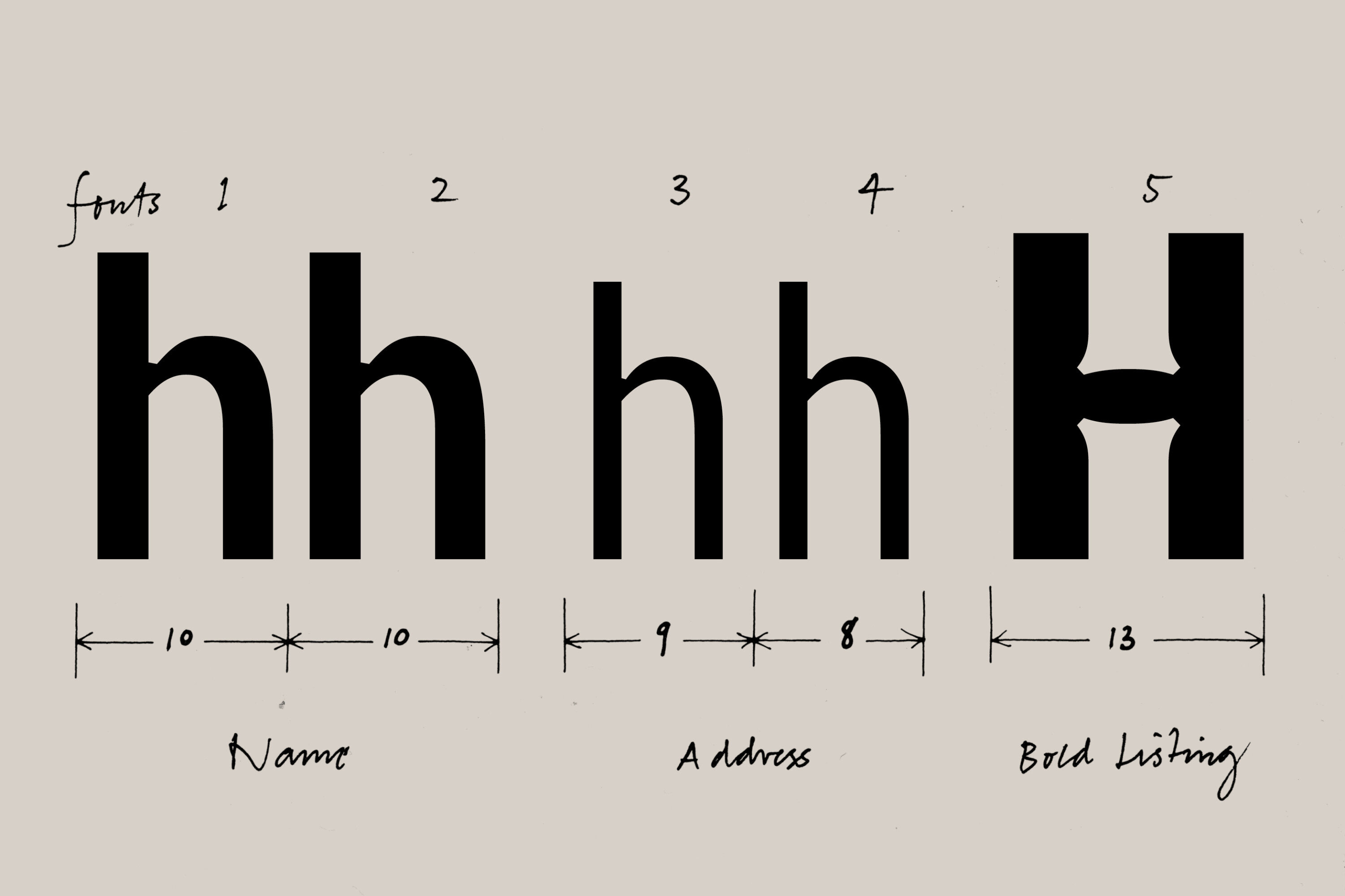
Carter designed various weights of the Centennial for names, addresses and phone numbers. The addresses in the directory were set in a narrower and lighter face, a huge saving in space, ink, paper and transportation.
To attract advertisers to the directory Carter designed Bell Centennial Bold Listing: a font without a lowercase and with large capital letters and numbers. Bold Listing was joined by Sub-Caption, an even smaller and finer font to make the best use of the available space.
From print to iPad
Even more recognizable than Verdana is Georgia, the serif font that Matthew Carter created for Microsoft. The name derives from a headline of a tabloid: ‘Alien heads found in Georgia’. Georgia was launched by Microsoft in 1996 as part of the package of default fonts for the internet operating software Windows Embedded Compact.
Georgia is one of the first serif fonts made for texts on screens. The approach was very different from adapting an existing typeface designed for paper to the screen, where it does not necessarily read well. Georgia has more in common with the omnipresent Times New Roman than with Verdana, but is distinguished by somewhat larger and more striking serifs with flattened ends.
With Georgia Carter felt strongly that new text carriers require new typefaces. The success of pdf reader, Kindle, iPhone today seem to confirm this.
Window on the internet
The sans serif font Verdana was commissioned by Microsoft. In the mid nineties the typographical division of the computer giant claimed that there was a need for a letter that would make reading computer screens easier. The result was named after Ana, the daughter of the manager of the typography department.
By working with a sans serif typeface, large proportions and lots of white space between the letters Carter made Verdana suitable for reading text on screen, even in a small font size and on a low-resolution screen. Therefore, the Verdana font was installed as the standard typeface on computers running Windows, but it was also used in Office and browser software for Windows and Mac.
Verdana is so widespread and pervasive that its critics blame it for a ‘homogenization’ of digital typography. In 2009, furniture giant Ikea decided to use Verdana for printing their catalogs, to more closely align print and online versions. Fanatical bloggers and fans of Futura (Ikea’s previous typeface) screamed bloody murder, and baptized Ikea's decision ‘Verdanagate’.
A total makeover for the museum
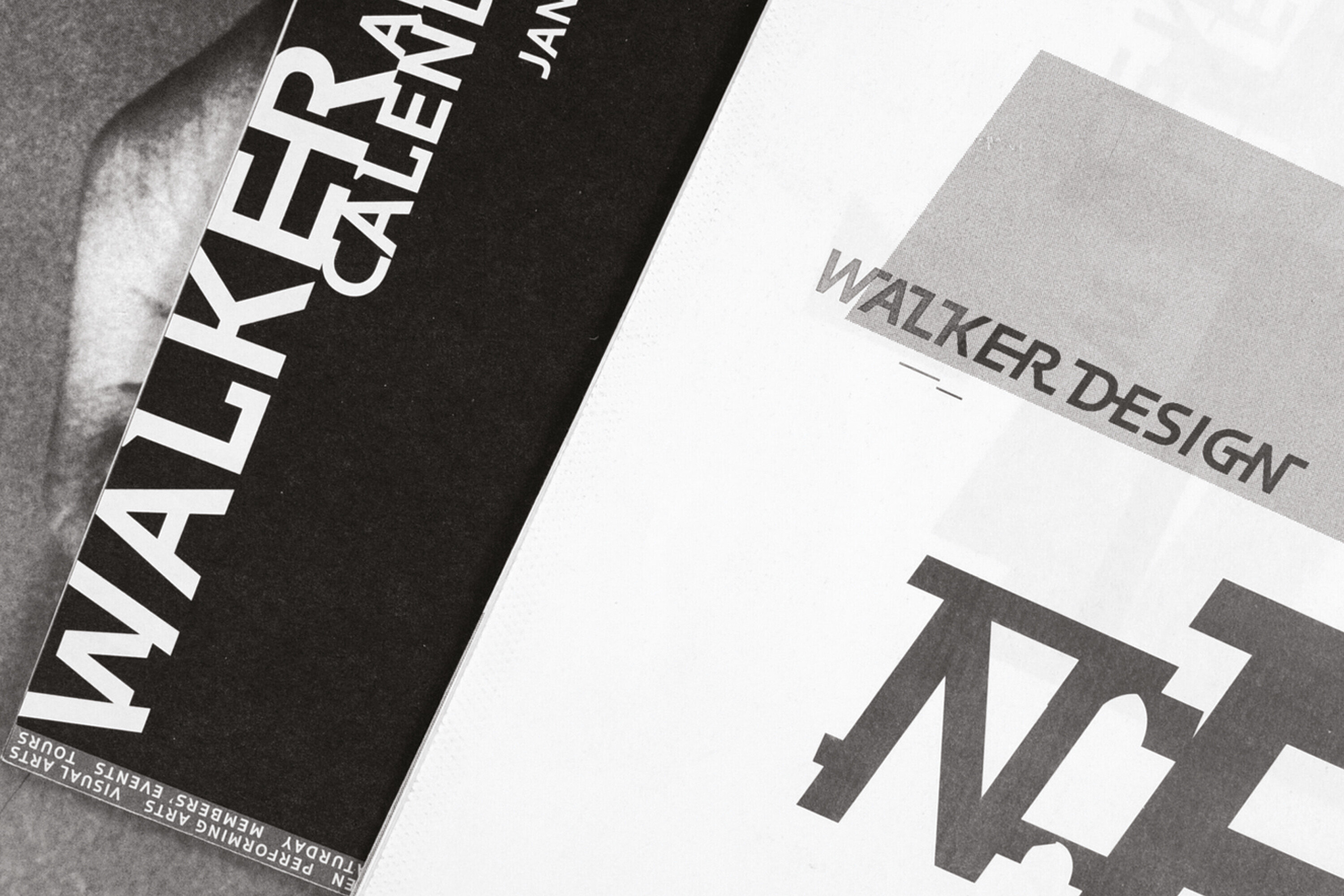
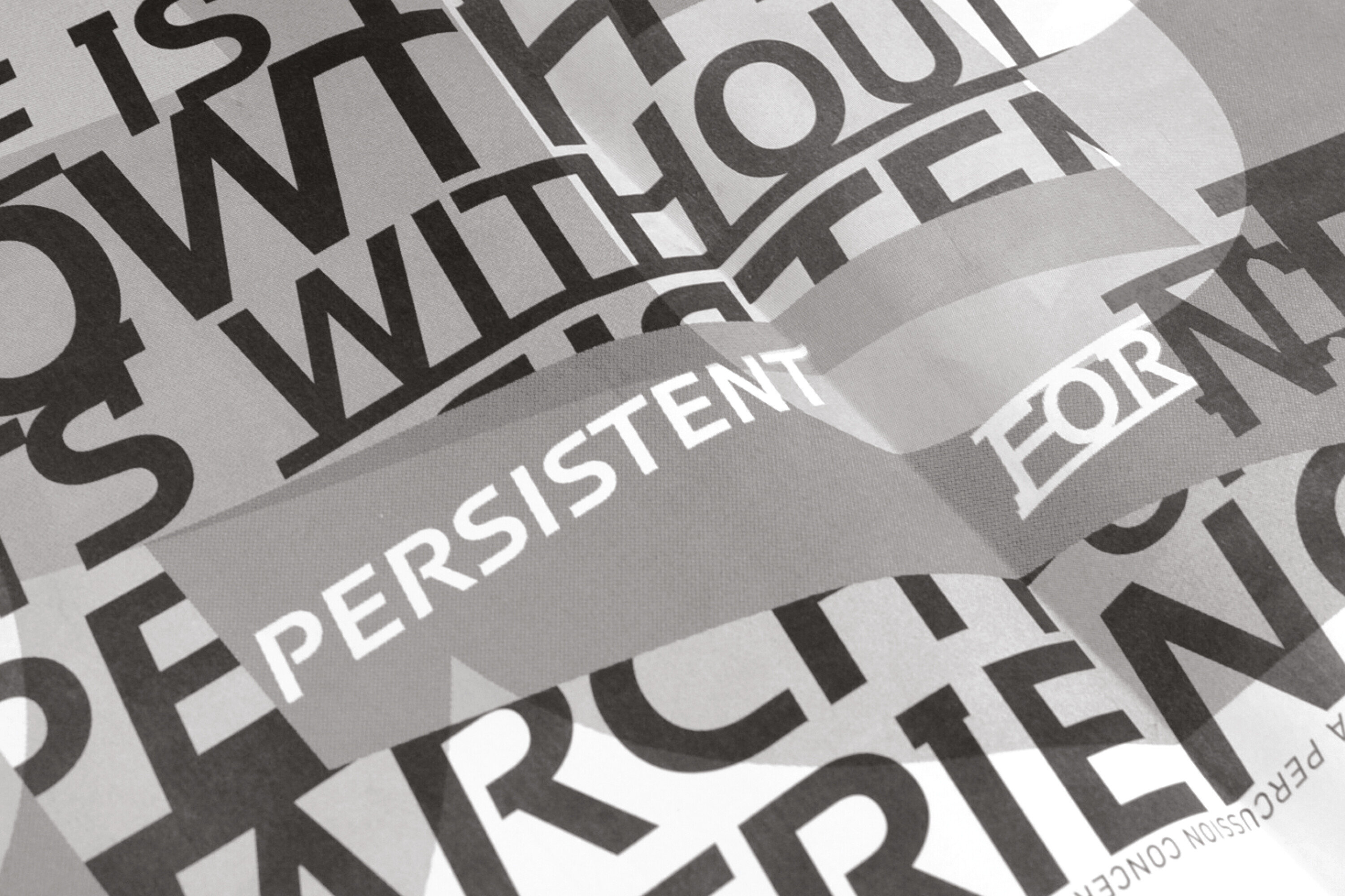
The Walker Art Center in Minneapolis, Minnesota, an institute for contemporary art that was founded in 1927, asked Matthew Carter in 1995 to design a letter that could translate its new mission. The Walker wanted an identity that would show its commitments to regional diversity, internationalism, and experimentation by breaking from the modernist aesthetics of the grid, white space, and sans serif type. This identity would become the museum’s new voice and, thus, would need to be flexible, expressive, and pluralistic.
Carter was intrigued by the opportunity to create a typeface that would not just be used in a secondary manner as part of an identity package to support a mark or logo but instead would play a highly visible and primary role. Carter began an intensive creative process working very closely with the designers at the Walker who were responsible for the signage and with the team that designed the printed material for exhibitions at the Walker. Any proposal by Carter was extensively tested by the in-house designers and feedback was provided. The result is a dynamic character with elements from the early nineteenth-century Egyptian and British typography, which was used in the events calendar of the Walker Art Center.
A favorite newspaper character
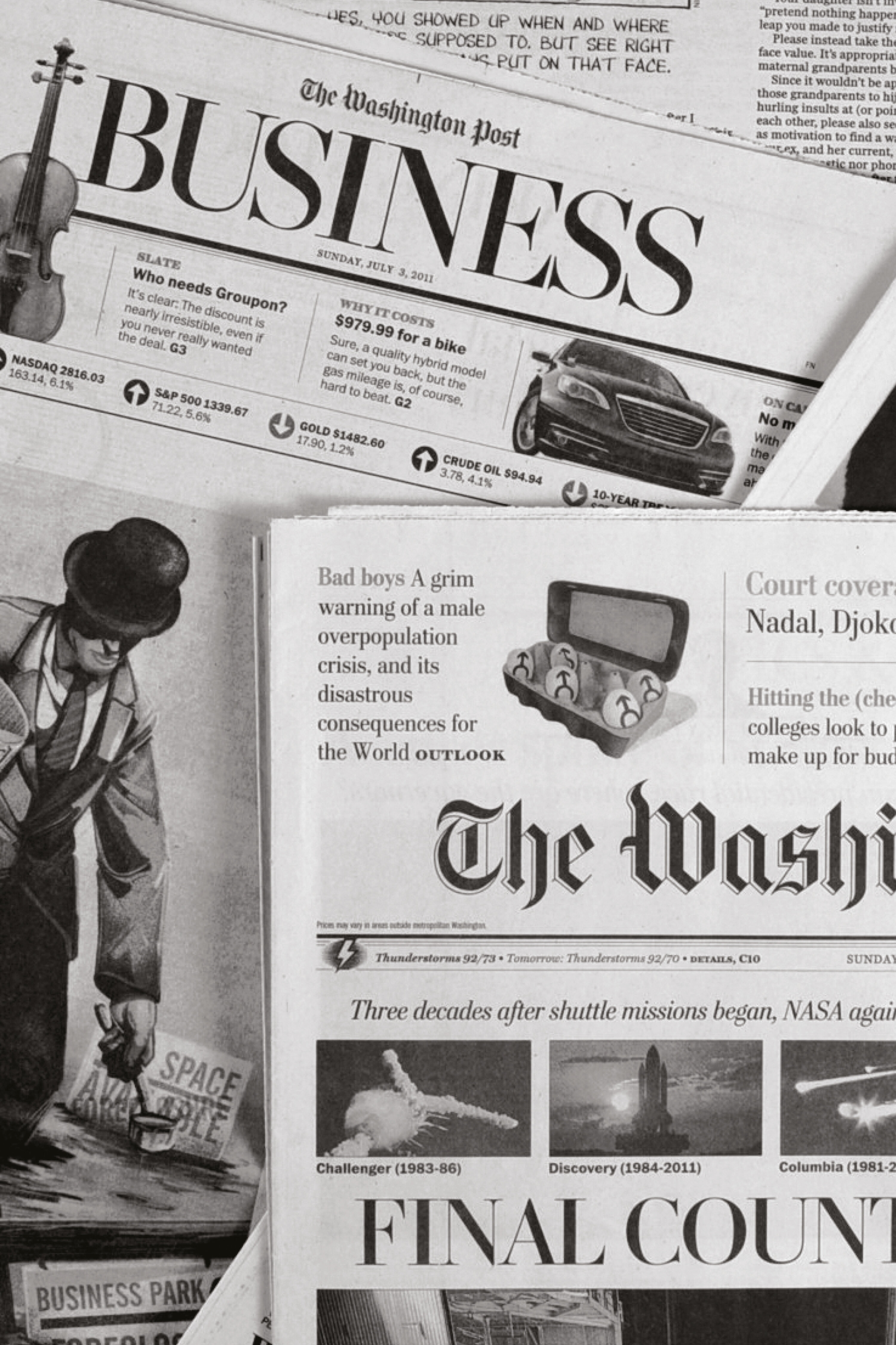
Where Georgia was a letter designed by Carter to make reading of displays enjoyable, Miller is the letter that perfectly translates the text on the screen into print. Miller and Georgia are two branches of the same tree; many characters are the same in both types. Georgia is a little tighter to work better on a screen, the italics of Miller are more elegant and further developed. Carter drew inspiration for the font from Scotch Roman, a letter that was named after its birthplace in the typefoundries of Edinburgh and Glasgow at the beginning of the 19th century.
At its launch in 1997, Miller was quickly picked up by newspaper publishers: The Boston Globe uses variations on Miller, as does The Washington Post, Glamour Magazine and The Hindustan Times.
An academic letter
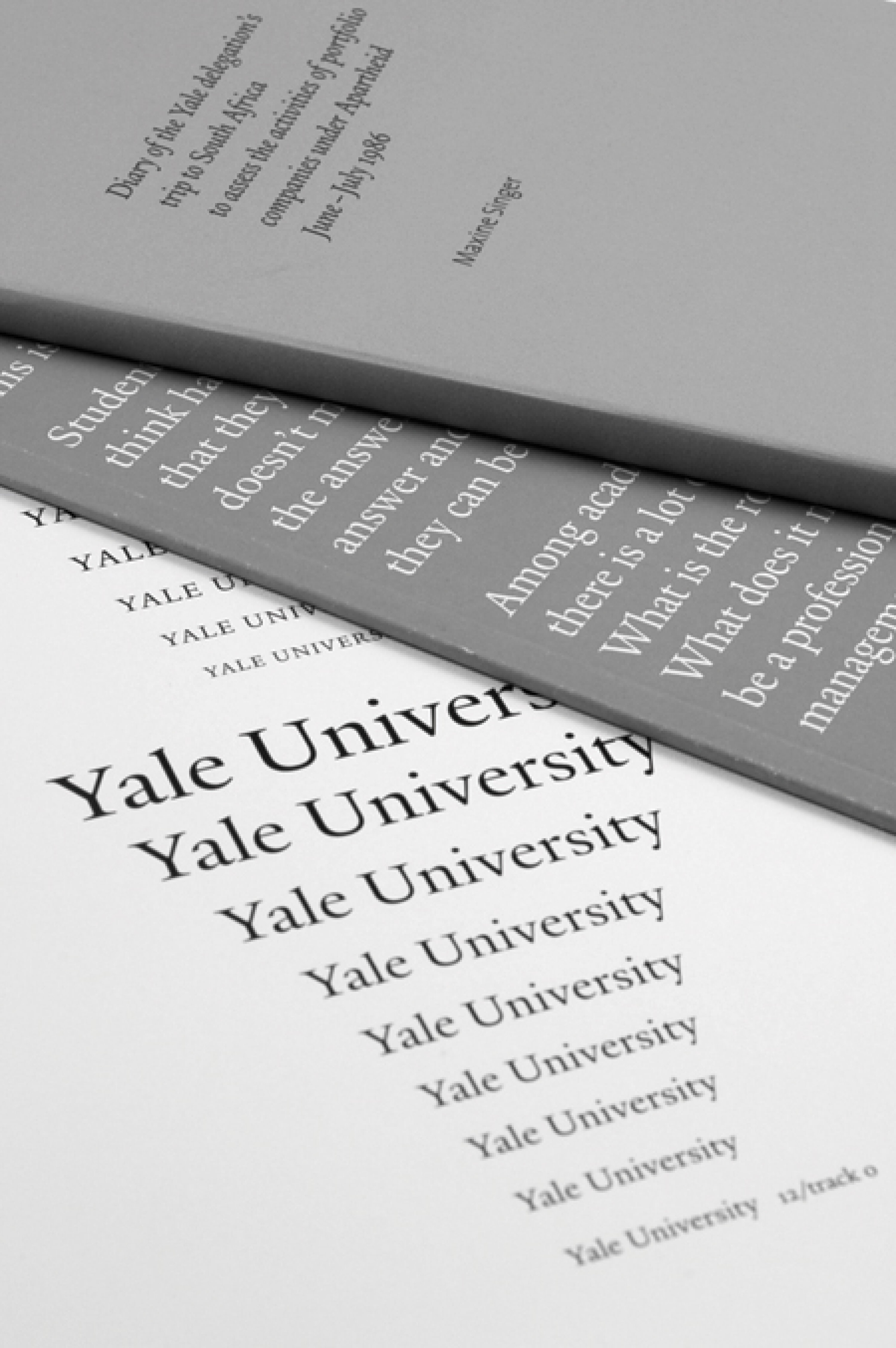
Every student, professor and member of Yale University, New Haven, Connecticut, is allowed to use the letter that Carter designed specifically for the University and that is used in publications and official communications.
Yale was inspired by the late-fifteenth-century Venetian typeface that first appeared in Pietro Bembo’s De Aetna. This book was published by Aldus Manutius, a successful printer and publisher, with clients throughout Europe. Matthew Carter’s Yale recovers the strength of the typeface, and updates it by sensitively simplifying the basic letterforms and their details.
Ode to a friend
While this robust typeface bears the name of Matthew Carter, another typographer played an important role in the development of the Carter Sans: the German-born type designer Berthold Wolpe, who died in 1989. Wolpe and Carter met in the glory years of Linotype. Carter Sans, influenced by the Albertus font that Wolpe designed, is Matthew Carter’s tribute to a type designer he admired. Carter Sans is strong in its simplicity, with hardly visible serifs and letters that are both angular and light.
Dan Reynolds of Linotype assisted Carter in the design, which was made at the request of Monotype Imaging.
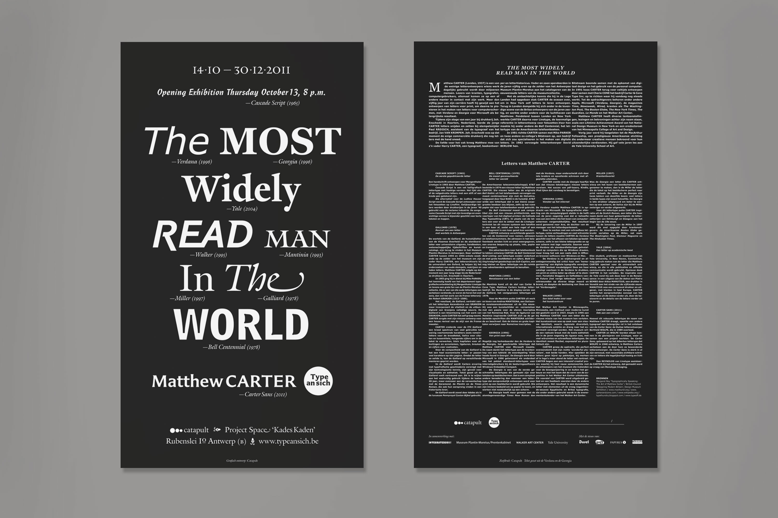
Matthew CARTER, The Most Widely Read Man In The World
(14.10.2011 – 30.12.2011)
Location: Catapult, Rubenslei 10, 2018 Antwerp (Belgium)
Hours: Monday–Friday from 10 a.m. to 6 p.m., weekends and holidays by appointment only
Curators: Catapult (Anton de Haan, Luk Mestdagh, Tom Van Welkenhuyzen)
Organisation: Catapult (Anton de Haan, Véronique Van Looveren, Tom Van Welkenhuyzen)
Scenography: Catapult (Omar Chafai, Anton de Haan, Andreas Depauw, Tom Van Welkenhuyzen)
Graphic design publications: (Omar Chafai, Anton de Haan, Tom Van Welkenhuyzen)
In partnership with: Designcenter DEWINKELHAAK, Integrated2011, Museum Plantin-Moretus/Prentenkabinet, Walker Art Center, Yale University
With the support of: Duvel/Moortgat, Intraco, Papyrus, Tubbax
Would you like to keep up with all our activities and exhibitions?
Subscribe to our newsletter!


